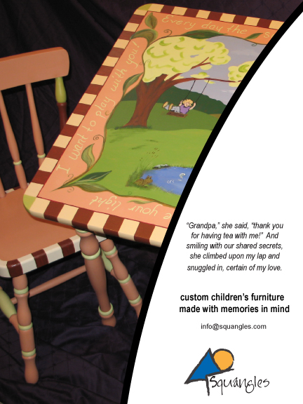
Week 3 in Electronic Design was about developing a logo for our client (Squangles) and then incorporating that logo into the ad from last week, now completed in color.
Prework that was turned in for feedback:
Some splashes of bright complimentary color, the lines with an almost crayon-like look, whimsical font, and voila, the final logo.

The final, full color ad with the logo incorporated:
[Note: this is one of my illustrated table and chair sets with Charlotte’s poetry going around the edges. This was commissioned by a chiropractor and now resides in his waiting room, which is decorated in the soft greens.]


