Electronic Design Final

This was an amazing online class!  Fellow students were fully engaged and the instructor actually taught us (and seemed to enjoy it!)  He stands out as one of my best online instructors and has raised the bar for any future instructors!

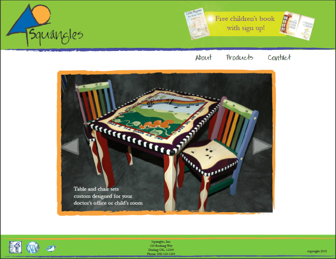
Remember, for this class we have a single client.  Mine is Squangles, my own business in which I have partnered with poet, Charlotte Franck, to create unique children’s designs on furniture.

Requirements:

  • Demonstrate typographical hierarchy and best practices 
  • Marketing:  display a giveaway
  • 4 pages
  • use a grid
  • and a few other incidentals (font choice is from a previous week’s discussion, a well as the logo)

I also chose this one because in all my tallying of the various polls and feedback, 1 and 3 tied.  However, the teacher chose #2 and I decided to go with that and see what I could do with my least favorite of the 3 designs.  It gives my business a very different feel than I originally was thinking, but I ended up loving it.  Tell me what you think!

Now I am really wanting to code the thing in Flash!  Crazy!  Aaarrgghhhh… I think there is more of a geek in me than I want to admit!

There is one thing I would change if I ever take it “live” – I would add my illustrations to each page.  That would kick it up a notch, I think.  Black and white outline, or maybe my puppy… something simple yet “me”.

Electronic Design Web Prework

What is with this quarter?  It’s another website final, but this time it is only designing (as opposed to coding.)  In week 5 we did the prework and 3 mockups and week 6 we will be choosing the final design and completing 3 sub pages.  Here are my thumbnails for the homepage as well as 3 of my favorite layouts.  Now that I think about it, the layouts were probably supposed to all be in the same colors, but I had fun playing around with ideas and different color schemes.

I am not sure which is my favorite!  The red circles are the 3 I chose to use in my mockups.

Thumbnails of 10 different layouts

Option 1 would have clickable photos that enlarge and have a description

Option 2 - lots of color and large scrolling images

Option 3 - a bit more soft / classy

Creating a Hang Tag

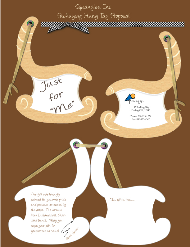
This week in Electronic Design we were required to create a packaging design for our business.  Since Squangles is still very personalized, that was a challenge and the normal packaging (boxes, displays, etc.) was out of the picture.  However, I have presented my work at art fairs and charity auctions.  I also hand deliver the item to the buyer, who then turns around and gives it as a gift.

This was to be presented to the client on an 8.5 x 11 presentation board with various views.  I chose to stylize a rocking chair design to reflect the wooden furniture portion of Squangles and create a hinged gift tag.  Views include: front (closed), back (closed), and an inside (opened) with 2 ribbon options.

Since this is an online class, prework was submitted via a pdf file:  SquanglesW4

Squangles Logo / Color Ad

Week 3 in Electronic Design was about developing a logo for our client (Squangles) and then incorporating that logo into the ad from last week, now completed in color. 

Prework that was turned in for feedback:

SquanglesW3

Some splashes of bright complimentary color, the lines with an almost crayon-like look, whimsical font, and voila, the final logo.


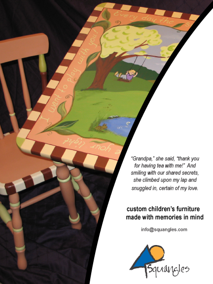
 The final, full color ad with the logo incorporated: 

[Note:  this is one of my illustrated table and chair sets with Charlotte’s poetry going around the edges.  This was commissioned by a chiropractor and now resides in his waiting room, which is decorated in the soft greens.]

I love newsletters!

The second half of the quarter has started and my new online class (Electronic Design) is very interesting and interactive!  Our first project was to choose a company that we will work with for the next 5 weeks.  I chose Squangles, my children’s illustration / Charlotte’s poetry business. 

First project,  mock up a design of the newsletter using a grid style of your choice.

First the requisite thumbnails of various newsletter styles/grids (portrait only).  #11 was a popular vote from classmates, but I chose #15 because it was outside of my experience and thus, seemed more personally interesting. 

Then choose one and turn it into a mockup on Illustrator.  (I kept the mock up as black and white and just used a photo that was in my stash.)  I think this grid could challenge me a bit, so I chose it. 

This activity made me miss my newsletter… I want to get back to writing, designing, publishing it!!!