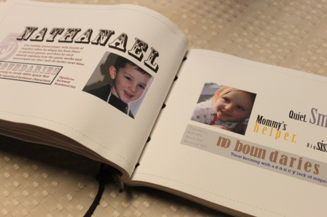
Our Typography final was a 4 week project to create a book. I chose to print mine on one sided canvas paper (meaning I had to sew the pages back-to-back) and to bind it with leather (for durability.) I also sprayed each page with a Krylon protective spray.
This book should be able to endure many, many years of loving hands flipping through it.
Process:
- Read the book “10 Commandments of Type”.
- Retype the 10 commandments (rules).
- Illustrate the rule with typography.
- Illustrate how to break the rule.
- Put all of this into a book format.
In other words, we were to have 20 typographic illustrations, 2 of which were required content.
Simple enough, but I was not interested in re-typing a book that did not impress me (I never did read it all.) So I came up with a whole different take on the same concept and turned it into a gift for my mother. Since 20 pages were required and I have 18 nieces and nephews, the subject matter was pretty much a no-brainer. The rules were turned into “Boundaries” and “No Boundaries”, which seemed an appropriate word for kids.
The pages were laid out in a spread format, so each spread (the boundary on the left and the broken boundary on the right) actually went together. Something that is not noticed when each page is read separately in the slideshow below.
The photos are all my own and taken in 2010. The writing is also my own and strives to capture something specific about each child.
During this process, I fell in love with these kids all over again. This has to be my absolute favorite project I have ever done at the Art Institute. How in the world will I ever top it?!
I ended up making two of these. One I turned in to my instructor and the other I gave to Mom as an early Mother’s Day gift. Keeping something like this secret just isn’t in my skill set.
For the entire book and photos of the process:


