Inktober Portrait

I am running way behind on posting to the blog! If you want to catch me in real time, I can also be found on Facebook or Instagram. Instagram has short process reels starting to appear also, as I am learning how to create them (and overcome my nerves!)

This year I am wanting to work more seriously on my portraiture. So I asked a coworker if I could draw his son, whom I met at a company BBQ, thus the company hat and keychain. He was such a delight to work on and my first Inktober piece. Nothing like warming up to the inks in the most intense way possible! When Jasper saw his picture he told his dad he wanted it on his wall. What a sweet compliment!

I did the entire piece with a pencil sketch, then this brush dipped in Higgins black waterproof ink (and a raccoon mug of water.) Again – Inktober was about working on the balance of tones and values with the ink. I saw myself progress as the month did. I doubt an artist every feels they have arrived, though, so I have learned to just accept where I am, knowing with each piece I am growing my skill.

Children’s Furniture Project

In April-May I began a massive clean out of my art studio. After over 40 years of collecting projects and resources, I have decided I have “been there, done that” and I know what I want to concentrate on from this point forward.

So nieces and nephews were the benefactors of all sort of fun things, but also, there were a few projects I really wanted family to have. While I donated a large amount of raw children’s furniture to a new church nursery, I held out a few pieces for my nieces and nephew. This was the result.

This table top was their Grandma’s farm with the chairs celebrating a childhood cat (a nod to their daddy – and Grandma still has cats on the farm) and the hummingbirds ever present in the summer.

Fairy Dust

Our library assignment was to write a report on two digital artists and then emulate one of their processes/styles.

Phil McDarby captured my imagination. He utilizes his own photos as well as painting to create fantasy environments that the child in me wants to visit.

So that is what I did… a lily pad from the zoo and a painting of my niece, Samantha, create this charming fantasy of a fairy whispering into the flower. Who knows what she is saying, but I like to think of her encouraging the blooms, or maybe coaching a lady bug out of hiding.

Lighting and Mood

My introduction to the mixer brush in Photoshop CS5 did wonders for my pleasure in digital painting. However, I still prefer my brushes and canvas.

Homework: create a mood utilizing light and multiple reference photos.

First one is of a nephew and the second is of King, my niece and nephews’ cat. (BTW, these look wonderful printed on canvas paper and framed.) Things really clicked for me when I completed King’s eye and it looked real.

Type My Heart

Our Typography final was a 4 week project to create a book. I chose to print mine on one sided canvas paper (meaning I had to sew the pages back-to-back) and to bind it with leather (for durability.) I also sprayed each page with a Krylon protective spray.

This book should be able to endure many, many years of loving hands flipping through it.

Process:

  1. Read the book “10 Commandments of Type”.
  2. Retype the 10 commandments (rules).
  3. Illustrate the rule with typography.
  4. Illustrate how to break the rule.
  5. Put all of this into a book format.

In other words, we were to have 20 typographic illustrations, 2 of which were required content.

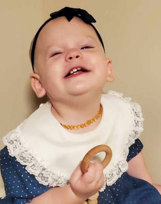
Simple enough, but I was not interested in re-typing a book that did not impress me (I never did read it all.) So I came up with a whole different take on the same concept and turned it into a gift for my mother. Since 20 pages were required and I have 18 nieces and nephews, the subject matter was pretty much a no-brainer. The rules were turned into “Boundaries” and “No Boundaries”, which seemed an appropriate word for kids.

The pages were laid out in a spread format, so each spread (the boundary on the left and the broken boundary on the right) actually went together. Something that is not noticed when each page is read separately in the slideshow below.

The photos are all my own and taken in 2010. The writing is also my own and strives to capture something specific about each child.

During this process, I fell in love with these kids all over again. This has to be my absolute favorite project I have ever done at the Art Institute. How in the world will I ever top it?!

I ended up making two of these. One I turned in to my instructor and the other I gave to Mom as an early Mother’s Day gift. Keeping something like this secret just isn’t in my skill set.

For the entire book and photos of the process:

This slideshow requires JavaScript.

Magazine Layout

Since this week was about typography, we were required to create a magazine layout consciously using type.  I could not help it, it was such fun creating my calendar a few weeks prior, that I reached into the work I had done with the vintage children’s books and went from there. So if this looks familiar, it is because it is similar to one of my calendar pages and plays off the book “The House that Jack Built” from The Gutenburg Project (a site I have fallen in love with!) However, it was not a previously created homework piece! I want to be very clear on that!

For a full description of the project, feel free to click on the pdf link:

Garvin_W2A2