
Design: Abstraction 4 Step Process – Take a photo and create 3 abstracts. The 3rd abstract must be so abstract that it does not look like the original photo, but the other 2 must show how it is related.
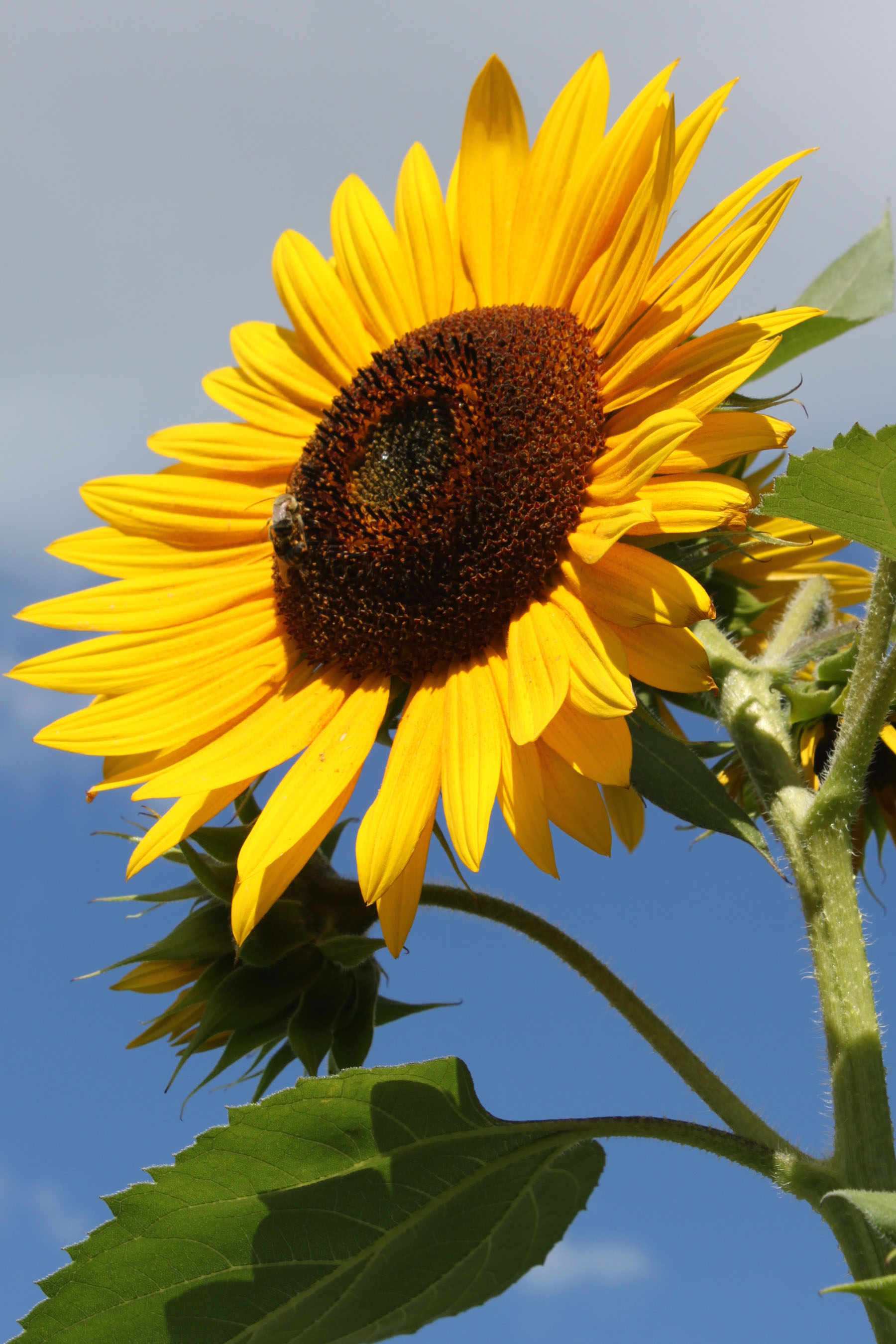
My sunflowers were chosen as the subject because they seriously needed to be commemorated this year. I had fought chipmunks and puppies to get them to this point and they are gorgeous.
My biggest challenge on this one was to pick the photo out of hundreds. Finally, I went and took a few more…then narrowed it down to 2. This was so much fun I did this on 2 different photos.
After spending time and a lot of paint and paper to create the 4th image, I opted to keep things simple and use photoshop as my tool. It was really fun playing with photoshop to do these renderings.
The first set of 4 was interesting and I really liked it a lot so that is what I turned in. The second set was another option that I liked a lot.

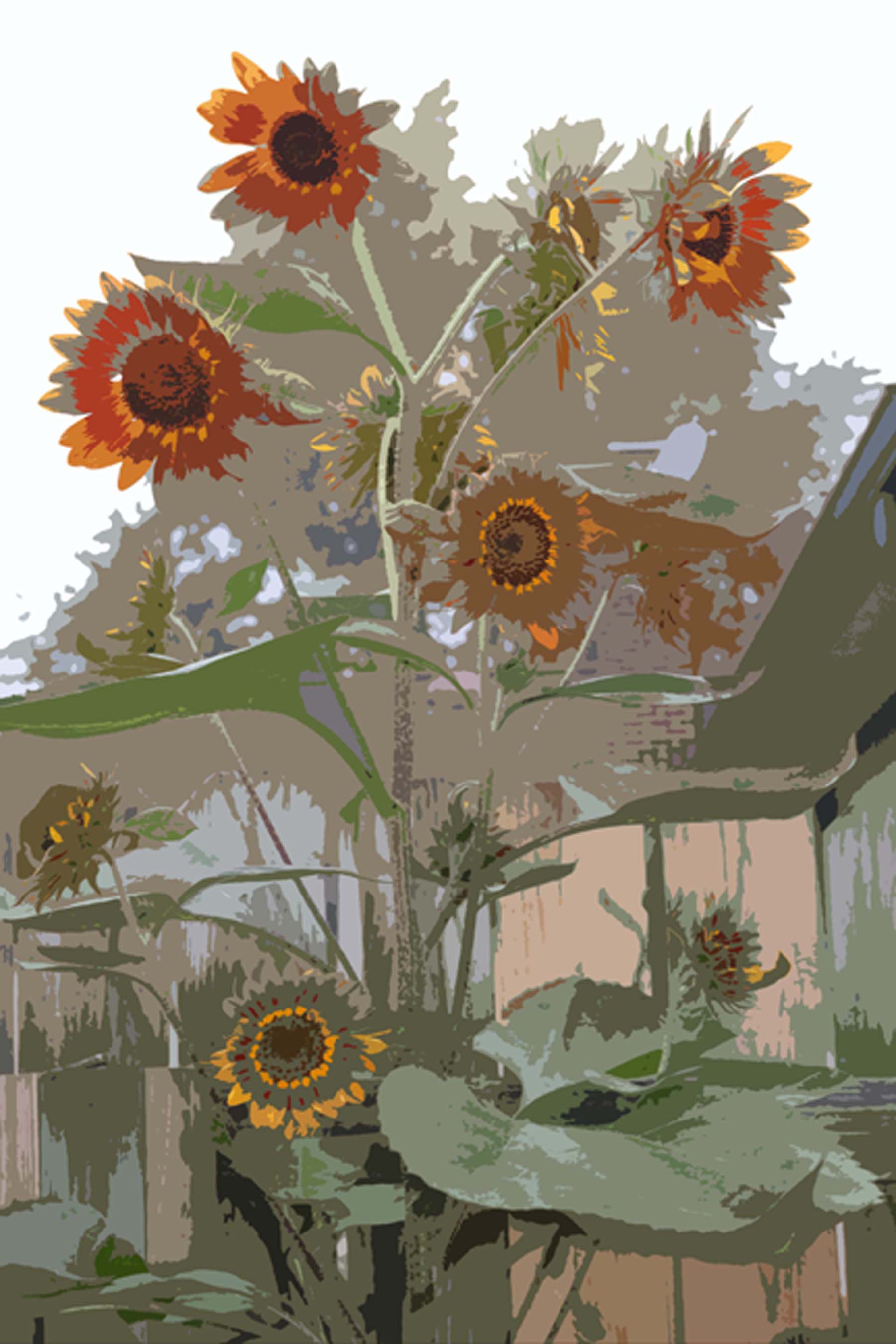


What I turned in: The original photo was taken on a foggy morning, thus making the colors and background sort of flat. I like that but the teacher, Scott, said that made it almost abstract from the beginning.
As it turns out, it was not exactly what he wanted. Sometimes I have to double check what Scott says. I love his class, but sometimes my notes and the gal next to me are saying opposite things! I am sure we are both hearing what we noted. It is all in how he phrases things. Usually I am the one who is right…this time I was not.
I think that second option of 4 might have served the purpose better as it more directly shows a progression to the abstraction…thus I include it here as the “road not taken”.

