Abstract of an Emotion Luke 2:21-33

The final for Fundamentals of Design:  “Joy of His Coming”

Project Criteria:

  • Dip into classic literature (either the whole book or a portion of the book)
  • It can not have been made into a movie
  • It must be about complex human emotion
  • Paint the emotion in abstract form remembering the fundamentals of design learned this quarter

Having cut my reading eye-teeth on classic literature, for a few moments I was overwhelmed (as in did I choose from Dickens or Five Little Peppers and How They Grew? What a variety!)  Then I broke down my own criteria.  Namely, since we were going to be working on this by creating thumbnails and talking about it for 3-4 weeks, I wanted a positive emotion.  Also, I wanted something that would add to my own growth as a person and as an artist. 

Whew…next time, someone pinch me and say “make it easy, you goof!” 

I chose a Bible passage that has been intriguing me ever since my nephew, Simeon, was born almost 2 years ago.  Bible – Luke 2: 21-33 (NIV) – Excerpt included in portion below:

25Now there was a man in Jerusalem called Simeon, who was righteous and devout. He was waiting for the consolation of Israel, and the Holy Spirit was upon him. 26It had been revealed to him by the Holy Spirit that he would not die before he had seen the Lord’s Christ. 27Moved by the Spirit, he went into the temple courts. When the parents brought in the child Jesus to do for him what the custom of the Law required, 28Simeon took him in his arms and praised God, saying:
29“Sovereign Lord, as you have promised, you now dismiss your servant in peace. 30For my eyes have seen your salvation, 31which you have prepared in the sight of all people, 32a light for revelation to the Gentiles and for glory to your people Israel.”

I have never created an emotion without symbolism before, abstracts not being my “thing”, so this challenge was painful in many ways.  That being so, I decided to document the process in order to help myself later on down the road (and maybe share the angst a little?)

FIRST:  I created a list of emotions I thought the old priest would have been feeling. 

I really wanted to become empathetic and connect with Simeon the priest.  This connecting took all 3 weeks (off and on) as I “discovered” new things about Simeon by delving into my own spiritual walk, beliefs, hopes, feelings.  It is like I almost know him in some ways now!

SECOND:  Hone in on the elements and the feelings I wanted to deal with (there are so many in just this one small passage!)

 Worship, joy, praise, release, awe, a sense of “God has it all in control and I am held in His loving Hands”

I also had a lot of thoughts tumbling around such as how we lift our hands when praising.  Also at times of great spiritual joy and triumph people will often dance. 

How to convey all this?

THIRD:   I began thumbnailing. 

I have never thumbnailed much and never an abstract, of course.  It was really messy in so many ways.  Below is the good, the mostly bad, and the quite so very ugly, I am hiding nothing… (anyone know about chaos theory? Then you might grasp some of the process. [ ie you often have to create disorder in order to have order.])

IMG_2950 - Copy

FOURTH: Decide upon which thumbnail form I want to concentrate on and a medium and start creating. 

I love working with pastels and felt I could recreate the feeling with them much better than with stiff acrylics.  Below are some of my attempts and my takover of the kitchen island… (this was a piece I realized I needed to stand to do.)

IMG_2951 - Copy IMG_2948 - Copy  IMG_2928 - Copy

FIFTH: Pray for inspiration because it was just NOT happening (and pulse your Facebook friends for feedback…feedback will often help break through the creative block at this stage.) 

I knew what I wanted, but it would not come no matter how many times I tried.  So I put this out there:  (And as fellow student friend, Rachel, noted, this had a look of flames…what I was NOT wanting! But where to take it? I was trying to capture the feeling of warmth and security along with praise and worship.)

 Small IMG_2919 adjustment - Copy

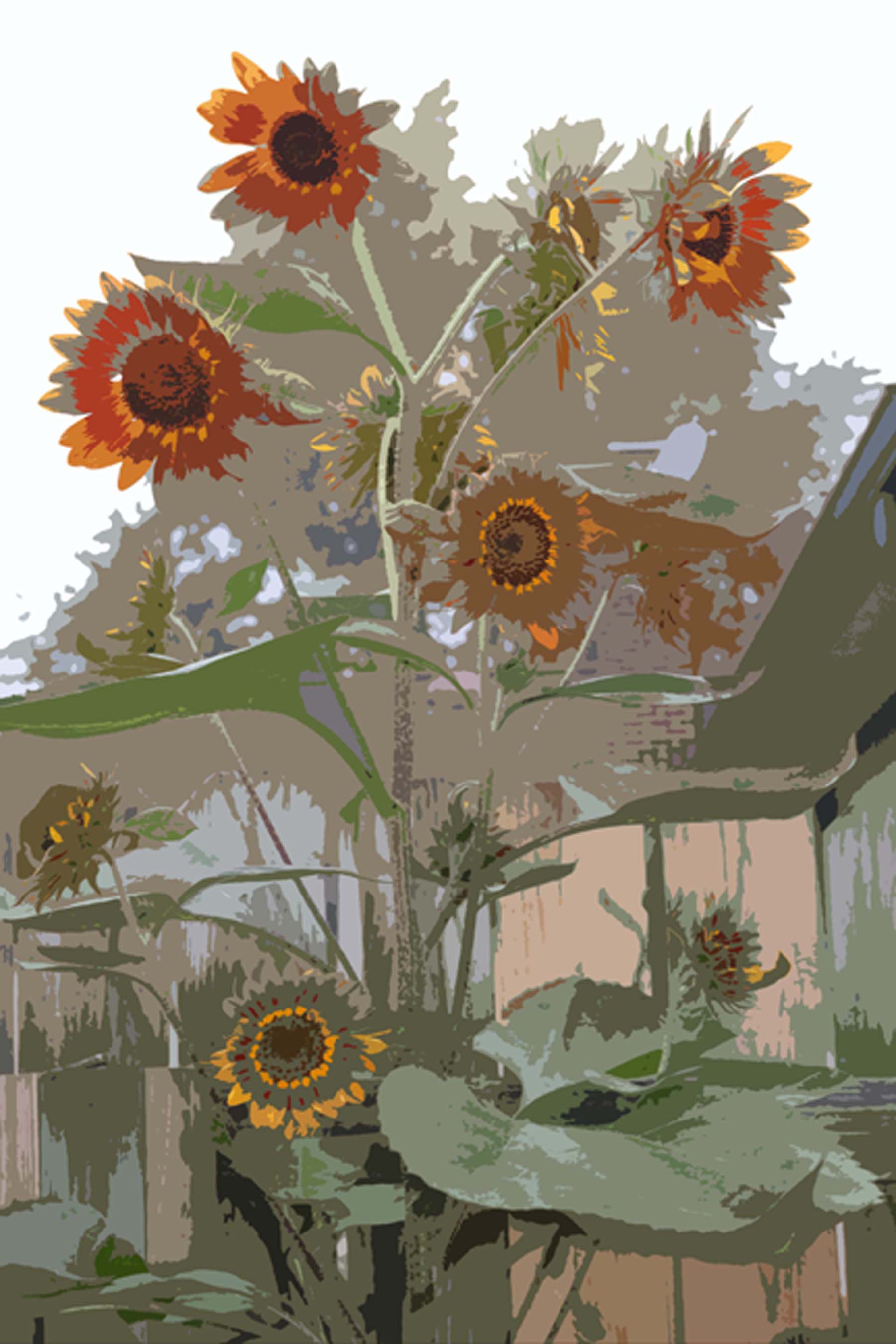
This is also the point in time I did a little color meaning research just to refresh my memory on the meaning of color.  Of course, it always depends upon your subject.  Yellow is joy, oranges are warm and happy, red was passion, purple-royal, blue-heavenly, green-safety.  I decided to add some green and reduce the level of reds. 

SIXTH:  Try it one more time and then finish it with a bit of Divine intervention. 

On the Tues afternoon before it was due (3 weeks after it had been assigned, mind you!) God brought the inspiration via my Jewish friend and housemate, Lainey. 

Lainey came home from work early that day to find me in a terrific struggle with the piece that was to become my final.  I had the basic concept but it was lacking feeling.  I was looking at her and describing Simeon’s world as I saw it, suddenly we both exclaimed in almost unison, “this is Jewish art!”  The colors and forms are what you see in Jewish art! Wow! 

Lainey, my sweet Jewish friend, then began singing a joyful Hebrew song and doing a dance around the kitchen.  If you have ever seen Jewish singing and dancing, it is something really special as it is a building of worship bringing the singer/dancer slowly into the Presence of the Almighty.  (I think we Gentiles could learn something from our Jewish counterparts on how to approach God!)  As soon as she did that, inspiration struck and I finished the piece right there on the spot – only adding a few defining strokes here and there throughout the evening.  

How appropriate that my inspiration for the connection to a Jewish rabbi of 2000 years ago came through a Jewish woman of this era, who loves God and is currently in the spirit of connectedness as she observes her High Holy Days – Rosh Hoshana.

This piece is about the spirit of worship and the joy of an eons old God-promise being fullfilled.

Enjoy it with the joy of the Lord in your heart!

IMG_2935 adj

Sunflower, Goodmorning!

Design:  Abstraction 4 Step Process – Take a photo and create 3 abstracts. The 3rd abstract must be so abstract that it does not look like the original photo, but the other 2 must show how it is related.

My sunflowers were chosen as the subject because they seriously needed to be commemorated this year.  I had fought chipmunks and puppies to get them to this point and they are gorgeous.

My biggest challenge on this one was to pick the photo out of hundreds.  Finally, I went and took a few more…then narrowed it down to 2.  This was so much fun I did this on 2 different photos.

After spending time and a lot of paint and paper to create the 4th image, I opted to keep things simple and use photoshop as my tool.  It was really fun playing with photoshop to do these renderings.

The first set of 4 was interesting and I really liked it a lot so that is what I turned in.  The second set was another option that I liked a lot.

What I turned in:  The original photo was taken on a foggy morning, thus making the colors and background sort of flat.  I like that but the teacher, Scott, said that made it almost abstract from the beginning.

As it turns out, it was not exactly what he wanted.  Sometimes I have to double check what Scott says.  I love his class, but sometimes my notes and the gal next to me are saying opposite things!  I am sure we are both hearing what we noted.  It is all in how he phrases things.  Usually I am the one who is right…this time I was not.

I think that second option of 4 might have served the purpose better as it more directly shows a progression to the abstraction…thus I include it here as the “road not taken”.

Cat and mice…a figure ground

Upon occasion (well, quite frequently in my Fundamentals of Design class, actually) I get a project that seems like an impossible task.  This was (another) one of those.

Our assignment was to create a figure ground (which harks back to the Gestalt concept we have been dealing with for weeks now.)

The principle of figure/ground is one of the most basic laws of perception… In its basic sense, it refers to our ability to separate elements based upon contrast–that is, dark and light, black and white.

or…

The figure-ground principle captures the idea that the visual field is normally divided into two parts, figure and ground. The figure-ground principle is very much a part of our everyday experience. If we notice a book on a table, we see the book as a figure and the table as its ground. The edge that divides the book from the table bounds the book but not the table. The table is assumed to continue under the book. We would be very surprised if, when we lifted the book, we discovered a hole in the table the size and shape of the book.

So…black and white image yet take it a step further and make something similar to this famous image…

FigGrd Is it a white vase or is it two black faces? 

This was painfully difficult for my brain, but eventually I came up with a concept that I liked using our cat, Stitches.  2006-02-08 022

What I was not sure about was whether I satisfied the teacher’s requirements or not.  Was it too obvious?   I was a bit hazy about that, but after trying to work it out with marker first, using tracing paper and carbon paper to duplicate and then flip the image, I finally committed it to paint. 

IMG_1079

 Arrgh!  Not being used to working with acrylic, I did not like the effect at all.  5th time is a charm and using airbrush paint (which is thinner and easier to apply) on a thick Bristol paper, I completed my final piece.

Ta da!!!

IMG_1077

Side Note:  My Mom thinks this is creepy.

Critique (other than Mom’s):

  • Teacher said I nailed it, so…happy teacher…happy student.
  • He did say I could have switched to kittens instead of mice if I wanted it to be more cuddly (I told the class my Mom said it was creepy.)

Wired!

A good description of my art over the past several decades would be 2 dimensional.  So when the Design instructor informed us that he wanted a 3D project made out of wire, it was a bit intimidating. 

That afternoon after class I sat on the back deck with all the proper tools around me (don’t forget the ipod! you need that when being creative) and it felt like a very blank space in front of me.  A blank 3D space. 

IMG_0689sm

After wrestling with the wire and nearly poking my eye out, the project was shelved for the weekend while my head worked on various options. 

For some reason, the idea to take the wire to my Mom’s after church on Sunday took hold.  There is something very inspiring about having the kids around me when I am creating… so I packed up my tools and supplies (with the added item of safety glasses!) and Sunday afternoon I sat there with an audience as I created my little nephew at his fishing pond. 

IMG_0899


[A pre-drawing gave me an idea of what shapes I needed to create. The kids were fascinated with it as they tried to work out in their little heads how such a funny drawing could mean anything!]

  The kids LOVED it! My siblings laughed at my glasses (but after watching my dangerous shenanigans with the wire they agreed it was a good idea for me to wear them.) My Mom said that at least my audience (the kids) were able to visualize my concept.  <g> 

He was really hard to grasp until I finally put the pole in his hands and stablized him. (Notice the fish on the end of the line?)

In class, the final part of the project was to draw our wire structure.  Ha…THAT drawing will not be included here!!!  It looks like a bunch of scribbles when put on paper!  Final resting place of this little guy will be on a shelf in my nephew, Nathanael’s, room despite protestations of his mother.

IMG_0880sm

Play…just play…

Those were the words my design teacher said to me when I commented that I was having difficulty with this project.  Funny enough, that is a big reason why I chose an art school… I had lost the “play” in my art, so he hit the nail smack on the head!  It sent little shockwaves through my creative spirit and this is becoming my mantra…play…just play!

Criteria:

  • Take a photo with distinct repeatable lines and photocopy it
  • Stretch the copy one direction per instructions
  • In class, chop these copies up and use the resulting pieces to create a new and interesting image

My Response:

  • Native American pottery has neat and fun images

 MrRee_pots6

 When I began chopping and arranging (remember there were 7 large photos of this image that had been stretched) the following began to appear

IMG_0901

The final product was completed in week 9 when we took that pattern and replicated it on marker paper in a specific ratio of a grey scale using markers.  I was not so impressed with the whole process, so that probably means I missed the point.

Do you think there is hope that I can learn to play with my art again?

Halleluiah, they found God!

Math or anything with numbers freaks me out, pretty much.  I did like algebra because it was like solving a puzzle, but math was a total mystery and quite scary.  (Which is funny since my first college experience was pushing towards an accounting degree…duh!)

Anyway…during the Mondrian discussion (see my post below this one), we also learned about the Golden Ratio and the irrational mathematical constant called phi (.618), and I found it utterly fascinating.  Made me wish I were one of those intellectual types.  I want to learn more about it!!!

What really impacted me, though, was the whole concept of how phi and the Fibonacci Series mimics algorithms in nature (for example the nautilus spiral.)  We also touched on the perfect square and how you can keep adding squares to themselves and they create golden rectangles.

OK…so I have totally lost some of you…never fear… I am sitting lost with you. But I am telling you, I nearly had myself a halleluiah moment right there in class when I popped my hand up, all excited, and asked, “So you are saying that phi is possibly the numerical expression of perfection?”  And the teacher said, “Yes!”

God… and once again they have found God!  And my teacher thought to tell me about it!

Besides finding God, again, you can also use this in more mundane pursuits such as building cabinetry, buildings, automobiles, art, and even music! … essentially any design… to create perfect proportions.  Just take the original golden rectangle (no matter where it is located) and multiply or divide it by phi (.618) and your porportions will be perfect and aesthetically pleasing every time.

Sometime I will study more on this, but for now, I was just thrilled to be introduced to another aspect of the Creator and the Perfection in which He has created all things!

[PS – Alt spelling for the title is Hallelujah.  Just in case you happen to be a “j” speller.]

Explain that Mondrian thing again…

Ever walk through an art museum and wonder why some of those pieces where hanging on the wall?  Our teacher, Scott Chenoweth, explained a life-time mystery to me the week we had the Mondrian assignment and I am forever grateful. 

Mondrian (and the Mondrian immitator) is the fella who always left me a bit disgusted when I would see his work in a museum.  Anyone can put a red square on a white background, add a couple of lines, and call it art!  (Here are some Google images.) 

So just how do you get such an image in a major art museum or snapped up by Nike? I always assumed it had something to do with the politics of the art world.

Come to find out, it has more to do with math and geometry and every item in the picture being in perfect relational porportion than politics!  I won’t go into it here (some really techy info about him if you really wish to know), but I probably learned more in this particular 4 hours than any others up to this point. 

Assignment:

  • Use Mondrian’s technique (with the proportional grid) to create your own version.

My Response:

  • Just drawing it seemed really boring.  I thought up all sorts of ideas with a variety of color schemes and even ditched one idea of using lego blocks (too difficult to carry).  I finally decided to cut out my grid work through several layers of cardstock paper using Mondrian’s colors. (Hey! I am finally learning that as long as you meet the class requirements and take it at least one step beyond, then you are going to do ok!  No need to kill myself!)

Critique:  This does not show it well, since this is 3 dimensional, but the teacher liked it so much he passed it around the class and then a week later told me again that he really liked it!  I think I got an A on this one.  <g>  Go figure!

Mondrian in 3D (layers cut out to reveal the colors below)

Mondrian in 3D (layers cut out to reveal the colors below)

Design Week 3 – Billboard

Assignment: Design a billboard for a new product

Constraints:

  • Proper scale
  • No text but space for it
  • Follow billboard design concepts
  • Geometric shapes in the background
  • Non-geometric product that you create

My response:

  • Product: Agility training facility
  • Media: airbrushed background/ photo of Bailey
  • Grid and ovals in the background

Critique suggestions:

  • Break up the straight lines of the green grass to create a more jagged, broken up line

2009_July_DesignBilboard2_web1

Over the Top

The first big assignment of my college journey was in my Fundamentals of Design class.  The class I thought would be the most boring showed a thrilling promise from the get-go. This project took a long time (it was my FIRST, remember), but it was a lot of fun!

Constraints:

  • 1 image transferred onto a sketchbook page (I used a photo I took in our back yard)
  • Divide into 9 panels
  • Use different specified mediums/techniques to complete each panel
  • Bottom center had to be a texture (I used minky fabric with a tinting of grey marker)
Garden Lillies in 9 Squares

Garden Lillies in 9 Squares