What was with all the logos? Funny how the teachers talk differently about how to create one!!!
Beth Remsburg was all about simplifying to the minimum.
Steve Williams wanted it to really tell him something about the company (he docked my grade because of that!)
Anne Nickolson did not care what we did as she was not grading on the design, rather on the color combinations.
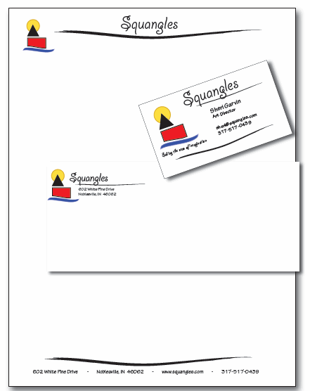
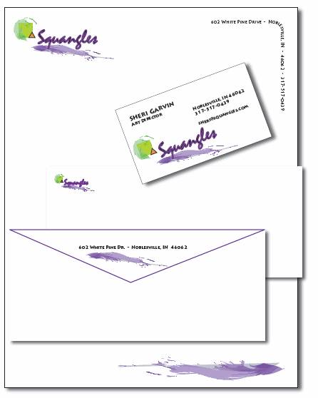
Here are my Illustrator logos and stationery for Squangles, the company Charlotte and I are playing around with right now. I created these on Halloween night sitting at a one-on-one agility training Charlotte was taking with a national champion and trainer!! It got me out of the house and the doorbell.
Criteria (that I knew about) was that they were to all be different concepts.
Sidenote: Squangles is a children’s products company and Charlotte and I are waiting until I go through a bit more schooling before we do further planning, what we will focus on, and whether to formally launch it, etc. Our first product was the children’s book. Then I began adding her poetry to my children’s furniture (now ensconced in two doctor’s offices and various households around the country.) We have played around with the idea of t-shirt designs also.
Steve wanted me to put a less ambiguous logo (i.e. a book or chair or something concrete) with the Squangles name and docked my grade for that reason. Even after a discussion with him, I am not so sure I agree. That sort of locks us in.
I think I will wait until my corporate identity class to set up my logo. In the meantime, I will play around with it.
My intention here was to explore something that has a children’s business look and feel.

Square and Triangle (our personality identifiers)

My puppy

Sailing the Sea of Imagination

Purple swoosh (squiggle) with circle/triangle/square


My favorite is the sailing one! Which do you like best?
The sailing one is funnest! “Sailing the seas of imagination”. I am not happy with any of them just yet.