A Mad Mix of Things

The three weeks break has gone by so quickly and now I am preparing to jump into the whirlwind of classes and studying again.  I keep telling myself to be patient because I am so very ready to be back to a full time job!  So while off I began job hunting again.

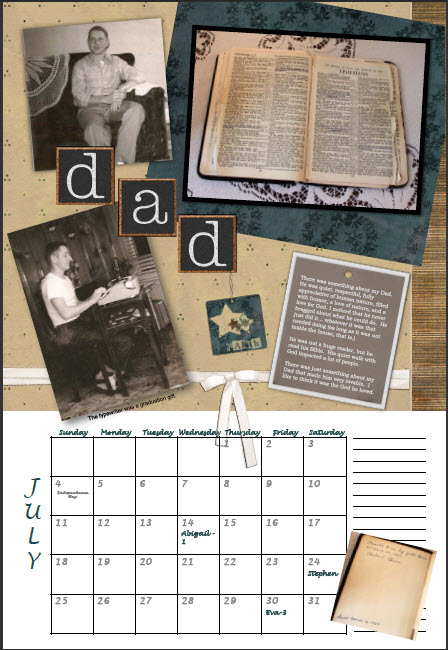
However, I spent the majority of my vacation finishing my annual family calendar!  This year’s theme was “A Mad Mix of Things” and is concentrated upon the things in our lives that bring back good memories.  I also threw in family history, as always.  My basis is this scripture:

Finally, brethren, whatsoever things are true, whatsoever things are honest, whatsoever things are just, whatsoever things are pure, whatsoever things are lovely, whatsoever things are of good report; if there be any virtue, and if there be any praise, think on these things.  –  Philippians 4:8

Examples: a couple of traditional style digital scrapbooking pages, and then a couple of pure family memory grabbers:

Below are the small records my siblings grew up on… next year, the large records.  I have started recording (I have a record player that digitizes the sound) the old gospel music from my childhood and hope to get copies to all of us eventually.

Technical notes:

  • 8 calendars printed on an Epson extra wide photo printer
  • Page size: 13×19
  • 7 pages of thick double sided matte photo paper per calendar (there is a cover /bonus page)
  • My own camera and hours on the farm photographing places we played and things from the past
  • Hours on the internet researching the 40s/50s/60s/70s
  • Some topics: Candy of the era, dolls of the 50s, toys of the 60s/70s, family recipes, family books, glassware and items that sat around the house, household furniture, old games, etc
  • Software platform: Powerpoint (very easy to use and my templates from past years are already set up)
  • Spiral binding and the hole for hanging provided by Kinkos
  • Total cost is approximately $40 each and a lot of time

I can’t say which ones are my favorites.  I love the one of my Great Grandpa, my Mom’s dolls, and the Christmas recipes (one in Grandma’s writing) and pictures from my Mom’s cookbook… but then I also like the modern photo page of our childhood haunts on the farm.  They are all so very different and they all pull on something warm within me, bringing prescious loved ones closer and making family bonds stronger.

Merry Christmas!

Did you notice that my Christmas cards looked a bit familiar?  I bounced off of my classwork in Illustrator and Charlotte added the poem.  I like the work we do together!  Lainey decided to join the fun and provided the stamps with my own art work from Stamps.com.


Snowmen

Born in laughter

From banks of snow

Where mittened fingers

And cheeks that glow

Craft these very merry creatures

With eyes of coal

And frozen features.

Snowmen, snowmen

Everywhere,

Come to life

in winter air.

C. Franck – November 26, 2009

Finals

This quarter I had my first ever “wicked” final – over 3 hours to complete a mini-project for Design Concepts.  I came out of that feeling like my head was a noodle and convinced that I will NEVER work for an ad agency.  However, I survived and that should count for something!

That afternoon was the Adobe Illustrator final… create a brochure with 25 criteria.  Not bad.  I came out of that experience thinking I just might actually enjoy working in Illustrator and that I really can learn the software. 

I went home to crash, only to be urged to give a potential web client a call.  Things are moving way too fast, but it is certainly very exciting!  If I were ready, I could be easily freelancing with several potential customers.  The need is certainly there.

We are now on break for 3.5 weeks, so I will not be posting much here.  However, keep tuned because you just never know what is going to happen next!

I did grab a shot of my poster (the Christmas tree) on the wall… it will be taken down after the first week or so of next quarter.

Cookie Day should be a national holiday!

Finals week:  Monday morning I had a team presentation in Color Theory and the final test.  We were out by 9:30 and then it was all about Cookie Day with the family in Hagerstown.  This year we had 13 kids involved and it was a wonderful time.  What I found hilarious is that my sister had to explain to my niece and nephew that “No, Cookie Day is not a national holiday.”  The next morning I was up early with 2 more finals to complete. 

Diety Final Project

Final Project:  A book incorporating what we have learned this quarter in Design Concepts.

Topic: Greek diety

When I was a kid I was fascinated with mythology, fairy tales, and fables (probably because I did not really grasp the full context of the story.)  As an adult, I find many of these stories really disgusting, so when we were told to pull a name out of the container in our Design Concepts class, my immediate thought was, “God, I really do not want to do this.” 

The answer seemed to come back:  “Accept the Situation…it’s just a class.”  So, I gave it up and was the first to pull a diety from the teacher’s cup.  I had probably 30 options and was praying I would not get Eros.  Voila, it turned out to be Eros, of course.  [Ok… yes, my friends who have known me all my life can really get the humor and irony of this particular choice (and they were sure to let me know that too!)  Do you think God might have a sense of humor in things like this? I was not laughing, though.]

However, I discovered that of all the stories, Eros is probably one of the more palatable!  Research elicited the suprising information that Eros’ story is the inspiration for Beauty and the Beast, and I actually found it a very interesting research project.  So much of our current verbage actually harks back to these ancient Greek stories.  Eros is also the same as the Roman diety, Cupid, and everyone has heard of him! 

There were so many potential directions with this story; however, I opted to work from the premise that if you can’t lick ’em, join ’em, and chose to go with the humor of the situation.  I also despise cliches and overdone topics, so that was the problem I decided needed to be solved… how can I take this topic a different and unique direction when it has been done and overdone so very many times? 

I will leave you to decide if I succeeded.  The design details are below the photos under the MORE tag.

Page 1 was an egg on black velvet paper for two reasons… it was the deepest black I could find and it was also going to be a “touch” book, so I needed things that could be felt.  An overlay of black feathers on acetate symbolized the bird.


 Page 2-3 was an illustrated spread.  The figures and Greek building to the right are raised off the page.

Page 4-5 has hand drawn, movable tags.  If you push them to the side, what they represent is written underneath, such as eHarmony.com, mail order brides, music, love potions, tv reality show such as The Bachelor, and matchmakers.

Page 5 has a letter with Greek type which is removable from the envelop.

Page 6 has embossed gold on the arrow and coming off of the broken arrow.  The words underneath say “Well…almost everyone.”  Basically demonstrating that even Cupid is not perfect.

I also decided to decorate the back of the book (not a requirement for the project.)  Below is a glimpse of how a portion of it looked when opened up with the two text panels enlarged.

More technical comments below:

Continue reading

Illustrator Final: A Poster

We had a choice of 4 projects for Illustrator and I chose to do a poster.  This allowed me to play with my creativity as I worked on the project.  It also allowed me to choose a topic I thought would be fun. 

Something I am struggling with is simplification and distilling an idea down to its essence.  My mode of operation is to complicate and make things way too detailed.  I want to learn to create sleek, clean forms and communicate the idea with as little fluff as possible.  I feel I got to it with the stamp project, so I again worked on it with this one.  This is actually very hard for me!

Charlotte provided inspiration by sharing one of her Christmas poems with me… her work always inspires, even when it is just a simple poem!

Twinkling tinsel
Miniature lights
Colorful glow
On cold, wintry nights
Berry berries
Popcorn beads
Shiny balls
On triangle trees.

Project: Create a poster without using photos, images, or live trace.  It must be all our own work.

Topic: International Christian singer/songwriter Sara Groves’ concert for “Food for the Hungry” on Dec. 19th here in Indianapolis.

More technical notes:

Continue reading

Color Theory: Paul Gauguin

Finally we get to choose the medium we want to work in for our Color Theory class.  We were also permitted to pick a picture from a pile the teacher laid out.  I chose Paul Gauguin.

Project:  Abstract the painting down to 5 basic colors and match them (term: local color).  2nd rendition: change the mood by changing those 5 colors (expressive color).

This was so easy that sometimes I wonder if I am missing the point somewhere!

Original is Paul Gauguin’s The Flageolet Player on the Cliff.

I pulled out a square portion of the painting to simplify the 5 colors so it looks abstract.

On the left I used pastels to create the local color.  On the right I used watercolors on Arches very thick watercolor paper (the only way to paint with watercolors!) to create the expressive version.  The only thing I would have changed is to do the expressive in more of a blue tint, shade, and tone to represent nighttime a bit more specifically.

USPS Stamps – Looking for Snowbabies

Project:  create a USPS stamp book in Adobe Illustrator.

This was a very fun project in Illustrator since I have a long standing love affair with the postal service and letter writing.  Those of you who have known me for years were probably on my long running newsletter mailing (which I closed down when I started college.)  The stamps on my envelopes were as much a part of the monthly communication as the letter itself, often chosen to celebrate the time of year.  In other words, stamps are way cool!  (And I really miss mailing that letter!)

This time I decided to get feedback from buddies on Facebook.  One is a graphic artist and also works at the post office… how neat is that?  With coaching on colors and fonts, the final product came out really fun!  And finally… I got a 100% on the project! Yes!

I call it… “Looking for Snowbabies”.

Looking for Snowbabies

Update:

The graphic artist for Bonanzle.com told me that my peeping snowmen inspired her holiday design for the site (how cool is that?):

CD Packaging

I had so much fun with this one. 

With the idea that Christmas is coming and I am so driven by efficiency, I opted to give up the edgy “cool” idea and go for nostalgia.  Sigh… teacher called it “cheesey”.  Sometimes you just want to give up.  However… it meets my needs beautifully and right now, that is what counts!

Target audience: my family – with a few adjustments this will eventually house a collection of digitized old photos and be gifted to each sibling and Mom.

Theme:  a commemoration to our family and to our father who passed away 13 years ago.

Every detail was attended to:

  • Christmas cd – it will be a family album and Christmas gift.
  • “Band” – THE Shepherd’s Children is a double reference to Christ and to my father who not only raised sheep, but was a pastor in his later years.
  • My siblings and I are the band.  The grandkids are the “Chorus”.
  • A multitude of tiny details have significance to the family or just me.
  • Each photo is one I have taken around the farm over the past 30 years except for the one of my brothers on the back (taken in TN).  Even the pine tree branches is one I took on the farm for photography class last quarter.
  • Inside the booklet, there is the Irish Garvin coat of arms in the lower right corner.

Update 11/24:  A week later it came back to me with a 95% and the feedback that I have the spine text on the wrong direction.  Not sure how I missed that!  So in spite of the “cheesey” comment, the teacher still gave me a good grade and the “cheesey” has become a joke between us.  Trust me… I won’t be forgetting that and I won’t let him either! 

Back and front of case

Open case and cd

The front cover/booklet opens up to the following pages:

Front cover foldout

Inside

Ad Campaign for ThermaCare

This project convinced me that I do not want to work for an ad agency.  I am not ruling out graphic design altogether, but advertising does not float my boat.   Since I am here in order to get out of the dry side of technical writing, it would be like jumping from the frying pan into the fire.   I would call this the dry side of graphic design.

I was also expecting my classmates to crucify me during the critique, but they were gentle and had good suggestions, such as lightening up the “Congratulations” so it doesn’t stand out so much.

Subject:  ThermaCare heat wraps

My idea: Out with the old school style of pain relief and in with the new idea of portable pain relief.

Execution:  3 magazine ads that “have legs” – meaning you can use the idea more than once, on multiple products, and could continue it for possibly years (i.e. the Energizer Bunny).

Several students in the class really impressed me.  This class is pretty amazing in their creativity so I was not feeling quite worthy with this project.  My head does not seem to work in an advertising sort of way.

ThermaCare... your hands free option.

ThermaCare... your pill free option.

ThermaCare... your discreet option.