Merry Christmas!

Did you notice that my Christmas cards looked a bit familiar?  I bounced off of my classwork in Illustrator and Charlotte added the poem.  I like the work we do together!  Lainey decided to join the fun and provided the stamps with my own art work from Stamps.com.


Snowmen

Born in laughter

From banks of snow

Where mittened fingers

And cheeks that glow

Craft these very merry creatures

With eyes of coal

And frozen features.

Snowmen, snowmen

Everywhere,

Come to life

in winter air.

C. Franck – November 26, 2009

Finals

This quarter I had my first ever “wicked” final – over 3 hours to complete a mini-project for Design Concepts.  I came out of that feeling like my head was a noodle and convinced that I will NEVER work for an ad agency.  However, I survived and that should count for something!

That afternoon was the Adobe Illustrator final… create a brochure with 25 criteria.  Not bad.  I came out of that experience thinking I just might actually enjoy working in Illustrator and that I really can learn the software. 

I went home to crash, only to be urged to give a potential web client a call.  Things are moving way too fast, but it is certainly very exciting!  If I were ready, I could be easily freelancing with several potential customers.  The need is certainly there.

We are now on break for 3.5 weeks, so I will not be posting much here.  However, keep tuned because you just never know what is going to happen next!

I did grab a shot of my poster (the Christmas tree) on the wall… it will be taken down after the first week or so of next quarter.

Illustrator Final: A Poster

We had a choice of 4 projects for Illustrator and I chose to do a poster.  This allowed me to play with my creativity as I worked on the project.  It also allowed me to choose a topic I thought would be fun. 

Something I am struggling with is simplification and distilling an idea down to its essence.  My mode of operation is to complicate and make things way too detailed.  I want to learn to create sleek, clean forms and communicate the idea with as little fluff as possible.  I feel I got to it with the stamp project, so I again worked on it with this one.  This is actually very hard for me!

Charlotte provided inspiration by sharing one of her Christmas poems with me… her work always inspires, even when it is just a simple poem!

Twinkling tinsel
Miniature lights
Colorful glow
On cold, wintry nights
Berry berries
Popcorn beads
Shiny balls
On triangle trees.

Project: Create a poster without using photos, images, or live trace.  It must be all our own work.

Topic: International Christian singer/songwriter Sara Groves’ concert for “Food for the Hungry” on Dec. 19th here in Indianapolis.

More technical notes:

Continue reading

USPS Stamps – Looking for Snowbabies

Project:  create a USPS stamp book in Adobe Illustrator.

This was a very fun project in Illustrator since I have a long standing love affair with the postal service and letter writing.  Those of you who have known me for years were probably on my long running newsletter mailing (which I closed down when I started college.)  The stamps on my envelopes were as much a part of the monthly communication as the letter itself, often chosen to celebrate the time of year.  In other words, stamps are way cool!  (And I really miss mailing that letter!)

This time I decided to get feedback from buddies on Facebook.  One is a graphic artist and also works at the post office… how neat is that?  With coaching on colors and fonts, the final product came out really fun!  And finally… I got a 100% on the project! Yes!

I call it… “Looking for Snowbabies”.

Looking for Snowbabies

Update:

The graphic artist for Bonanzle.com told me that my peeping snowmen inspired her holiday design for the site (how cool is that?):

CD Packaging

I had so much fun with this one. 

With the idea that Christmas is coming and I am so driven by efficiency, I opted to give up the edgy “cool” idea and go for nostalgia.  Sigh… teacher called it “cheesey”.  Sometimes you just want to give up.  However… it meets my needs beautifully and right now, that is what counts!

Target audience: my family – with a few adjustments this will eventually house a collection of digitized old photos and be gifted to each sibling and Mom.

Theme:  a commemoration to our family and to our father who passed away 13 years ago.

Every detail was attended to:

  • Christmas cd – it will be a family album and Christmas gift.
  • “Band” – THE Shepherd’s Children is a double reference to Christ and to my father who not only raised sheep, but was a pastor in his later years.
  • My siblings and I are the band.  The grandkids are the “Chorus”.
  • A multitude of tiny details have significance to the family or just me.
  • Each photo is one I have taken around the farm over the past 30 years except for the one of my brothers on the back (taken in TN).  Even the pine tree branches is one I took on the farm for photography class last quarter.
  • Inside the booklet, there is the Irish Garvin coat of arms in the lower right corner.

Update 11/24:  A week later it came back to me with a 95% and the feedback that I have the spine text on the wrong direction.  Not sure how I missed that!  So in spite of the “cheesey” comment, the teacher still gave me a good grade and the “cheesey” has become a joke between us.  Trust me… I won’t be forgetting that and I won’t let him either! 

Back and front of case

Open case and cd

The front cover/booklet opens up to the following pages:

Front cover foldout

Inside

Front Cover of a Comic book

This one was harder than I thought.  Maybe because I was in a hurry as I wanted to spend Sat. with my family on the farm.  Seems like any time you are in a hurry, things conspire to slow you down!

We were learning “live trace” and “live paint” in this exercise.  I hand drew outlines of the cat and the castle, scanned them into the computer, did a “live trace” in Adobe Illustrator, then did the clean-up and “live paint” work. 

I learned that  I am not real crazy about live trace.  If I had 20 more hours I might have been able to get him to look the way I wanted, but the tediousness was a bit much for my creative soul.  He is what he is. I am thinking that in the future I would probably use the pen tool for this type of work, but I can see how live trace could be handy for certain projects.  I also think I am still old school enough to want to do my art work by hand (draw, paint – you know… all that wonderful, messy, glorious tactile stuff.)

Criteria:  Illustrate a fairy tale on a comic book cover using live trace/live paint.

I chose to simulate a 1960’s comic book cover.  (The teacher tried to tell me several times that the UPC was not on the front cover and I reminded him each time that this was 1960s!  The teacher was not even born yet, so I do realize that it is probably hard to remember a time when UPCs were not on the front of comic book covers.  [Ok…that was a bit tongue in cheek…but really now!])

Again… another 90% but no reason as to why (one student laughed at me for being bothered by that.)  Steve (teacher) did say he thought it looked like “Tom and Jerry”.  Sheesh… I told him I was trying to mimic that time frame and drawing style (although this is not Tom or Jerry.)  I hit all the stated requirements and did my own drawings from my head right in class (which he saw), but again it just wasn’t enough. 

It is a frustrating thing when you can’t get the teacher to tell you what it will take to please him/her, but I think this is my quarter to learn to “accept the situation.”  However, I am not used to this sort of thing happening, since as a consultant I usually obtain all the requirements up front in order to bring the client the “wow” factor. 

Somehow I get the feeling I am missing something and I haven’t figured out how to get him to tell me what that might be. 

I will keep trying.  I have a few more weeks yet.

Logos Galore – In Illustrator

What was with all the logos?  Funny how the teachers talk differently about how to create one!!!

Beth Remsburg was all about simplifying to the minimum. 

Steve Williams wanted it to really tell him something about the company (he docked my grade because of that!)

Anne Nickolson did not care what we did as she was not grading on the design, rather on the color combinations.

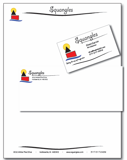
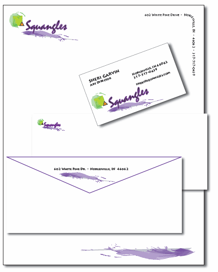
Here are my Illustrator logos and stationery for Squangles, the company Charlotte and I are playing around with right now.  I created these on Halloween night sitting at a one-on-one agility training Charlotte was taking with a national champion and trainer!!  It got me out of the house and the doorbell.

Criteria (that I knew about) was that they were to all be different concepts.

Sidenote:  Squangles is a children’s products company and Charlotte and I are waiting until I go through a bit more schooling before we do further planning, what we will focus on, and whether to formally launch it, etc.  Our first product was the children’s book.  Then I began adding her poetry to my children’s furniture (now ensconced in two doctor’s offices and various households around the country.)  We have played around with the idea of t-shirt designs also. 

Steve wanted me to put a less ambiguous logo (i.e. a book or chair or something concrete) with the Squangles name and docked my grade for that reason.   Even after a discussion with him, I am not so sure I agree.  That sort of locks us in.

I think I will wait until my corporate identity class to set up my logo.  In the meantime, I will play around with it. 

My intention here was to explore something that has a children’s business look and feel.

Logo1

Square and Triangle (our personality identifiers)

Suangles2

My puppy

Suangles3

Sailing the Sea of Imagination

Suangles4

Purple swoosh (squiggle) with circle/triangle/square

Extra, Extra…read all about it!

My next Illustrator project (#3) got a 100!  I really got into it and the class said mine looked the most like a real front page of a newspaper.  Finally! 

The loose premise for my newspaper was my favorite humor site… the home of those wonderful LOL cats!

They were my initial inspiration, but my own cats (and dogs) were the real inspiration.  Ideas just kept rolling.  A few stories came off the internet, tweaked by me, but some were my own invention.  It was fun and I plan on printing it off and sending it to my nieces and nephews.

Every tiny detail was attended to… including the “obituaries” reference being changed to “Rainbow Bridge” and the weather raining “mice and men.”  Did I say I had fun with this?  The sports references were fun to do also… the cats vs. the dogs who were making a comeback because of their new dental hygiene routine (based on the fun photo I had of Charlotte brushing Bailey’s teeth.)

The Cats Paw Press

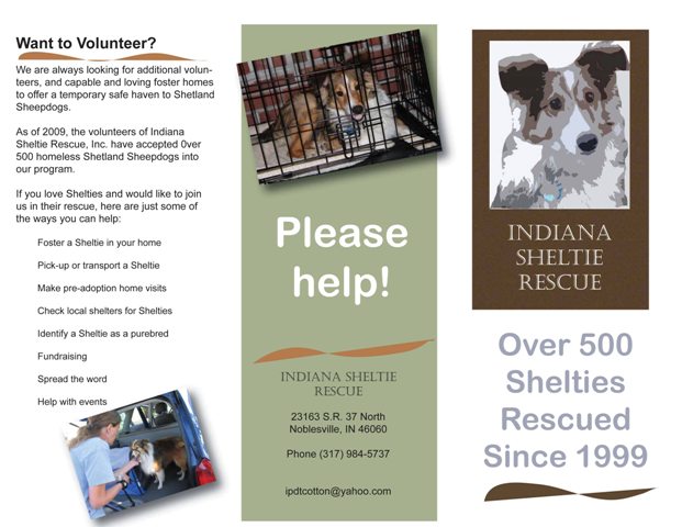
Indiana Sheltie Rescue Brochure

When it comes to the Adobe products, I feel like my head is made of putty.  I am keeping my grades at an A by doing extra credit.

This was the second project and again, I got an 85%.  Not sure why… and yes, I asked the question several times “what would have made it better.”  No answer, I was just told “it could have been better.”  Since I hit all the technical pieces, that does not tell me anything… give me a reason and give me something to go on.

Subjective grading really frosts me because there is no way you can work towards that undefined goal.

Anyway, here is the brochure… (I gave it to the rescue group when I was done.)  The brochure features our dogs and one of the dogs we helped rescue.

Indiana Sheltie Rescue brochure

Indiana Sheltie Rescue brochure

Using Adobe Illustrator brushes

The very first Illustrator class was loads easier than Photoshop.  One big difference is how the teacher is presenting the class.  Very well done.

However, my first assignment only netted me an 85%.  I am struggling a bit to get my head around the whole Adobe software setup, so I spent more time figuring out how to use the tools than trying to smooth out the look of the piece.  It is very rough.

Assignment:  Paint over the top of a photo of yourself using the “brushes” and “pen” tools.

Sheri boating

Original Me

Adobe Illustrator

Illustrated Me