Final Design Layout

For our Design Layout class, the final was to choose an inanimate object, write what it means to you, and then design three 11×17 posters. They were to be photographic, illustrative, and text only. My object was key lime pie and I wrote about the first time I had ever tried real key lime pie when Lainey and I visited the Florida Keys.

With all my energy diverted to my Corporate Communications class, I let the creativity slide a bit on this project (and the teacher commented on that.) I plan to use these as the basis for a frameable final print to go in our kitchen, so I think of them as my “roughs” of the final project, which is not yet finished.

This slideshow requires JavaScript.

Lawn Pride 3 Ad Layouts

I was so not inspired by this project. This is a real company locally, but I have not yet fallen in love with advertising and just struggled for inspiration.  We had to do the same concept in 3 different layouts… I get this nasty feeling that I still have a LOT to learn and that something hasn’t yet clicked in for me.

BTW this is not as simple as it looks…but I did eventually have a very cool idea that was more complex and time consuming. Maybe I need to learn how to be quicker with my inspiration so that I have more time for execution. The idea came the day before it was due.

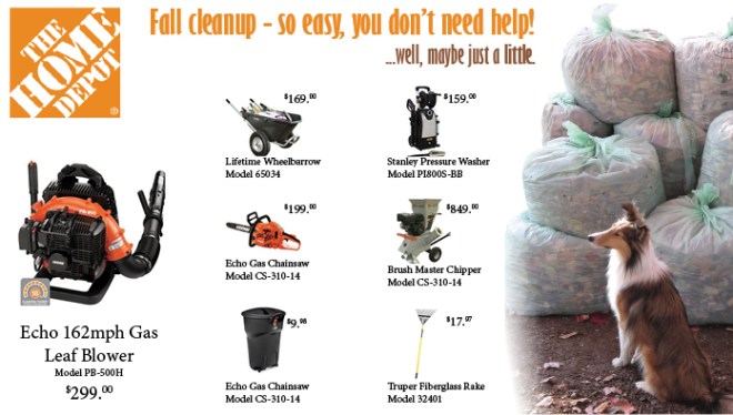
Home Depot Print Ad

For Design Layout we were assigned a business and instructed to create a print ad using the almighty grid as our guide. 7 products with info and one product needs to be featured. I used the grid, but purposefully “broke” it in several places.

Sometimes finding the right picture to illustrate the concept and then making that picture work is the hardest part.  I wanted one of the dogs with the leaves and this one from 2007 was my best option (ie the project is finished and bagged.) If I had known this 3 weeks ago, I could have gotten some fresh photos with the exact look I was going for… but it works! Thanks, Bailey (and Charlotte)!

The lesson I am learning this quarter… take loads of photos from different angles if there is even the remotest possibility it could be used later on for an assignment!

Follow up with class feedback: I should have made it larger. I constrained it to a specific size which was a bit small. The products feel like they are floating, so with more space I could have done a lot more with this.

Side note: The week I finished this I had messed up my back really bad… creativity was so not happening, nor was I sitting for long periods or even concentrating well. Now that I am feeling better… we will see if I can be a bit more inspired on the next project!

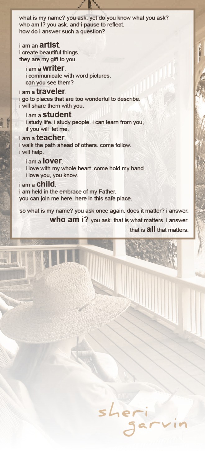
what is my name? you ask.

Design Layout Project #1

  • use the Adobe InDesign program
  • 1 photo of self
  • 100 words or more about self
  • masthead of your first/last name
  • 3 sizes… 8×8, 5×11, and your own choice for the 3rd using shape
  • mount them on black board with 1 inch boarder

I was tired of writing introductions of myself so I started thinking about it. Next thing you know the project took me over and became a typography exercise!  However, the poem that came out of me was what I fell in love with and then it was a matter of finding a photo that would work with the text. 

I tackled the 8×8 first (for reading ease, go to one of the larger examples further down):

 Then the 5×11

And then my favorite:  I chose a 4×16 in order to capture the words in a complimentary way (the poem sort of drove my design… making the project more difficult than it needed to be!)

Whoa… bad design… bad!

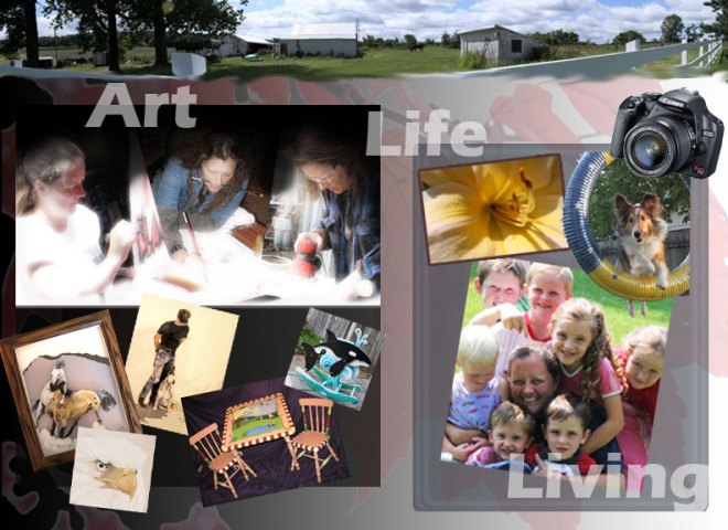
Sorry… just had to put this on here!  For the online classes students always give an introduction of themselves to be posted by Tuesday of that first week.  Tuesday came and I puttered around getting life taken care of when lo and behold I approach my normally simple first post only to realize the teacher also wanted us to illustrate it in Photoshop, demonstrating what we know. 

What I know? I avoid Photoshop like a plague from … well… where plagues come from!   In addition, a project and discussion question were both due on Wed. and I had just filled that day full of classes.  So basically… it was all due on Tuesday.

I am including the disaster to show the progress I make over the next 5 weeks, because it can only get better!!! Oh… this went along with text introducing myself. 

No critiques, please.  I know it is a bomb, but on the other hand, the teacher will hopefully feel fantastic about his teaching ability when my final project looks 200% better! (That was my purpose all along… I promise!)