Magazine Layout

Since this week was about typography, we were required to create a magazine layout consciously using type.  I could not help it, it was such fun creating my calendar a few weeks prior, that I reached into the work I had done with the vintage children’s books and went from there. So if this looks familiar, it is because it is similar to one of my calendar pages and plays off the book “The House that Jack Built” from The Gutenburg Project (a site I have fallen in love with!) However, it was not a previously created homework piece! I want to be very clear on that!

For a full description of the project, feel free to click on the pdf link:

Garvin_W2A2

Create Your Own Type

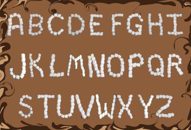
I don’t know what I was thinking… it has been an exciting idea in the back of my mind to create my own handwritten type for several quarters now, but for some reason I got it in my head to go a different way and do something totally different. The first several weeks of this quarter were so overwhelming in the amount of work assigned, that I think I was concerned that I could not give it the attention I wanted to give it, so I chose to challenge my Photoshop skills. However, one day I will design my own handwritten type because I really want to.

So… I chose to use “found items” and have rediscovered a love of miniature marshmallows, which are now on my snack list.

The process turned out to be laborious so creating my own font would have been much easier and the lighting on a few of the letters could not be corrected. Since they all had the same light source, I am not sure exactly what happened with those.

Process:

  1. Photograph each individual letter on a black background using specific rules that I set up for width/height etc.
  2. Get into a mini marshmallow war with the roomies to reduce the tediousness of arranging little spongy things in a straight line
  3. Pull image into Photoshop, remove background, adjust lighting, as well as smooth out the edges of each marshmallow!
  4. Eat a few marshmallows to reduce stress
  5. Place them in a grid in alpha order in Illustrator
  6. Toss a few marshmallows to the dogs to reduce stress
  7. Create a background that looks like hot chocolate
  8. Voila – print, mount, done! (Eat a few more marshmallows to celebrate.)

Cat Logos Galore!

In Design Media we are branding a zoo of our choice for the first 5 weeks. Since I am also working with a charitable client that is in cat rescue, I opted to make this project a cat rescue “zoo” and explore some options for my client.

The first step was to write a creative brief and thumbnail many options. I enjoy the sketching!

This slideshow requires JavaScript.

Web Quest – Typography

This week’s topics were lettering /typefaces and one of my favorite type foundries has to be Hoefler & Frere Jones. I have researched and written a paper on them in the past. For those of you who are not designers, you might be surprised to learn that the computer generated text you read is usually a very expensive font designed at a type foundry.  That font was paid for by the software company in order for them to include it in your package for your use.

Some of those typefaces (a collection of fonts in one family) are inspired by old, hand rendered type from centuries ago and others are more recent such as Arial and Helvetica. There is a whole fascinating history around the topic of typography and it can be mesmerizing how typography impacts history (or maybe that is just the geeky graphic designer in me showing up.)

Hoefler & Frere Jones:

http://www.typography.com/fonts/index.php

This is a professional type foundry. This is the type of company you would hire if you were setting out to create a brand for your own company. They have designed fonts specifically for brands such as Martha Stewart Living, Wired, and President Obama.

http://www.typography.com/fonts/font_overview.php?productLineID=100018

I especially like the numbers fonts they put out such as the Greenback, based on the look of our American dollar. They also suggest a font that goes well with it, as if you are choosing a wine to compliment your dinner!

You can even test drive their fonts. Example: http://www.typography.com/testDriver/index.php?productLineID=100018

Expect to pay for a font from them if you want to keep it. Numbers alone is $129 for a single computer user, but you can price it out for up to 50 users.

Font: a single style in a typeface such as what you are reading here.  Another font using the same typeface would be Times New Roman Bold. You thought you were just making the lettering darker, but in fact, you are using another font!

Typeface: a collection of fonts in one style such as Arial: Arial bold, Arial italics, Arial Narrow.

Right or wrong, these terms are often used interchangeably and I find myself guilty as charged.

Web Quest – Vintage and Retro

One of the things we do in Design History each week is a search for good online links that relate to that week’s lecture material. Those I find interesting I will include in a post each week.

Graphic Design from the 1920s and 1930s in Travel Ephemera

http://www.travelbrochuregraphics.com/

This is an online gallery of a personal collection of travel ephemera. It is an astounding group of images by a person who has spent nearly 20 years collecting old posters and travel related pieces as he has traveled around the world. What I find very fun about the site is the joy that the creator obviously feels in the world of old ephemera. It is an amazing site I would recommend bookmarking for future reference!

Smashing Magazine: Celebration of Vintage and Retro Design

http://www.smashingmagazine.com/2008/04/21/celebration-of-vintage-and-retro-design/

Smashing Magazine itself is something I recommend to any designer who wants to keep up with current trends and design related content.  However, this is a wonderful writeup with excellent photos of vintage and retro design. Some of the designs in this particular collection are more modern, but reflect a vintage style. It is a “celebration of retro and vintage design — ads, illustrations, book covers, pins and posters from 1920-1980s.”

The Metropolitan Museum of Art: Egyptian section

http://www.metmuseum.org/

I love this location for an overall research location with a historical background. I love art and I love history and this site has been tremendously helpful when I am looking for a specific timeline or image examples from an era or people group such as the Egyptians.  It covers a lot of ground including Asia.

http://www.metmuseum.org/toah/hi/te_index.asp?i=14

They also have a resource link list that is helpful: http://www.metmuseum.org/education/

Design History – Ancient Designs

Design History is my online class for this winter and I have fallen deeply in love with it. Week 1 started the subject off with a bang over  discussions of the beginnings of design. With that, we were to take an old style and imitate it in a logo form for a fictitious tourist company.

Following is my client presentation for a logo and business cards for a hot air balloon company in Arizona. It is a bit tongue-in-cheek as I do realize petroglyphs, rocks, and hot air balloons don’t really go together. It was fun!

For the full presentation with thumbnail sketches and more images, please click the following pdf link:

Garvin_W1A3_ClientPresentation