Another thing I used my sketchbook for this quarter was to practice drawing dogs. Charlotte ordered 4 ornaments to give as gifts to her agility friends. So first I practiced with Bailey and Toby just to get a feel as to whether I could even draw the semblance of a dog!

Final Design Layout
For our Design Layout class, the final was to choose an inanimate object, write what it means to you, and then design three 11×17 posters. They were to be photographic, illustrative, and text only. My object was key lime pie and I wrote about the first time I had ever tried real key lime pie when Lainey and I visited the Florida Keys.
With all my energy diverted to my Corporate Communications class, I let the creativity slide a bit on this project (and the teacher commented on that.) I plan to use these as the basis for a frameable final print to go in our kitchen, so I think of them as my “roughs” of the final project, which is not yet finished.
Share this:

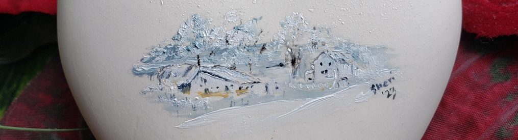
Sketchbook: Holiday Style
The final weeks of my sketchbook for Life Drawing were gearing more towards the topic of Christmas. This included documenting my ornament painting, a poinsettia we had, as well as reaching back into my photography class last year and using my Mary/Jesus images to create this year’s Christmas cards.
Share this:

Branding: Finding my Voice
Life Drawing and my teacher, Beth, both contributed to my finding my voice in the brand. As I struggled with how to be myself in this computerized project, Beth kept commenting on my fine arts side. So I decided to move in that direction and voila, a sketched tree and bird became the basis for my branding presentation.

It began to “have legs” as I could do a lot with the sketching idea as well as the stylized bird.
For a view of the entire process in an interactive .swf file, go to my online presentation.
Here are a few touchpoints created for the brand:
- Front and back of my business cards
- Letterhead
- Tag
- Holiday tshirt design
- Online banner
Share this:

2010 Christmas Cards


Share this:

Sketchbook: Heads and Hands
Another study we did was on the planes of the face as well as self portraits. I did 4 of myself and liked none of them, but I am including the one our instructor liked best.
I am also including a couple of my studies on hands. These were sketched sitting in the chiropractor’s office right before class! Talk about doing your homework at the last minute.
Share this:

Branding: Brand Brief
Another visual that is presented to the client (or class, in this case) is the compilation of many intense hours of work building the brand values, mission, vision, key messages, etc. These all build up to the “Big Idea” for the brand located in the center of my layout (on the blue). It seemed with everything in my life that I examined, I came back to inviting people to meet God, each other, a great store/product, an interesting concept, or myself… always that invitation to engage in and interact with each other. So I took that as the “big idea” in my life.
An invitation to relationship through verbal, written, and visual communications.

Share this:

Sketchbook: Masters
Sketchbook homework often included copying a Master drawing. I hope to continue with this exercise because it was extremely helpful to study their particular styles.
DaVinci’s horse, a study of how architecture imitates the human form, Michelangelo’s figure:


Share this:

Branding: Attributes
In branding a company (or yourself) you go through a research process to discover brand attributes. From those, you build a brand dimensions map. I began building for my final presentation with this visual, cleaning it up from the previous rendition.
During this process I discovered that everything in my life centers around relationship. Relationship with God, family, co-workers, clients, etc.

Share this:

Branding: Logo Me Round 2
![]() Self branding adds a complexity to an already intense process and once again I was a bit slow on the uptake. However, when the breakthrough happened, I was pleased with the outcome. You can see how far this came from the previous Logo Me Round 1 posting.
Self branding adds a complexity to an already intense process and once again I was a bit slow on the uptake. However, when the breakthrough happened, I was pleased with the outcome. You can see how far this came from the previous Logo Me Round 1 posting.
Pieces of this process included painting, drawing, inking the triangle logo until I found something I liked. The rough, hand drawn rendering was a conscious choice even though I love a smooth look. Beth (instructor) pointed out this truly reflects “me” and brings my fine arts into my logo / identity.
With a lot of help on the color study, I landed on the brown (earth/stability/natural) for the open (welcoming) triangle and blue splash (water / creativity / life).
The naming was also difficult, but I liked studio33 because it can represent all of my art, as opposed to locking me into one aspect of it such as graphic design or fine art. I also solicited a lot of help on the font choice which is Fontin.
Eventually the tagline was added and became more than a tagline, as you will see in subsequent postings.
![]()
