Branding: Finding my Voice

Life Drawing and my teacher, Beth, both contributed to my finding my voice in the brand. As I struggled with how to be myself in this computerized project, Beth kept commenting on my fine arts side. So I decided to move in that direction and voila, a sketched tree and bird became the basis for my branding presentation.

It began to “have legs” as I could do a lot with the sketching idea as well as the stylized bird.

For a view of the entire process in an interactive .swf file, go to my online presentation.

Here are a few touchpoints created for the brand:

  • Front and back of my business cards
  • Letterhead
  • Tag
  • Holiday tshirt design
  • Online banner

This slideshow requires JavaScript.

Branding: Brand Brief

Another visual that is presented to the client (or class, in this case) is the compilation of many intense hours of work building the brand values, mission, vision, key messages, etc.  These all build up to the “Big Idea” for the brand located in the center of my layout (on the blue). It seemed with everything in my life that I examined, I came back to inviting people to meet God, each other, a great store/product, an interesting concept, or myself… always that invitation to engage in and interact with each other. So I took that as the “big idea” in my life.

An invitation to relationship through verbal, written, and visual communications.

Branding: Attributes

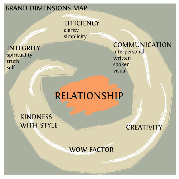
In branding a company (or yourself) you go through a research process to discover brand attributes. From those, you build a brand dimensions map. I began building for my final presentation with this visual, cleaning it up from the previous rendition. 

During this process I discovered that everything in my life centers around relationship. Relationship with God, family, co-workers, clients, etc.

Branding: Logo Me Round 2

Self branding adds a complexity to an already intense process and once again I was a bit slow on the uptake. However, when the breakthrough happened, I was pleased with the outcome. You can see how far this came from the previous Logo Me Round 1 posting. 

Pieces of this process included painting, drawing, inking the triangle logo until I found something I liked. The rough, hand drawn rendering was a conscious choice even though I love a smooth look. Beth (instructor) pointed out this truly reflects “me” and brings my fine arts into my logo / identity.

With a lot of help on the color study, I landed on the brown (earth/stability/natural) for the open (welcoming) triangle and blue splash (water / creativity / life).

The naming was also difficult, but I liked studio33 because it can represent all of my art, as opposed to locking me into one aspect of it such as graphic design or fine art. I also solicited a lot of help on the font choice which is Fontin.

Eventually the tagline was added and became more than a tagline, as you will see in subsequent postings.

Branding: Logo Me Round 1

In Corporate Communications we began the process of branding ourselves. This will take weeks, so this week we tackled discovering our values and creating 3 symbolic logos in rough form.

We interviewed people from 3 different roles in our lives (I chose a sister, a close friend, and a peer-student-friend).  Probably my biggest suprise was how my student-friend was so perceptive and caught things about me that I had no idea were noticable, such as my “concern for justice” and “makes concepts clear and understandable to others”. Both of those are huge drivers in my life, but not necessarily obvious (from one student to another, anyway.) I also liked how my sister said “classy vs. cheesy work” (no kitsch here!) and a friend said I am like a “laser beam”.   My perceptive student-friend also commented “not complacent or too comfortable.”  I laughed at that one and couldn’t help commenting that I am “not likely to allow that in anyone around me, either.”

This all boiled down to 7 core values. Pretty much the same ones I have had for years, but it is good to rework this process periodically. Sometimes one or two might change depending upon life’s circumstances.

At that point, I created a brand dimensions map using 7 attributes derived from the values activity. Beth asked that we visually show it, as well as use words. Since Relationship is at the core of everything I do, from spirituality to business to being creative, I started with the crucial component of integrity and wrapped my attributes around and flowing into Relationship.

I then thumbnailed and brainstormed until I came up with requisite 3 logos in rough form.

Working with the premise of a whirlwind (another term I was given through my interviewing…at least it was not a tornado which is destructive!) I ended up with my stylized initials:

Then I took the infinity symbol and played around with it until I had it looking like a paint brush. I put three spots of paint with it representing body/mind/soul as well as perfection and Divinity (3 is a strong number for me.)

Then the final one came when I was adjusting a triangle. A triangle is my personality shape, if you remember from previous attempts at logos. One flick of the wrist and I had a brush (stroke) with it. I stopped there before I messed it up. This one is my favorite. It will be interesting to see if it still works once I move through the branding process over the next few weeks. 

We each had to present our values, map, and logos to the class. Any thoughts?

Alchemie Client Logo

Rachel and I teamed up to work on the logo for Alchemie (a company created by one of our fashion programs). Alchemie will be selling wallets which they designed and are producing. 

Our Corporate Communications class participated in naming the “company” as well as each of us presented logos for their selection.  While our logo did not make the final cut, we were in the top 3! I think we hit the mark for the homework assignment; however, since we were told to design as if this were an international corporation that intended to grow and not to focus on simply this one product. We were also requested to keep our presentation limited to a specific set of slides, one black and white and one color version of the logo, and to a short timeframe.  

In our presentation, we were to outline our process.  Alchemie is a play on the French for alchemy. If you are interested in seeing the short presentation with some of our early sketches and explanation of our process, you can view it here> Alchemie Project.

So what did I learn? I thoroughly enjoyed teaming up with Rachel, and working the process with her was fun and helped fuel my own creativity! I have always preferred teamwork when the team is responsible and able to pool resources!

I think I also learned it is ok to break the rules outlined by the instructor if you really want the project? That is what the winning group did, anyway, with a long presentation and they definately took it to the theme of wind/earth/fire/water, which was for this particular product set only, thus locking the company into that theme forever. I don’t know and am a bit confused on that point.

What I am not sure of is if that would work in the real world. I think that is something I would be checking out ahead of time because to make such a gamble could sink your company if you were wrong. I have worked with companies where they will throw out your presentation without review if it does not fit the guidelines they set forth. They view it as you are not hearing their initial request and thus they do not want to work with you in the future.

So I am a bit confused as to what happened with this project. I think the Alchemie group was not looking at things long term and were a bit tunnel visioned with their current project. The logo  they chose (while excellent) was very specific to their current product line.

The majority of the class followed what we were told, and there were some wonderful offerings on the table for a global mark! There is real talent in this school!

Branding – Noah Grant’s

Beth Remsburg gave us a fabulous first assignment for Corporate Communications! We had to find a business we had never been to before, visit, and analyze it.  I opted to recruit Lainey for this project because this is right up her alley. She chose a little oyster bar in Zionsville that we had never visited before called Noah Grant’s. We had a wonderful experience as a customer! We will be going back, no question about that!

The premise for their business comes from the owner’s experience as one of 5 kids growing up in this area.  She said they could never find a place to eat where everyone was happy.  So she has an oysterbar with 5 star food offerings, yet you can also get a burger and fries.  The prices are more reasonable for fresh fish and local Angus than if you went downtown.

As far as the branding, I think they could use a bit of help. It is pretty basic black and white, but they have a good thing going and I think they could pump it up a bit. They have a black chalboard wall in each room with writing and drawings on them. They place felt fun, friendly, and the food was to die for!

We had to put a presentation together for the class outlining different points about the brand. Here are 3 pages as an example: