Farm Life – Sketch 1

I am playing around with ideas for a more distanced portrait. Sometimes it is nice to get the person in their daily element. This is Stephen – a farmer and a craftsman by trade. This was a composition, colors, and values practice sketch. Expect a few more to be posted before I decide which one to go with for the larger version.

Farm Journal Watercolor Project

Quick sketch of our childhood farm in the 1980s

The kids continued to ask for more classes, so in February I sent them all watercolor paints, brushes and paper. We had loads of fun as I taught them how to use their new tools. In the meantime, I continued on with my own project of painting family memories. I am trying to get looser with my sketching, making it less of a detailed and frustrating project.

One of my favorite things is using old black and white photos from my Dad’s family farm. I want to amass a large group of these. Maybe a picture book with stories in the future.

Tonal Exercise

20190921_184854

This was a week of working on tones (no details) and looking at how the eyes are made, reflections, cast shadows etc.

20190921_184911

I chose one of our local squirrels to be the subject – a little hazelnut thief. I am a sucker for them every time, though. They run around trying to bury huge walnuts in our lawn. So funny!

20190921_184918a

I find that I need more practice finding the structure and geometric shapes – then examining all the shading and light source. This has been more of a cerebral exercise than I am used to.

I need to do more of this. Nothing wrong with picking up the pen or paints and having at it, but stopping to think about the details and remembering why things look the way they do is a good practice. This has been an excellent course.

NewcastleX: NHI101xDrawing Nature, Science and Culture: Natural History Illustration 101  – EDX Link

20190921_184935


Rescued

20150502_171002_resized

What does an artist do when she blows 2 tires on her new car and her sister and family, Sunday soup in hand, come riding to the rescue in their clunkety van? She draws a thank you!

20150502_191821_resized

Note: Coup Fourre is a reference to a rescue card in the game of Mille Bornes, which the kids insisted would have helped me a lot. I told them that they were my coup fourre.

IMG_8606

20150509_103802_resized

Their unabashed joy in the whole situation made it not so bad. A month later, their poor van gave up the ghost itself, but it was useful for several family rescues over the years.

20150509_103749_resized

Note: It has only been recently that I learned to illustrate. Much thanks to a class I took during my graphic design degree. Thank you, Jacob!

Catch the Project Big Bucks!

One of the blogs I illustrate – this blog writer is picking up her pace with big ideas ahead. I think I am going to be busy!

Welcome to Insite Solutions

Money blowing machine-1

I once was selected to manage a project that had plenty of funding, an abundance of resources, and no urgent deadline. It was like stepping into a Money-Blowing Booth full of $100 bills flying around. Yet after a few months and a considerable amount of time and money spent, there was no real accomplishment and the project was cancelled. I was bewildered and confused! What had happened? I felt like one of those contestants that had just come out empty-handed from one of those booths seen at fairs or tradeshows.

In a Money-Blowing Booth, money is flying everywhere and contestants (project stakeholders) have a limited time to grab as much money (value) as they can. Yet, like many contestants, I had stepped out of the booth empty-handed. So what can a project manager do?

In “How to Catch Money in a Money Blowing Machine”, Eric Ott, an e-How…

View original post 189 more words

The Changing Face of Business Communications

1970892_10203722447574430_16040442347722223_n

Visuals are becoming more and more crucial for communicating quickly, even in the dry world of business. However, business communication is becoming more dynamic with the advent of powerful digital devices to handle images, as well as the interactivity of the social media scene. A cutting edge company must embrace this and find ways to speak the language of the day to their customers, as well as employees.  Anything less and that company will be left behind. It is that simple.

Visualization of content is the communication wave of the “now” and of the future. It is not going away, so as a writer in business communications, this trend is why I returned to school for a graphics degree. (It did not hurt to be a lifelong artist and illustrator on the side.) It has been exciting to see how companies are able to tap into this newly developed creative skill and use it for their business needs.

The Newest Opportunity

This year’s opportunity appeared unexpectedly in the realm of social media, my passion.  When asked, I quickly jumped on the chance to be a member of the (volunteer) team working on the new company blog. This is with Moser Consulting, where I have my day job as an IT Senior Consultant – Technical Writer.

My official project title is Staging Coordinator. While we are currently outsourcing the technical aspects of the blog, it is my role to prep the articles submitted by our talented consulting team and supply images for those articles.

dynamic-media-oracle-content-server

 New Challenges

Being a technical IT blog, the challenges have been different than those encountered on my personal blogs.

  1. Figuring out how to illustrate a coding problem or business concept that is someone else’s brainchild.
  2. Choosing the medium and style for each illustration – that is the fun part.
  3. Learning to work with a system that I do not have direct access to (i.e. I can not fix a problem with my images once they are uploaded.)
  4. Setting up a simple blog process (with the team) with multiple authors – the most difficult piece.
  5. Working with an article pipeline dependent upon outside sources and a specific schedule (my own blog posts currently come as I have time because I always have more than enough topic ideas.)

The Illustrations

As far as the illustrations go, I am discovering that some are quick and easy in Adobe Illustrator.

10-Best-Practices-for-QA

Or I simply use my own photos and manipulate them in Photoshop.

Table-recovery-small

This avoids all that time spent searching for a creative commons image, not that I have any problem with that. Eventually I will probably have to use CC a lot as our pipeline of articles grow.

Other illustrations take on a whole life of their own. I am currently working on a superhero illustration (see top image) – never in my life would I have thought I would be doing comic book style illustrations! But it has been a lot of fun and the style is good for IT articles (in my humble opinion.)

Examples

Here are some of my exploratory works:

Trying out my first vintage comic book look, which has then led to more along the comic book line.

Azure-Vintage-Gotcha

Quick cartoons. Once you have the concept, this is a very easy style executed on a Wacom tablet within Illustrator. The hardest part is coming up with the idea to fit the article.

BI-easy-does-it

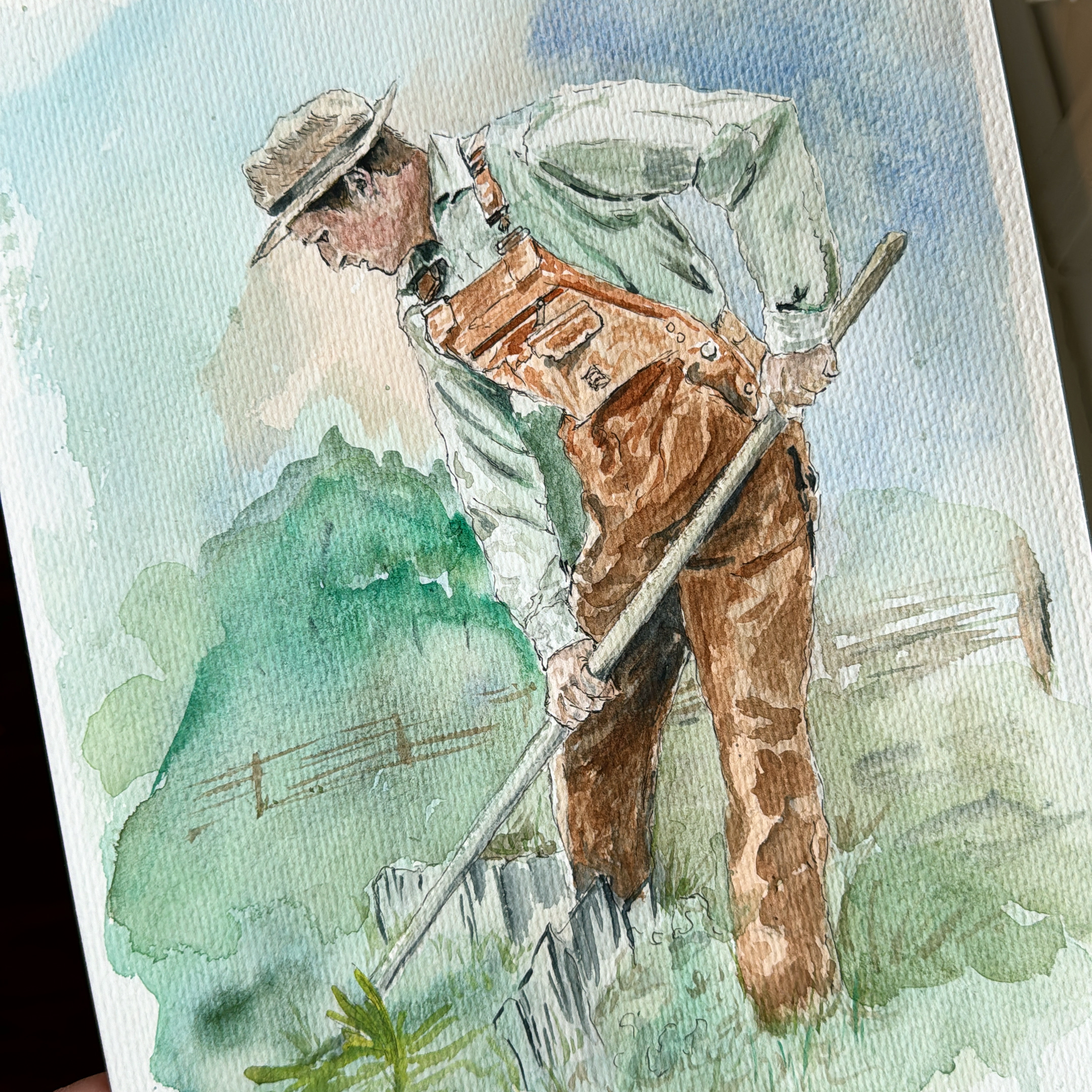
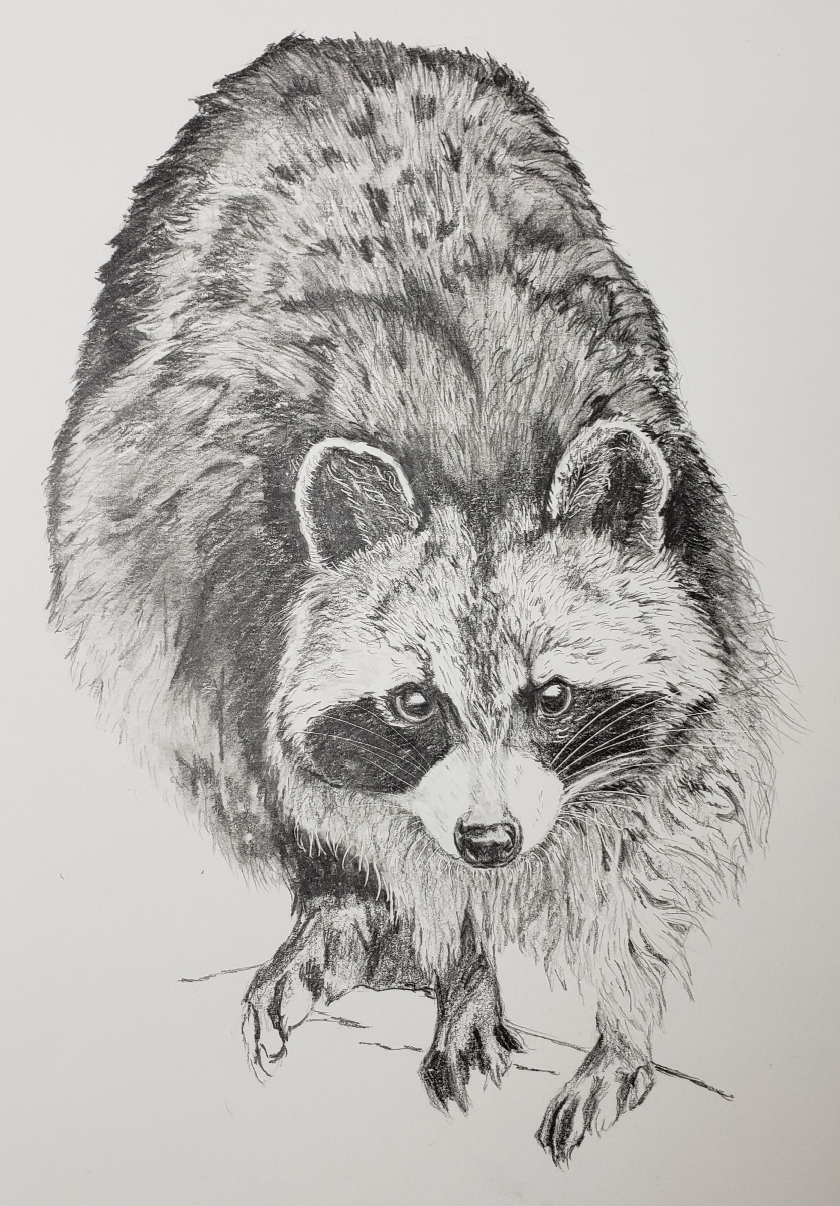
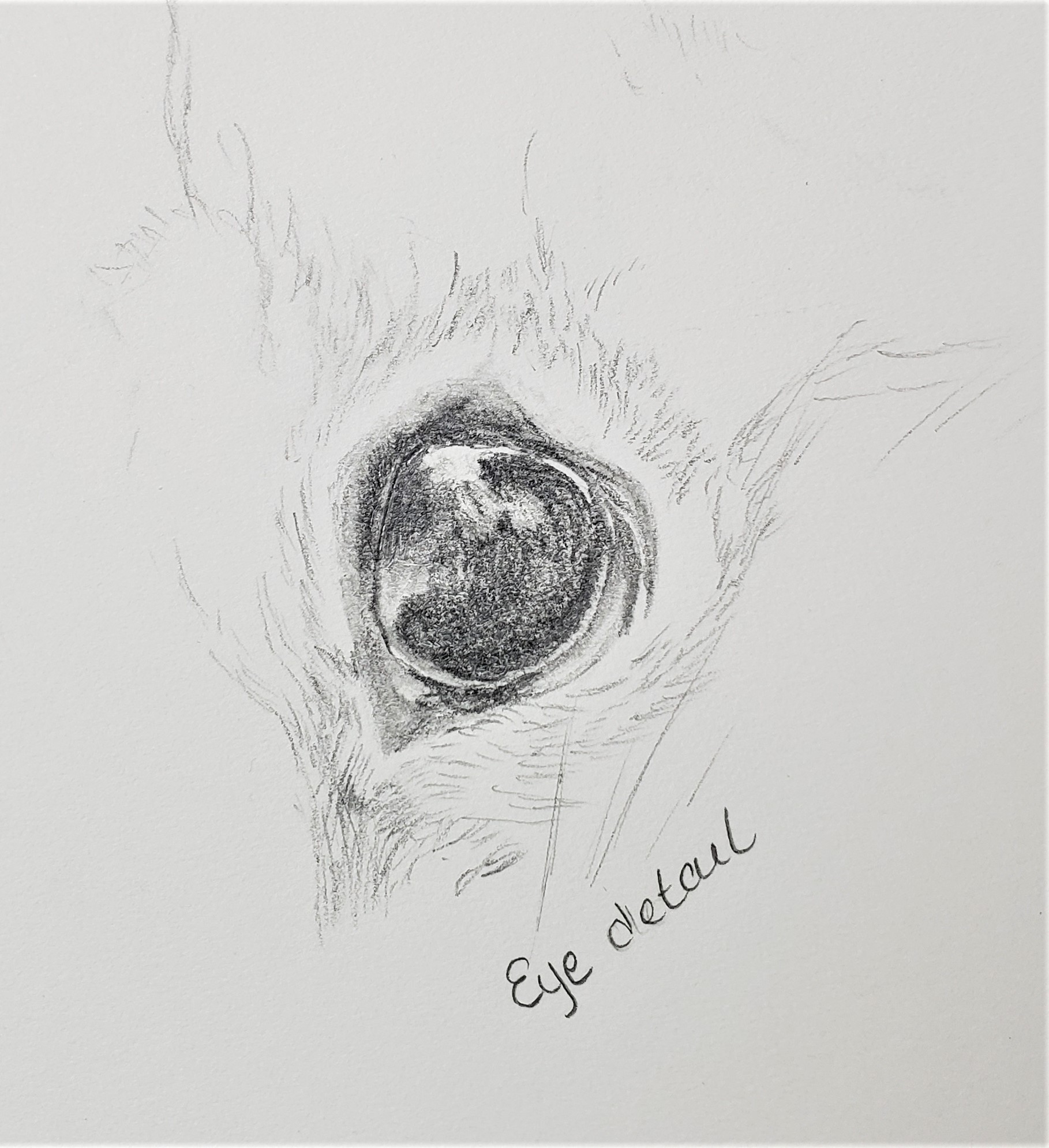
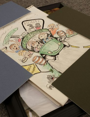
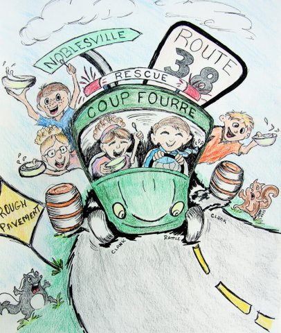
And then my favorite, but very time consuming one, which was executed with colored pencils.

Big_data1

Hand rendered images are very “real” and vulnerable. When I am searching the web, they grab my attention. It is not a style that works for all topics, but it is one that I hope to use more in the future.

I was so inspired that I got carried away and created a whole infographic in this style. This went along with a story in When Big Data Isn’t Sexy. Being time consuming, infographics are probably not going to be at the top of my list, but they are fascinating to create.

Big_data2

This has been a year of positive growth, and I am grateful to work for a company that is encouraging me to practice and develop a skill that taps into my passions of communicating, social media and creative design.

Illustration Rework

Two days before my final was due, I had an epiphany and figured out why I was struggling with this painting so much. I spent the weekend re-working and adjusting what I had spent the previous 8 weeks creating. There was a lot of sanding off of what I had put on, then repainting. Fortunately, we were having a 80 degree, summer-like weather and I was able to do this work outdoors.

I can not even describe the amount of rework I did, but thankfully the teacher gave me grace. As long as I promised to complete it, which I will be doing in the next weeks, then he was satisfied with what I had accomplished so far.

It seems that my left side perception must be scewed. I spent my time adjusting that side of the painting, making everything just slightly bigger (well, the guitar a lot bigger) except for Ron’s face, which I needed to make smaller or just move things about (like bring his ear down and nose and mouth up… sounds odd, doesn’t it.) It is like that whole side was just slightly off scale or proportion.

It was quite the operation, and while it is definitely not finished, I was elated once I had created the outlines and positions. I now had a roadmap to the finished piece that I was very satisfied with, and for the first time in my life I believed I might be able to do portraiture- something that has been a very scary impossibility in the past.

Illustration Class Midterm

The focus of this class was centered around spending our time crafting one illustration. It was an amazing experience in practicing patience, as well as pushing through doubt and the anxieties of “I am not good enough to pull this off.”

About halfway through it, I was struggling with the nuances of the painting, yet loving every minute of it. I was also still hanging onto the belief that I could never be a portrait artist. And as I looked at it, I knew the face was not right. It did not look at all like my brother, the face was all wrong, the proportions of the guitar and boots were off. It was driving me nuts.

Notice the white areas around the steps and boots. These are where I took sandpaper and removed most of the paint and started over, more than once. I was also using an exacto knife around edges and to sharpen some areas. I know it is not possible, but I felt like I removed more paint than I put on!

This is the artist’s angst and I was feeling it all. It felt hopeless as far as catching my vision, but I was learning new painting techniques, and for that I was happy. Sort of a ying yang thing going on… loving it and hating it at the same time.

To me it almost looked more like my brother, Stephen, at this point. He has a rounded face, whereas my brother, Ron, has a more oval visage. So I kept seeing Stephen here, (and it was not that I mind seeing him, do not take me wrong, dear family, but it was not my intention to be painting him at this point), so frustration and artistic despair were mounting.

Stay tuned! It changes once again as the quarter progresses…