Packaging Final

The packaging class ended with an excruciating fizzle… I pinched a nerve in my back so I could not sit during finals week! I missed my last day in a business class and 3 days of work. I hate it when that happens and it happens when I sit for 18 hours a day working on the computer in bad chairs.

So, while I could not finish it the way I was hoping, I did complete a package… barely. It was a toss up as to whether I just take the hit and get a C or actually push to at least get a B. I literally cried all the way through this one. When I was ready to quit, my roomies kept encouraging me.

This is a class that with enough time, I would have easily gotten an A because the teacher allowed us to redo our work after we received feedback. However, that week I was barely able to get my first drafts turned in. Very, very painful. Four weeks later and I am finally feeling fine, although I am still being very careful not to do anything to aggravate it. 2 weeks of daily chiropractor visits and then 3 days a week, and now 2 days a week.

At this point in time, I am still not sure if it was worth it for this particular class. One thing I have learned, these past 3 years, is what it means to push myself beyond what I thought  I was physically and mentally capable of accomplishing. Amazing how I have overcome stressors that before I never thought possible.

Part of the requirements on this were the handle and the die cut. I disliked the distinct color change between the computer color and the actual printout on the final, which was more orange, but I gave that detail up in the interest of being able to present a finished piece. Normally I would have tweaked and reprinted until this was perfect with my vision.

That is another skill I have learned – how and when to make the proper compromises, what to fight for and what to let go of.

Here are the final results for Packaging:

This slideshow requires JavaScript.

Art Direction Final

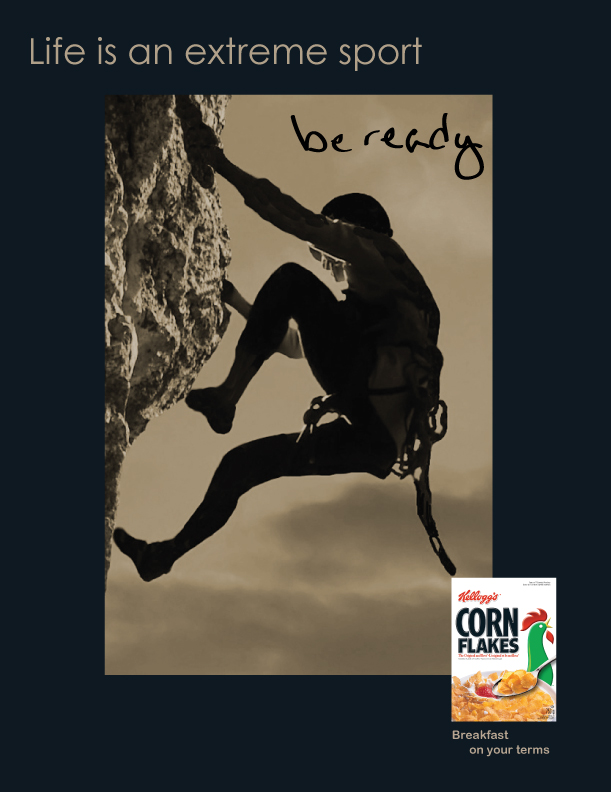
Art Direction was partially a team class and I enjoyed the teams I was put on, even if we were working at warp speed. As a team on the final project we chose to research and promote Kellogg’s Corn Flakes. The team also chose the tagline (which happened to be one I proposed, which was fun.) We then chose our 3 favorite group proposed headlines and general visuals. From there, we each interpreted the final pieces in our individual ways.

One challenge was to find high resolution stock photography and to create the ads in a way that the photography doesn’t scream “stock”.  We each used our own stock photography finds, although as a team we chose a general direction for each (extreme sport, old bicycle, and a business person.) I chose to crop mine and manipulate in Photoshop CS5 by removing the color. I also hand wrote a portion of each headline as if it were a note on the photo.

My thought for this group is that they could be located in a photography magazine.

Packaging Product Labels

Moving along with my product, High Tea, the next phase was to create labels and photograph the containers.

Instructions were to use clear glass containers with the product visible and a die cut of some sort. I chose to use our Penzey’s spice containers and package this as a gift set for high end loose leaf tea. I never did get around to dumping out the spices and filling it with the loose leaf tea. Oh well.

With more time, I feel I could have really done something with these (i.e. they have potential.) Feedback was to extend the labels further around, lose the die cut on such a small item or die cut around the logo, and to darken the name of the tea. Otherwise the teacher felt they were a strong design.

This slideshow requires JavaScript.

Illustration Rework

Two days before my final was due, I had an epiphany and figured out why I was struggling with this painting so much. I spent the weekend re-working and adjusting what I had spent the previous 8 weeks creating. There was a lot of sanding off of what I had put on, then repainting. Fortunately, we were having a 80 degree, summer-like weather and I was able to do this work outdoors.

I can not even describe the amount of rework I did, but thankfully the teacher gave me grace. As long as I promised to complete it, which I will be doing in the next weeks, then he was satisfied with what I had accomplished so far.

It seems that my left side perception must be scewed. I spent my time adjusting that side of the painting, making everything just slightly bigger (well, the guitar a lot bigger) except for Ron’s face, which I needed to make smaller or just move things about (like bring his ear down and nose and mouth up… sounds odd, doesn’t it.) It is like that whole side was just slightly off scale or proportion.

It was quite the operation, and while it is definitely not finished, I was elated once I had created the outlines and positions. I now had a roadmap to the finished piece that I was very satisfied with, and for the first time in my life I believed I might be able to do portraiture- something that has been a very scary impossibility in the past.

Art Direction Activity 2

Another fun discussion project in Art Direction class was a simple cropping activity with the 4th panel being a manipulation in Photoshop. This was showing how you can change the meaning of a photo with some very simple changes.

It did not matter which photo, so I dipped into a joyful moment last summer. My fellow students seemed to like it.

Packaging – Tea Research and Logo

For the final in our Packaging class we were to choose a product and create a brand and packaging around it.

I was so crazy busy that I could not throw myself into it as I wished. My product choice was more a decision of what I had available for all the work it was going to encompass in the coming weeks. This particular class had a weekly final due date that landed on Tues., which was the same as my Illustration class that went 6-10 (after work), so I was late every week on the 4th deliverable. Very frustrating.

I chose to go with tea (because I have about 50+ different types of tea.) With all the research and photography we had to do of products, I knew I could not get to a store. This worked perfect.

First step was to perform research and document the findings. Thankfully, unlike most ground classes, we created a book, but did not have to print it due to the fast pace of the class.

Note: all but 3 photos are my own.

This slideshow requires JavaScript.

The logo was based off of an idea for English tea and leaning on the concepts of history, longevity, and class. Research showed that tea is rich in history and wealth. Wars were fought over it (our own rebellion during the Boston Tea Party is only one instance.) In England, high tea is actually a meal and not confined to the upper class, but I liked the sound of it and went with it. In this case, my main priority was to get the project completed. We were doing each phase in the matter of hours (usually it was due the night I was working on it.) I really was not focused on this project.

Art Direction Activity 1

Art Direction was an online class that spanned 5.5 weeks. We covered a lot of ground and fast; however, the work was not extremely exciting to show, from my perspective.

One activity was that we were given headlines and told to create an ad from only that starting point. My teacher really liked my solutions.

Funny… I don’t think of myself as having even the slightest bent towards advertising.


Illustration Class Midterm

The focus of this class was centered around spending our time crafting one illustration. It was an amazing experience in practicing patience, as well as pushing through doubt and the anxieties of “I am not good enough to pull this off.”

About halfway through it, I was struggling with the nuances of the painting, yet loving every minute of it. I was also still hanging onto the belief that I could never be a portrait artist. And as I looked at it, I knew the face was not right. It did not look at all like my brother, the face was all wrong, the proportions of the guitar and boots were off. It was driving me nuts.

Notice the white areas around the steps and boots. These are where I took sandpaper and removed most of the paint and started over, more than once. I was also using an exacto knife around edges and to sharpen some areas. I know it is not possible, but I felt like I removed more paint than I put on!

This is the artist’s angst and I was feeling it all. It felt hopeless as far as catching my vision, but I was learning new painting techniques, and for that I was happy. Sort of a ying yang thing going on… loving it and hating it at the same time.

To me it almost looked more like my brother, Stephen, at this point. He has a rounded face, whereas my brother, Ron, has a more oval visage. So I kept seeing Stephen here, (and it was not that I mind seeing him, do not take me wrong, dear family, but it was not my intention to be painting him at this point), so frustration and artistic despair were mounting.

Stay tuned! It changes once again as the quarter progresses…

Coconut Palm Sugar

The funny thing is, I love to look at the packaging designs I see everywhere. It is fascinating to see beautifully rendered package solutions. However, I have discovered that I do not find it at all interesting to try to solve that problem by myself. Working on a team, I think it could be fun, but alone, nope. Not my thing.

But I did it for the class.

Flat version of the label

The assignment was to create a continuous design on a cylinder for a fictitious product. I chose coconut palm sugar. In this short, but fast paced class, I did not have the time to hand paint it, which is what I really wanted to do. We also had to create a solution in very short order. I have never worked so fast in my life. Which is not my style.

A new and exciting job!

At the end of February Artisan  , a creative staffing firm I had been trying to meet up with, sent me (sight unseen) to an interview with one of their clients. The next day I was offered a job! This was after hitting the job hunting trail for the previous 4-6 weeks and, while I spoke to a lot of consulting and staffing firms, nothing had happened. So needless to say, my head was spinning at how fast life can change.

Since I am reporting this 4 weeks later, I can say that I am thoroughly enjoying the job. It is challenging, the project is huge, and it landed on the top of 2 online design classes and 2 ground. That made it super challenging.

In addition, our group is introducing a new way of presenting the information technology group’s activities to the entire organization, and also a new way of doing business to over 10,000 employees across the US, Canada, and Mexico.

Those of you who know me know that my two favorite things are communicating and organizing. Next, I absolutely love startups or newly forming companies or groups. This company is huge and has multiple companies within it; yet it mimics a newly forming company since they are beginning to pull these silo groups under the umbrella holding company and introducing a more corporate attitude to how they do business.

I was hired by a newly formed information technology group to work as a coordinator with the marketing department to brand the group and create the communications portion of their projects. The first initiative is a rollout of Office 2007 to their entire organization. The second is a 2 year rollout of brand new computers (as well as the attending peripherals such as printers, scanners, etc.) across the organization. That is 10k computers to locations all across the US, Canada, and Mexico. It is a huge initiative. I find it exciting.

Change. I thrive on change. And while the older I get the more I question that concept (and almost long for at least some routine),  I find I still love the thrill. Also, if any of you remember, it was the fear of routine that sent me on this wild college ride in the first place!

So… yes, I thrive on change. Although I seriously thought it was going to kill me with 2 online design courses and 2 ground classes going on at the same time as a new and very challenging consulting job, somehow I survived and am now looking forward to being able to concentrate on the job.