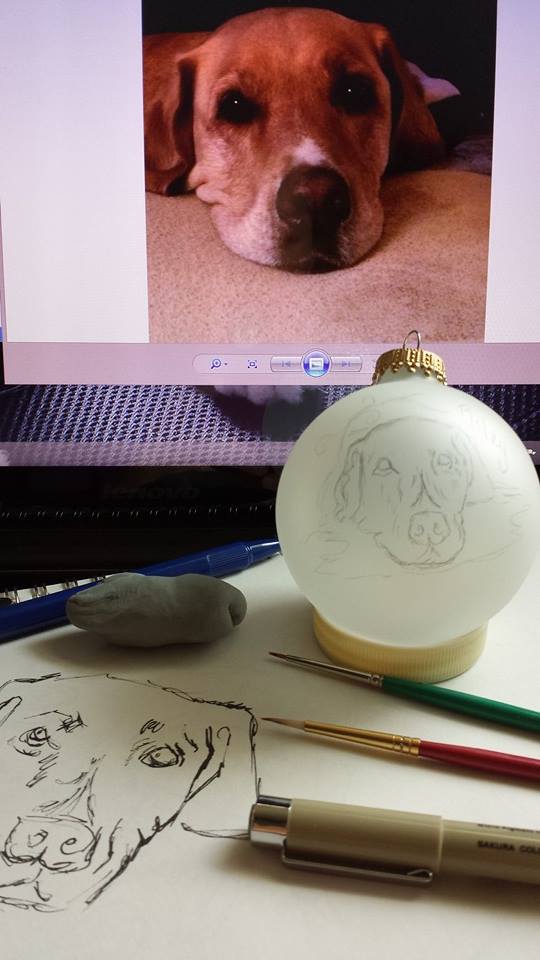
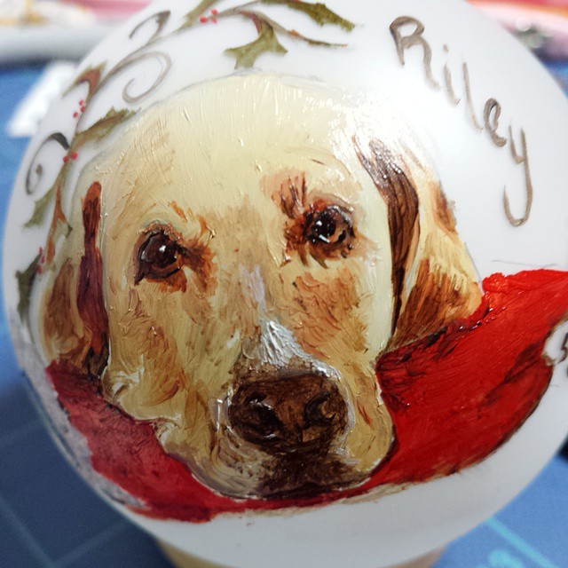


This is the time of the year when I go “blog silent” until all the ornament painting is complete for the 2014 season. I will start with a fun one… for little Jude, born in a snow storm last winter.


I am learning, as I open myself up to more spontaneous illustrations, that I never know where it will take me. It scares me sometimes, yet the time is right. There is this desire to expand that must be satisfied.
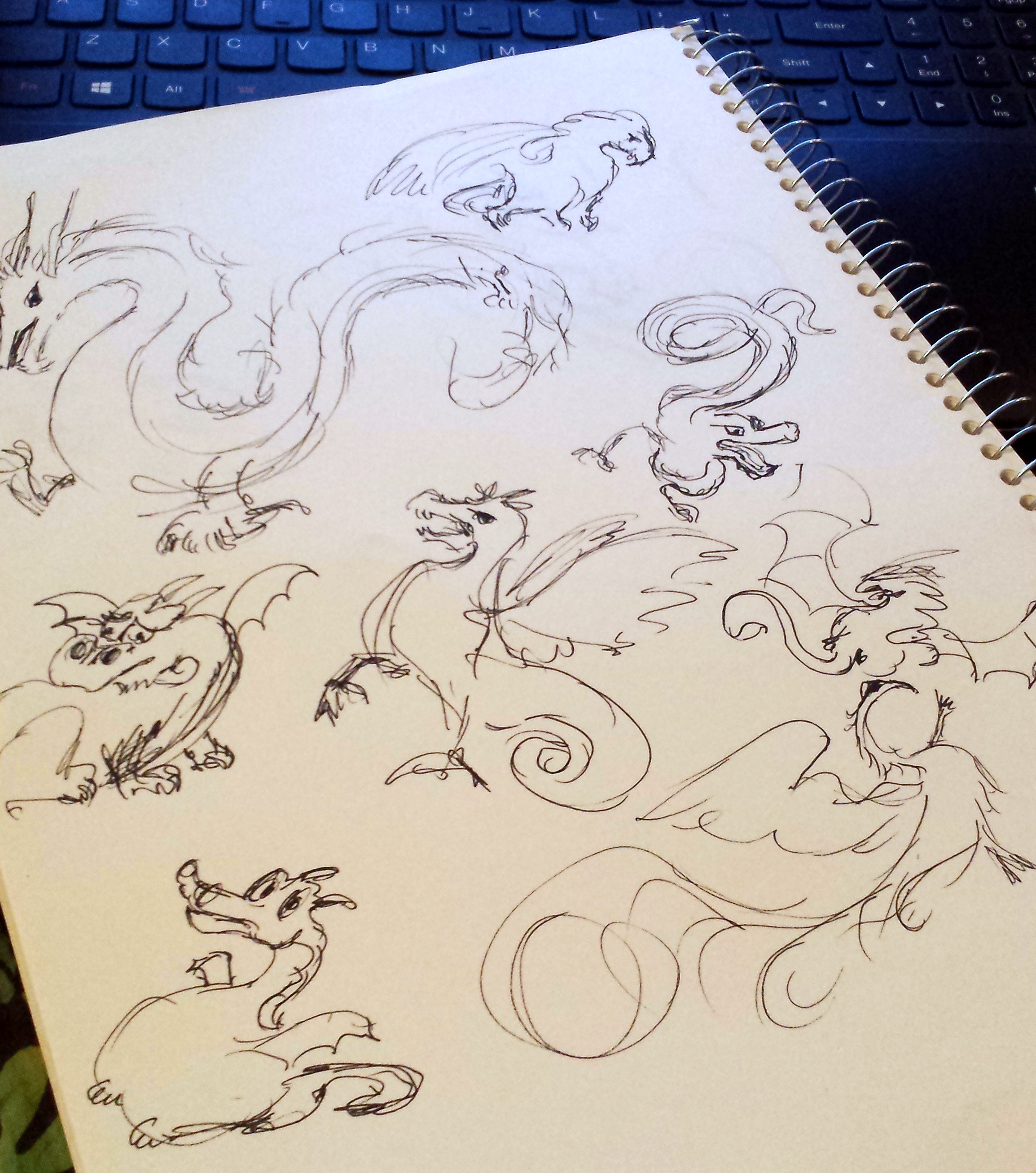
When the business blogger sent me an article called Taming the Multitasking Dragon, it only made sense to have a busy dragon. In the end, I left him to stand on his own, no extras, but along the way I learned that researching dragons was not that easy. I mean – no one has actually seen a dragon!

You can look up vintage dragons, you can look up current art on dragons, but in the end, you can do whatever you want with a dragon. I also reviewed bats wings, goats faces, eagle’s talons. The tail was a mix of reptile, squirrel and imagination.
Somehow he ended up pregnant looking, but that was ok. One observer really wanted to just “poke that fat belly.” Yeah – you try that! He has fire!


Working away then this appeared between me and the light.

Now this is one big cat. I couldn’t believe he fit.

But then he couldn’t get out because forward was blocked. Yeah, I quit painting in order to help him.


Earlier this month was the grand opening for a new store in the small town of Hagerstown, Indiana, Every Day Is Christmas.
I had the privilege to work with the owner, Robin, in crafting the brand and logo.

This brand was such a delight to craft a logo for. The owner has a vision for her store that goes beyond offering Christmas gifts all year long. She is building a location where the community can come together, as well as welcome travelers from around the country as they visit small individual holiday stores.

In the back section is The Sidewalk Cafe and classes are being offered in the store where children and adults alike can come and make holiday crafts.
In addition, over the coming years, she will be adding one-of-a-kind local artist’s items. With those items, her vision is to tell the story behind the craft to bring a depth to the gift giving that sometimes gets lost in our harried era.

Christmas holds a special nostalgic place in my heart also, as you have seen by the ornaments and gifts I have made over the years. It was pure pleasure to craft a logo that embodies the joyful whimsy of Christmas, and yet is also classy and contemporary.
Congratulations to a wonderful new store spreading joy all year around!
To link to their Facebook page click: Every Day Is Christmas


I wrote an article (click link) for the Moser Consulting blog to clarify what I have spent much of my life doing.
It seems a mystery to many.

One of the blogs I illustrate – this blog writer is picking up her pace with big ideas ahead. I think I am going to be busy!

I once was selected to manage a project that had plenty of funding, an abundance of resources, and no urgent deadline. It was like stepping into a Money-Blowing Booth full of $100 bills flying around. Yet after a few months and a considerable amount of time and money spent, there was no real accomplishment and the project was cancelled. I was bewildered and confused! What had happened? I felt like one of those contestants that had just come out empty-handed from one of those booths seen at fairs or tradeshows.
In a Money-Blowing Booth, money is flying everywhere and contestants (project stakeholders) have a limited time to grab as much money (value) as they can. Yet, like many contestants, I had stepped out of the booth empty-handed. So what can a project manager do?
In “How to Catch Money in a Money Blowing Machine”, Eric Ott, an e-How…
View original post 189 more words


Visuals are becoming more and more crucial for communicating quickly, even in the dry world of business. However, business communication is becoming more dynamic with the advent of powerful digital devices to handle images, as well as the interactivity of the social media scene. A cutting edge company must embrace this and find ways to speak the language of the day to their customers, as well as employees. Anything less and that company will be left behind. It is that simple.
Visualization of content is the communication wave of the “now” and of the future. It is not going away, so as a writer in business communications, this trend is why I returned to school for a graphics degree. (It did not hurt to be a lifelong artist and illustrator on the side.) It has been exciting to see how companies are able to tap into this newly developed creative skill and use it for their business needs.
This year’s opportunity appeared unexpectedly in the realm of social media, my passion. When asked, I quickly jumped on the chance to be a member of the (volunteer) team working on the new company blog. This is with Moser Consulting, where I have my day job as an IT Senior Consultant – Technical Writer.
My official project title is Staging Coordinator. While we are currently outsourcing the technical aspects of the blog, it is my role to prep the articles submitted by our talented consulting team and supply images for those articles.

Being a technical IT blog, the challenges have been different than those encountered on my personal blogs.
As far as the illustrations go, I am discovering that some are quick and easy in Adobe Illustrator.

Or I simply use my own photos and manipulate them in Photoshop.

This avoids all that time spent searching for a creative commons image, not that I have any problem with that. Eventually I will probably have to use CC a lot as our pipeline of articles grow.
Other illustrations take on a whole life of their own. I am currently working on a superhero illustration (see top image) – never in my life would I have thought I would be doing comic book style illustrations! But it has been a lot of fun and the style is good for IT articles (in my humble opinion.)
Here are some of my exploratory works:
Trying out my first vintage comic book look, which has then led to more along the comic book line.

Quick cartoons. Once you have the concept, this is a very easy style executed on a Wacom tablet within Illustrator. The hardest part is coming up with the idea to fit the article.

And then my favorite, but very time consuming one, which was executed with colored pencils.

Hand rendered images are very “real” and vulnerable. When I am searching the web, they grab my attention. It is not a style that works for all topics, but it is one that I hope to use more in the future.
I was so inspired that I got carried away and created a whole infographic in this style. This went along with a story in When Big Data Isn’t Sexy. Being time consuming, infographics are probably not going to be at the top of my list, but they are fascinating to create.

This has been a year of positive growth, and I am grateful to work for a company that is encouraging me to practice and develop a skill that taps into my passions of communicating, social media and creative design.

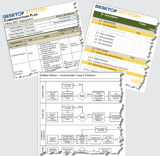
I went back to college full-time in 2009. By 2012 I was wrapping up my degree and looking for corporate work once again. A 7 month contract presented itself, during my last 6 months of classes, which married my years of IT communications with my newly acquired graphic design skills.
(I love organizing projects!) My portion of the project was to build the communication plan for the IT team running the program, as well as the process flow and work breakdown structure. It was fun to apply a simple branding to what can often be “blah” business documents.
![]()
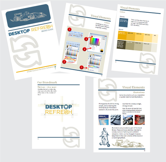
Note: While I guided the discussions for our team name (Desktop Refresh), the in-house marketing group created the logo.
I took the logo we were given (a simple logo with blue and gold colors) and built out the brand for the team. They were skeptical about the creative brief and brand guide, finding them quite foreign at first, but once they grasped the idea, they appreciated how it simplified communication and visual decisions.
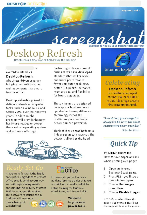
The business was preparing to do a company-wide revamp of their computer systems. That included rolling out around 10,000 new computers across the company. As the project’s Communication Director, I was tasked with creating email blasts as well as their corporate newsletter for the project. This was a Microsoft project, so I leaned on some of Microsoft’s graphics and added some of my own illustrations.
Note: Marketing had a tight hold on anything going outside of the team, so I believe they nixed the illustrations before this was actually published. It was a bit odd working with a Marketing group that was not familiar with trained graphic designers and their processes. I was told their designers were raised up in-house from the sales team. This was a real-world eye-opener.
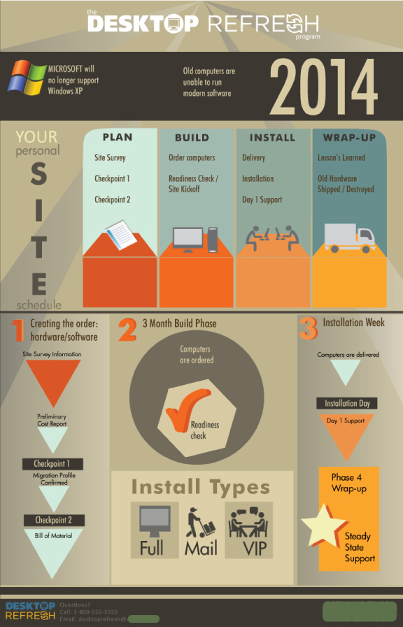
I also created the language, including an easy-to-understand phased rollout approach, around our process and built a poster sized infographic that made it easy for the team to explain the process to the hundreds of managers this project would be impacting.
Organizing is always an exciting challenge, but this was also the first time I was able to bring my graphic design training into the corporate mix. The project was a perfect way to wrap up my degree and give me real world experience in using design within a corporate setting.
Can I say that it was a thrill to see it all come together?

![]()
A 12 year old project management training business rebrand.

In discussions with the client, the important piece of the logo is the directional arrows (they have solid meaning behind them when she speaks to a classroom.)
Your Guide to Effective Project Management
The new logo creates the sense of movement, as well as the hint of a compass.
![]()


