Flexing My Wings

and chasing that ellusive Muse

Menu

Skip to content
  • Home
  • About
  • My Art
    • The 1980s
    • The 1990s
    • The 2000s
    • The 2000s Airbrushing
    • The 2000s Arizona Pottery Restoration
    • The 2000s Children’s Illustration
    • The 2000s Miniatures
    • The 2000s Quilting!
    • The 2000s Squangles – It is all about the kids!

logo

October 22, 2014 by Sheri Garvin

Every Day is Christmas – Logo and Branding

sign

Earlier this month was the grand opening for a new store in the small town of Hagerstown, Indiana, Every Day Is Christmas.

I had the privilege to work with the owner, Robin, in crafting the brand and logo.

FinalLogo_web


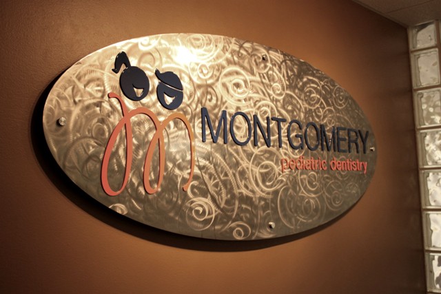
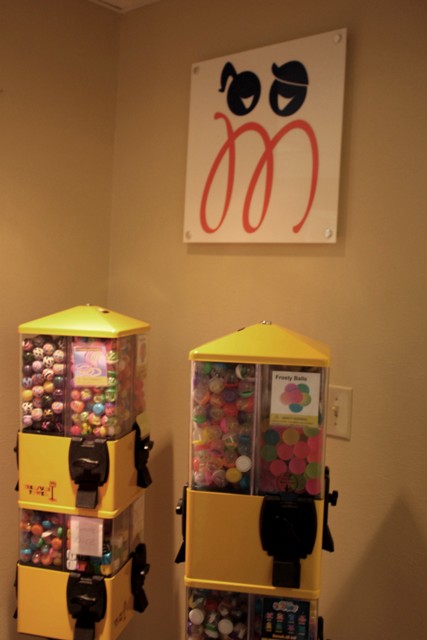
This brand was such a delight to craft a logo for. The owner has a vision for her store that goes beyond offering Christmas gifts all year long. She is building a location where the community can come together, as well as welcome travelers from around the country as they visit small individual holiday stores.

IMG_4221

In the back section is The Sidewalk Cafe and classes are being offered in the store where children and adults alike can come and make holiday crafts.

In addition, over the coming years, she will be adding one-of-a-kind local artist’s items. With those items, her vision is to tell the story behind the craft to bring a depth to the gift giving that sometimes gets lost in our harried era.

IMG_3918

Christmas holds a special nostalgic place in my heart also, as you have seen by the ornaments and gifts I have made over the years. It was pure pleasure to craft a logo that embodies the joyful whimsy of Christmas, and yet is also classy and contemporary.

Congratulations to a wonderful new store spreading joy all year around!

To link to their Facebook page click:  Every Day Is Christmas

IMG_3891

Share this:

  • Tweet
  • Email
  • Print

Like this:

Like Loading...
Posted in Branding, Client Work | Tagged branding, Christmas, Christmas gifts, Christmas tree, every day is christmas, hagerstown, holiday, IN, indiana, logo, shopping, store | 2 Comments
When a Brand is Embraced
July 3, 2014 by Sheri Garvin

When a Brand is Embraced

My task was to create a logo and stationery for a world renowned pediatric dental surgeon (from Cincinnati Children’s Hospital) who was opening his own private practice.

Bouncing off his first name, Murray, and the business name, Montgomery Pediatric Dentistry, I proposed using the an M and adding some whimsy.

Logo_Final


Wordmark_Final


 Front of Business Card

BusCard_Front


Back of Business Card

BusCard_Back

stationery_final

Dr. Dock took the concepts, embraced them and expanded upon them beyond my own imagination, designing his new office to support and reinforce his brand. It is such a thrill to see a client do this.

And what kid would not love a dentist like this? Colorful, basic shapes, bright arcade games, puppies, sports. So much fun.  (For a 360 view of the office click here.)

IMG_9810


Commissioned art work:

IMG_9811

His branding welcomes his patients and families from the moment they enter the office.

IMG_9815


Notice the toons on the walls and the circles on the chairs and floor.

IMG_9814


IMG_9816


Benches for the parents have backrests that are blue circles (and squares). Genius.

IMG_9818


Matching art of dogs, kids and matching themes.


IMG_9821


IMG_9817


A youthful patient’s contribution is perfection.

IMG_9823


IMG_9822

IMG_9820

IMG_9819

Share this:

  • Tweet
  • Email
  • Print

Like this:

Like Loading...
Posted in Branding, Client Work | Tagged branding, circles, Client Work, dentist, design, graphic design, interior design, logo | 1 Comment
June 20, 2011 by Sheri Garvin

The Journey

Assignment: Rebrand The Journey (click for original website) and update their website.

Logo is a simple wordmark, based upon the precedent set by high end restaurants.

Original Logo

Rebrand

The website was created in InDesign and exported as a .swf file (Flash site). Click on the photo to launch the Flash website.

Photos were pulled from Getty Images and Google Images.

Share this:

  • Tweet
  • Email
  • Print

Like this:

Like Loading...
Posted in 2011 Spring, Publication Design | Tagged branding, flash, indesign, logo, restaurant, sushi, swf, website | Leave a comment
April 2, 2011 by Sheri Garvin

Annie’s Rebranding – Packaging

To continue on (see initial logo rebrand) with the themes of Annie’s Homegrown, which are organics, earth-friendly, recycling, and kid-friendly, I chose to make the packaging simple.

With their current packaging, which is 196o’s psychedelic tye-die, I believe they are trying to hark back to a time that speaks to those values. However, their message only targets a very small group of people between 50-60. Maybe. The problem with this type of message is that a younger generation won’t relate and an older generation might take exception, depending upon their experience with the youth of the 60s.

So I chose a more modern approach to the concept of “all natural” with minimalism and using a recyclable cardboard box. Then it was a matter of designing every side, top, and bottom of the box. This included photographing the product (and eating any broken crackers… you can not have broken pieces in picture, for heaven’s sake!)

This slideshow requires JavaScript.

The only thing I would change is the recycling emblem – from green to white.

The teacher suggested I send them a copy of this. Hmmmm. This is so opposite of the colorful  tye-die, but you never know.

In addition to the package, we were to design a magazine ad. Once again, I went with simple and used one of Annie’s current taglines.

Share this:

  • Tweet
  • Email
  • Print

Like this:

Like Loading...
Posted in 2011 Winter, Media Design | Tagged annie's homegrown, branding, children, food, kids, logo, packaging, rebranding, typography | 1 Comment
April 1, 2011 by Sheri Garvin

Annie’s Rebranding – The Logo

Media Design had 2 projects this quarter, but both were large. The second project was to choose a product from the grocery and rebrand it. My idea was to pick a badly branded package so that no matter what I did, it would have to be an improvement.

Voila! Enter Annie’s Homegrown. From a design perspective, this package has more things wrong with it than I can list out here, including multiple renditions of their very complex logo, too many typefaces, and way too many messages coming at the buyer – from all sides of the box.

Upon researching their brand, I began to fall in love with the company and the concepts they were attempting to communicate. Concepts that were getting lost in the myriad of messages jumbled on the box. I decided to focus on two:

  1. Bernie the bunny (their mascot and current logo, as well as the shape of their graham cookies.)
  2. Their push for organics, recycling, and green.

Our first step was to re-create the logo. I chose to stick with the bunny, update his look, simplify the overall logo, and make him kid-friendly.

Current logo pulled from website

My logo / wordmark went through many iterations before coming to rest with the following look and color scheme. With this logo, I think there are opportunities to change his colors depending upon the product. I went with this choice to complement the simplified color palette I was planning to use on the packaging.

Click for final package rebrand.

Share this:

  • Tweet
  • Email
  • Print

Like this:

Like Loading...
Posted in 2011 Winter, Media Design | Tagged Annie's, annie's homegrown, branding, bunny, logo, rebranding | 1 Comment
February 20, 2011 by Sheri Garvin

Cat Logos Galore – 2

Next step with the logos was to move them into a black and white vector format on Illustrator. We use the black and white (and gray scale)  initially so that color will not distract from the form and function of the logo. This is also a way to tell if it will look good printed when color is not used.

This slideshow requires JavaScript.

Share this:

  • Tweet
  • Email
  • Print

Like this:

Like Loading...
Posted in 2011 Winter, Media Design | Tagged cat, logo | Leave a comment
June 28, 2010 by Sheri Garvin

Museum Wayfinder Logos

Woo hoo!  Finally an A on my logos and I think I learned something!  

  • Just MAKE the time to use Lynda.com as a refresher on software.
  • If I like the topic, I will throw everything I have at it .  My biggest hinderance in many arenas is when I don’t see the point of something I spend energy asking “why” and balking.   
  • I am no longer afraid of logos.


We had to choose a museum and create 6 wayfinder logos for it.  I chose my beloved Eiteljorg, bought a membership, and spent a lot of time on location (doing research…uh huh!)  I also took several of my buddies along at different points and introduced them to the museum (with plans to take more of them this summer!)  Needless to say I was in my own version of artist’s heaven!  This re-awakened that passion in my heart for painting and all things Native American.

What do you think?  Did I get it?  I know I still have a ways to go since I am only in the beginning stages of creating logos.  I also thought these were very simple, but I wanted that.  Compared to my talented fellow-students I felt they were very basic, but Beth encouraged me with a good grade, by telling me these were my best yet, and saying “simple is good”. 

If I were working with a client, I would take these to them and there would be several rounds of changes before the final product hit the printers.  So here is my first draft for wayfinders representing areas of interest in the museum:

  • Jewelry / Pottery / Interactive (they have a t-pee kids can get their hands on in this section)
  • Southwest Paintings /Performance arts /A generic logo for changing galleries

Share this:

  • Tweet
  • Email
  • Print

Like this:

Like Loading...
Posted in 2010 Spring, Corporate Identity | Tagged Eiteljorg, logo, logos, museum, wayfinders | 1 Comment

Enter your email address to subscribe to this blog and receive notifications of new posts by email.

Join 397 other subscribers

Newest Stuff

  • Grandma’s Kitchen
  • Everyone’s a Critic
  • Sweet Lily Girl
  • 2 Kitties and their Pup
  • Some East Coast Fur-babies

By Course

Blog at WordPress.com.
  • Follow Following
    • Flexing My Wings
    • Join 132 other followers
    • Already have a WordPress.com account? Log in now.
    • Flexing My Wings
    • Customize
    • Follow Following
    • Sign up
    • Log in
    • Report this content
    • View site in Reader
    • Manage subscriptions
    • Collapse this bar
 

Loading Comments...
 

    %d bloggers like this: