Color Theory: Paul Gauguin

Finally we get to choose the medium we want to work in for our Color Theory class.  We were also permitted to pick a picture from a pile the teacher laid out.  I chose Paul Gauguin.

Project:  Abstract the painting down to 5 basic colors and match them (term: local color).  2nd rendition: change the mood by changing those 5 colors (expressive color).

This was so easy that sometimes I wonder if I am missing the point somewhere!

Original is Paul Gauguin’s The Flageolet Player on the Cliff.

I pulled out a square portion of the painting to simplify the 5 colors so it looks abstract.

On the left I used pastels to create the local color.  On the right I used watercolors on Arches very thick watercolor paper (the only way to paint with watercolors!) to create the expressive version.  The only thing I would have changed is to do the expressive in more of a blue tint, shade, and tone to represent nighttime a bit more specifically.

Acrylic Breakthrough!

Illustration board!!!  2 simple words that have made ALL the difference!  I saw some students from another teacher’s color theory class and their work looked so nice.  “Is that acrylics?” I asked.  “Yes, we have to use illustration board for everything in Diane’s class!”  They were complaining.  They should try watercolor paper!!!  Diane is a painter, though, and she would know the creative angst cheap watercolor paper and Liquitex acrylics would send an artist into!

So… I purchased that expensive illustration board and went to town on this week’s project.  What an amazing difference – the experience does not compare. 

No…I still do NOT love acrylics, but I certainly gained a lot more pleasure working these color combinations within geometric shapes than I would have had on watercolor paper. 

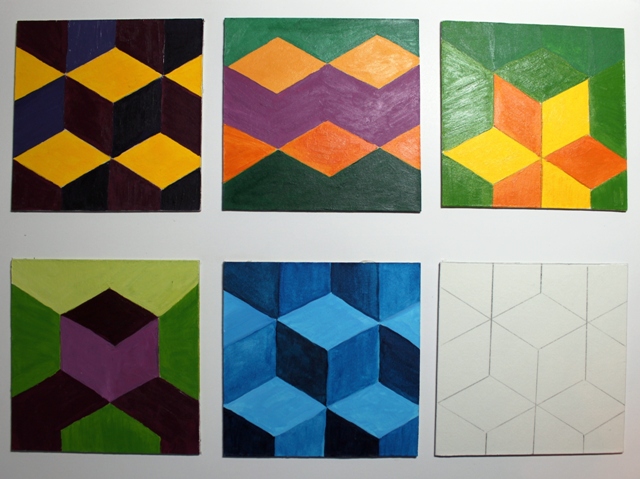
This project was about combining color to create different visual effects on a single geometric design (the black and white line drawing in the photo.)  I chose a quilt pattern called “Tumbling Blocks” which can be made to look so many different ways.

Teacher took one look and said, “wow.”  However…she is so quiet I have absolutely no idea what that meant.  I thought maybe I had done it wrong.  But she said it was fine.  I am assuming it was more an expression of suprise (probably at the illustrator board).  She is a quilter and would definately recognize the pattern(s). 

Another Logo

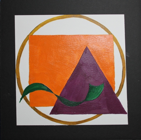
Another logo?!  Only this one was done in acrylics and let me tell you, it was a pain!  I can not get Liquitex acrylics to behave.  You know… stay in the lines, cover the paper consistently, etc.

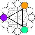
This is a simple logo of the 4 personality trait symbols: circle, square, triangle, and squiggle.  From the color wheel we had to pick and use triad colors:

triad colors

I was just attempting to get the project done in order to spend time with the family, so this is really uninspired.  It does contain all the personality trait symbols though: Circle/Square/Squiggle/ and me… a triangle!

Still got a 100% on it because I met the criteria.  Not happy about the watercolor paper/acrylic paints execution!  Ugh! 

IMG_3772sm

Uninspired logo

Credentials of a Color Theory Teacher

Anne Nickolson is my Color Theory teacher.

She never talks much about paints so one day after class I asked her, “What is your medium?” and she answered “Textiles” and sent me her web site.

I was absolutely blown away.  She is a quilter of great magnitude and has shown in 12 countries!!!  She is also extremely shy or quiet or something because she won’t talk about her work.  Check out the Commissions section!!!  Open the Tree of Life (located at Methodist Hospital).

And I know she has more than this…this is just a single body of work she collected into one website.  Makes for a gorgeous site!  I would like to sit down and talk with her… but she just is not a talker.  Funny for a teacher, eh?  I pay money to get a chance to go see the work of quilters of her calibre, but have never talked to any… and here she is my teacher!!!  But won’t talk!

How frustrating is that?!  Very!

Color Theory – Various Combinations

This was one boring week.  Not the least was this project which took a full day to complete.  Why?  Because we had to mix our own paints and had to use a specific mixture of color combinations (complements, split complements, and the brown is a mix of 2 complements.)

Let’s just leave it at:

  • I don’t like acrylics because they dry very quickly
  • I don’t like acrylics on watercolor paper because it does not allow for a smooth line
  • I don’t like acrylics because blending is very difficult
  • I don’t like acrylics because they are globby if you want to cover the white (and then they dry and leave little white speckles…not sure what is going on with that!)
  • I don’t like acrylics because you can not achieve a smooth line
  • I don’t like acrylics

Using specific color combinations

Genesis 1:4 – God Seperated the Light from Dark

Georgia O’Keeffe I am not… but I preferred copying some of her ideas as opposed to Picasso! 

Assignment:  We were given a list of artists to pick from.  Then we were to take one of their paintings and photo copy it in black and white.  From that point, we were to take the anachromatic forms and give it life using 1 color (a hue and its tint, tone, and shade) to paint half the piece.  Any half we desired.  The other half was to be done greyscale.

My hue was a tertiary color: orange-yellow.  It almost looks green when black is added to it and I liked that.

Remember, I don’t do acrylics, but this quarter I just have to suck it up and do it.  But here is the really funny part…this has gotten rave reviews!  Charlotte claimed it for her own, the teacher requested to display it next quarter, and even my very country sister-in-law, Annie, likes it!!! 

When I was done, Charlotte thought it looked like the point in Genesis when God seperated the light from the dark.  I liked that.  Don’t you think that the first verses of Genesis were probably quite a tremendous and chaotic time in the earth’s history?

Maybe I missed my calling by sticking with realism and oils or watercolors!

Gen. 1:4 - ...and God seperated the light from the darkness

Gen. 1:4 - ...and God seperated the light from the darkness

Primary, Secondary, Tertiary…oh what fun

Color Theory started out with a bang… NOT!

The first 2 classes were all about taking our 3 primary colors (red, blue, and yellow) and white and black, mixing them all and coming up with a very tedious color wheel and then a color panel. We did all this with our Liquitex acrylics. I despise mixing acrylics, so there you go! A dull few weeks as we kicked off the quarter and to add to that, we were not allowed to be creative with it.  It was just an exercise in color mixing.

However, it was easy on the brain, which was really nice!  I was so stressed with the overload of projects and doing an online class in 5 weeks, that for this alone I was grateful for the menial tasks in Color Theory.

Primary:  Red Yellow Blue

Secondary: Orange Green Violet (purple)

Tertiary: the colors in between each of those such as yellow-orange and red-orange.

Color Wheel

Color Wheel

For the panel, you pretty much mix up a big pile of the color on the left, then divide it into 4 piles.  Add white to one, black to another, and a grey you mixed to another.  Bada bing…

To add to the tediousness, you then have to cut out a 1 inch square of each color called a paint chip (like in a paint store) and paste it onto another page. 

Excuse the bad photography…it was a last minute snap before taking it to class. 

Primary color / add white (tint) / add black (tone) / add grey (shade)

Starting color / add white (tint) / add black (shade) / add grey (tone)