Script Writing Update

There is not a whole lot to be said about the script writing class.  Basically, we are learning to write scripts for advertisements, a training video, and this week it was a website proposal with embedded videos. 

It seemed much easier to do a real proposal with a real project, so I worked with a client to start planning a website that she is interested in setting up.  It was a great exercise for both of us!  I feel like this project has prepared me to work with a potential web client more than any other so far.  I enjoyed it.

A glimpse of 3 fun pages out of my proposal packet…

Cover Page (fun?)

The site map did not have to be huge.

Home page layout

Typography: Tobias Frere-Jones

Instructions were to produce a brochure in black and white on the typographer of our choice. I chose Tobias Frere-Jones, a 40 year old whom I have found fascinating. How can typography actually be interesting?!!! But I am finding it very much so!

This was a double sided, single fold down the middle, brochure.  You can download the entire brochure through the link below:

GarvinSheri_Proj5_Brochure_II

The front and back pages were created to "bleed" onto each other.

Harrison College – a 2 month consulting project

Woo hoo! Don’t underestimate the power of social networking! A previous boss learned of a need at Harrison College for a “Curriculum Development Technician” and looked me up on Facebook. She sent me the contact info and personally recommended me to the project manager.

I winged off my resume on a Thursday between classes, got a call 2 hours later during Typography, and stepped out to take it. I was sitting on a table in an empty classroom hammering out the contract details when Kevin (my instructor) walked in. That was a bit amusing for me, but not necessarily for him since he had no idea what I was doing and gave a frown. (I later explained it to him.)

Hired…and started work Feb. 9. Pretty cool, eh? I am thrilled because I am so ready to be back at work and doing something that is within my competencies! School is fine, but doing “real” work is validating. My friends keep telling me that school IS my job, but somehow, it feels different.  And by the way, the work is right up my alley – organizing information and specifically instructional content, plus it is keeping me tied into the whole e-learning world from the supplier side (as opposed to the consumer side.)  Needless to say, I am loving the project.

Moral of the story:  use social networking wisely.  You never know who is watching or who might look you up and when!  I guess that goes for blogs too!

Dissecting a Font

Typography is an interesting class, but I also think we are learning things I will never use in my entire life. Such as much of the terminology of a typed letter. While the history of type is interesting, it is probably one of those odd things from college that will stick in my head til I am 95 and be of absolutely no use to me unless I am in New York City and end up in the Cash Cab.

However, I am convinced I will remember that the curve that connects the serif  to the stem is called a bracket and that some letters have beaks while others have bowls.  And don’t even start me on the floppy ears, tails, eyes, spurs, and loops!  It is crazy intense!

Project 3 was to dissect the type and to create our own hand made type.  I preferred to practice writing with my Wacom tablet than to expend undue energy making it fancy.  Some weeks you have to make choices and this week practicing with my Wacom won out.  It is actually much more difficult than I imagined and I need all the practice I can get!

FYI – below is a Wacom tablet for those who might not be familiar with them…

So the lower example is my hand drawn font a la Wacom tablet in Adobe Illustrator.

Jacob Dobson – Sculptor

I admit, I chose to take my Art History class online in the second half of this quarter (starting 2/19) because I was sure it would be a boring course (totally forgetting that being in an art college would make a huge difference…duh!)  Unfortunately, the school would not allow my previous art credits to roll over, so this will be my second or third time through.  Let me correct that… it will now be my third or fourth time through.  No complaints though… repetition is needed with my brain!

However, I am a note taker for a student at the Art Institute (through the Work Study program).  This quarter I am taking notes in Jacob Dobson’s Art History class and am finding the note taking a mesmerizing task.  I get so caught up in his lectures, which are fascinating, that I have apologized to the student for the massive amounts of notes I am taking.   [Let me also mention that the online course and the ground courses are very different.  They are even studying different periods in time, so I am going to get a broad art history education this quarter!]

NOTE: Below is a photo of Jacob Dobson.  I snagged this off of a photo I found online at http://www.jacobdobson.com/

His outlook on life is also amusing and, I admit, I am in agreement with it so far.  (He has a very dim view of our current pop culture and it’s effects upon youthful minds.  I really get into his diatribes on the subject, but often wonder what the youthful minds around me are thinking.)  Up to now they (and me too… I just don’t have to take the tests) are studying the 1300s-1500s.  We sort of side tripped on the whole Rome-during-Michelangelo’s-time, which was quite delightful, in part because he went to Italy last year and gave us first hand experiences with the art pieces.  He gets excited about what we are studying and brings a new perspective to things I have seen in books for years.

In addition to being trained in painting, he is also a scuptor. Being more of a 2D artist, I find that intriguing.   Last week he showed us the steps taken in creating this life sized statue of a child that was commissioned from him, and it gave me a new appreciation of bronze sculptures.

Check out his blog and the huge doorway called “Articles of Faith” that he is in the beginning stages of creating!  It is already creating a stir and 2 of the panels are in a traveling art exhibit.

Needless to say, in the 3 quarters I have been here at this school, I have been quite pleased with the overall level of instructors!  A totally different experience than IUPUI in that the training is relevant, current, and personal, in addition to having teachers who are “doing” as well as teaching.

Introduction to Type

My Thursday afternoon class is Typography.  Not difficult, but definately time consuming.

The first project was to design the front cover on our binder using only one font type.  The writing is all the requirements.  The design was up to us.  I was so intent on the design that I messed up the oblong of body type, which I should know better!  I was not paying attention… hmmm… right brain (design) / left brain (technical).  One of the things I often forget is the need to use both sides of the brain!

The second project was to create the face of a famous person using a single font.  I was bored and feeling a bit down, so decided to reach into my childhood and do a cartoon character (that was allowed.)  It was fun.

Mr. Magoo in Matura font (can you see the letters that make up the various parts?  I used some straight lines and parenthesis on some of the long or curved lines, but otherwise tried to stay true to the font face.  The eye is an N, for example, the nose a C, the chin a G, the collar Ds, fingers Ms… etc.)

Marketing – My Passionate Project

Suprisingly, I am truly enjoying my online marketing course!  We could choose any company to work with for 6 weeks and I chose Compassion International because I was curious about it.  Amidst all the research and statistics, I have found a topic that has sparked my passion.

Over 1 million children are being sponsored

The first week of the quarter, Haiti suffered a devastating earthquake, so Compassion International has been all over the Christian radio for weeks on end. 

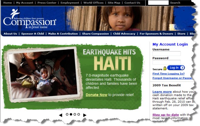
The Compassion website is featuring the needs in Haiti

Compassion has been serving Haiti for over 40 years and were working with 65,000 children in that country prior to the quake.  As of this writing, they are missing a large chunk of those kids and working to find them.  A heartrending situation yet filled with wonderful testimonies of God’s Grace.  What is positive for this organization is that they already have many contacts via the local churches and organizations they work with, so they have been able to bring in support more efficiently than most organizations that are trying to help.

I also read the autobiography by Wess Stafford, “Too Small to Ignore” and it has impacted my life in ways I will probably not be able to fully appreciate until I can look back over the span of years.  It is up there on my list of the most important books I have ever read.

To add to the immersion in this organization, I am using it in my Career Development class by collecting job opportunities as my homework each week.  In addition, my first project for the Script Writing course was to write 3 thirty second tv advertising spots on one product by week 4.  I did all 3 spotlighting Compassion in Haiti and making a call for donations.  The teacher was quite complementary and said he had nothing to suggest changing.  I think they came across so well because of how deeply I am getting to know and care about the “product”, thus it allowed me to write well.

Needless to say, I have fallen in love with this particular organization. 

On Feb. 2, Wess Stafford, the President of Compassion, spoke for 30 minutes at Moody’s Founders Week event.  The speech is well worth hearing!  If you have any feeling for children in poverty, this will give you hope and possibly help you understand a bit of why I have become so passionate about my marketing project.

Click on the Audio link

A slow start

Quarter 3 started out slow and easy.  4 classes but none of them are too strenuous, and then on week 2 we did not go to class on Monday.  This was actually good since I discovered I had been fighting a sinus infection since early in Dec. (A doctor visit at the end of the year did not catch it although I told the doc that I had these symptoms prior to getting a cold.  Sometimes I wonder about my doctor!)  So, I needed the time to recover because I was feeling pretty lousy!

I do have the pleasure of seeing one of my Design Concepts projects on the wall this quarter!  See my Tacy kitty in the center?  I am delighted that she is the project that Beth selected!