Next step with the logos was to move them into a black and white vector format on Illustrator. We use the black and white (and gray scale) initially so that color will not distract from the form and function of the logo. This is also a way to tell if it will look good printed when color is not used.

Field Trip – Bodoni Typeface

Typography by Alex Smith
Image retrieved from http://www.fontco.com/font-facts/bodoni.php
For my online typographic Field Trip, I chose the above poster, which uses the Bodoni typeface . Bodoni was designed after the work of Giambattista Bodoni, an 18th century typographer. I like the typeface and decided it would be interesting to learn more about it.

Image retrieved from http://www.fontco.com/font-facts/bodoni.php
For one, it is definitely a readable, Modern, serif type. There are many versions of this typeface as typographers have reworked it over the years. Some versions of it degrade when used in body copy, but there are a few fonts that can be used in body copy as well as headings, posters, etc.
We are all used to using Times New Roman, so in comparison, this serif typeface is smaller and more condensed. When analyzing the font you can see there is a distinct difference in the serifs with the Bodini serifs being crisp and direct, more flat (slab) and without brackets. Also the ears remind me of Pluto’s ears!
Funny, but now that I have made that association it has stuck in my head. Doesn’t the ear on the “g” above look like Pluto’s ear below? They may have even used a version of Bodoni in the text of Pluto’s name. Even though the O is fatter, it still looks pretty close, even as it is styled. Now I am going to be looking at Disney characters to see if they derive some inspiration from typography.

I think this typeface is saying “I am easy on the eyes, clean and crisp. What you see is what you get, no surprises.” It is a very up-front typeface. This would be used in a design that is meant to be easily read and understood with no hidden agenda. Advertising is a good use of this typeface. You might be surprised at how often you’ve seen it and never realized it. As an example: Bodoni has been used in posters such as the one for Mamma Mia!

Share this:

Magazine Layout
Since this week was about typography, we were required to create a magazine layout consciously using type. I could not help it, it was such fun creating my calendar a few weeks prior, that I reached into the work I had done with the vintage children’s books and went from there. So if this looks familiar, it is because it is similar to one of my calendar pages and plays off the book “The House that Jack Built” from The Gutenburg Project (a site I have fallen in love with!) However, it was not a previously created homework piece! I want to be very clear on that!

For a full description of the project, feel free to click on the pdf link:
Share this:

Create Your Own Type
I don’t know what I was thinking… it has been an exciting idea in the back of my mind to create my own handwritten type for several quarters now, but for some reason I got it in my head to go a different way and do something totally different. The first several weeks of this quarter were so overwhelming in the amount of work assigned, that I think I was concerned that I could not give it the attention I wanted to give it, so I chose to challenge my Photoshop skills. However, one day I will design my own handwritten type because I really want to.
So… I chose to use “found items” and have rediscovered a love of miniature marshmallows, which are now on my snack list.

The process turned out to be laborious so creating my own font would have been much easier and the lighting on a few of the letters could not be corrected. Since they all had the same light source, I am not sure exactly what happened with those.
Process:
- Photograph each individual letter on a black background using specific rules that I set up for width/height etc.
- Get into a mini marshmallow war with the roomies to reduce the tediousness of arranging little spongy things in a straight line
- Pull image into Photoshop, remove background, adjust lighting, as well as smooth out the edges of each marshmallow!
- Eat a few marshmallows to reduce stress
- Place them in a grid in alpha order in Illustrator
- Toss a few marshmallows to the dogs to reduce stress
- Create a background that looks like hot chocolate
- Voila – print, mount, done! (Eat a few more marshmallows to celebrate.)
Share this:

Cat Logos Galore!
In Design Media we are branding a zoo of our choice for the first 5 weeks. Since I am also working with a charitable client that is in cat rescue, I opted to make this project a cat rescue “zoo” and explore some options for my client.
The first step was to write a creative brief and thumbnail many options. I enjoy the sketching!
Share this:

Web Quest – Typography
This week’s topics were lettering /typefaces and one of my favorite type foundries has to be Hoefler & Frere Jones. I have researched and written a paper on them in the past. For those of you who are not designers, you might be surprised to learn that the computer generated text you read is usually a very expensive font designed at a type foundry. That font was paid for by the software company in order for them to include it in your package for your use.
Some of those typefaces (a collection of fonts in one family) are inspired by old, hand rendered type from centuries ago and others are more recent such as Arial and Helvetica. There is a whole fascinating history around the topic of typography and it can be mesmerizing how typography impacts history (or maybe that is just the geeky graphic designer in me showing up.)

Hoefler & Frere Jones:
http://www.typography.com/fonts/index.php
This is a professional type foundry. This is the type of company you would hire if you were setting out to create a brand for your own company. They have designed fonts specifically for brands such as Martha Stewart Living, Wired, and President Obama.
http://www.typography.com/fonts/font_overview.php?productLineID=100018
I especially like the numbers fonts they put out such as the Greenback, based on the look of our American dollar. They also suggest a font that goes well with it, as if you are choosing a wine to compliment your dinner!
You can even test drive their fonts. Example: http://www.typography.com/testDriver/index.php?productLineID=100018
Expect to pay for a font from them if you want to keep it. Numbers alone is $129 for a single computer user, but you can price it out for up to 50 users.

Font: a single style in a typeface such as what you are reading here. Another font using the same typeface would be Times New Roman Bold. You thought you were just making the lettering darker, but in fact, you are using another font!
Typeface: a collection of fonts in one style such as Arial: Arial bold, Arial italics, Arial Narrow.
Right or wrong, these terms are often used interchangeably and I find myself guilty as charged.

Share this:

Web Quest – Vintage and Retro
One of the things we do in Design History each week is a search for good online links that relate to that week’s lecture material. Those I find interesting I will include in a post each week.
Graphic Design from the 1920s and 1930s in Travel Ephemera
http://www.travelbrochuregraphics.com/
This is an online gallery of a personal collection of travel ephemera. It is an astounding group of images by a person who has spent nearly 20 years collecting old posters and travel related pieces as he has traveled around the world. What I find very fun about the site is the joy that the creator obviously feels in the world of old ephemera. It is an amazing site I would recommend bookmarking for future reference!
Smashing Magazine: Celebration of Vintage and Retro Design
http://www.smashingmagazine.com/2008/04/21/celebration-of-vintage-and-retro-design/
Smashing Magazine itself is something I recommend to any designer who wants to keep up with current trends and design related content. However, this is a wonderful writeup with excellent photos of vintage and retro design. Some of the designs in this particular collection are more modern, but reflect a vintage style. It is a “celebration of retro and vintage design — ads, illustrations, book covers, pins and posters from 1920-1980s.”
The Metropolitan Museum of Art: Egyptian section
I love this location for an overall research location with a historical background. I love art and I love history and this site has been tremendously helpful when I am looking for a specific timeline or image examples from an era or people group such as the Egyptians. It covers a lot of ground including Asia.
http://www.metmuseum.org/toah/hi/te_index.asp?i=14
They also have a resource link list that is helpful: http://www.metmuseum.org/education/
Share this:

Design History – Ancient Designs

Design History is my online class for this winter and I have fallen deeply in love with it. Week 1 started the subject off with a bang over discussions of the beginnings of design. With that, we were to take an old style and imitate it in a logo form for a fictitious tourist company.
Following is my client presentation for a logo and business cards for a hot air balloon company in Arizona. It is a bit tongue-in-cheek as I do realize petroglyphs, rocks, and hot air balloons don’t really go together. It was fun!
For the full presentation with thumbnail sketches and more images, please click the following pdf link:
Garvin_W1A3_ClientPresentation

Share this:

Christmas Break 2010
Christmas break was approximately 4 weeks long. With all that time, you would think a lot would get done, but on the contrary, it seemed I only accrued more to do! I did fit in some fun with the family with our seasonal cookie day, Christmas Eve and Christmas Day, visits to the Eiteljorg museum’s first train setup, and visits with friends.
Incidentally, this was also when one family of kids broke out into chicken pox (Christmas Eve) and promptly shared it with their cousins on both sides of the family. Kids at our church were dealing with the result of that all the way through Jan.
One design related item I did accomplish was the annual family calendar that did not get printed until the end of January due to printer breakdown.
This year I chose a theme of vintage children’s books and had a lot of fun with that. This has always been a favorite topic, but the more research I did on it, the more in love with it I fell. I even purchased a couple of vintage books… a Mother Goose book that my Mother grew up with and one of my own first books that is falling into tatters. Now I want to start collecting vintage children’s books! The art is so amazing (especially because it is not computer generated!)
I did not include all the months, but here is a slideshow of some of them and some wonderful links are included below.
Vintage Kid’s Books My Kid Loves – a blog with wonderful images
Project Gutenberg – Free vintage e-books – the children’s books have gorgeous photos and you can download these to your e-reader
Share this:

At Home with Pencil and Paper
While I struggled with the advertising projects, the Life Drawing classes were an oasis for me. I felt like I had finally come home and was losing myself in the homework. I understood this. It was basic. It was kinetic. It involves the whole being – spirit, mind, body – as well as many senses that are untouched in my computer work (which is still very left-brained for me.) It is difficult to explain.
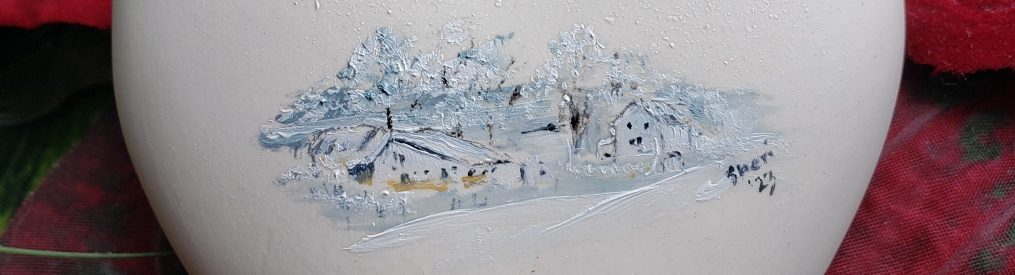
When in the lab, I lose track of all time and the world is upright. Nothing else matters but the challenge before me, and I fell in love with capturing in graphite the reality I was experiencing. This then translated over to my technical pen work, which can be seen in my Corporate Communications final and this year’s Christmas cards. It also inspired me to pull out my oils and brushes once more and start painting my beloved Christmas ornaments.
I came back to the “me” I love being… the artist me… the me who loves the world she sees through appreciative artist’s eyes. I am happy and it is impacting more than just my school experience… it is eveloping my whole world.
Here is my final lab drawing on my large sketchbook. This is with a live model who would stand for 20 minutes at a time, then take a 10 min break. Each time she came back the folds in her clothing would change, so that was a challenge. One of my fellow students wasn’t thrilled with the back view, but the front view involved a shirt full of ruffles and a textured vest… I think this was the easier view for the timeframe we had (2 hours or so). I could do this all day long!


