Drawing – Marco Island

8 days on vacation during a college quarter can do weird things to your pleasure trip.  I spent a lot of time doing homework.  The odd part of that was, it was mostly my drawing homework and we were off for Labor Day for that class.  I should not have had so much to do for it.  But I did.

Projects:

  • 3 point perspective building
  • Extra Credit (2 point perspective)

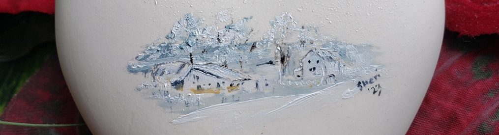
3 point perspective: Our condo building with reduced detail.

Teacher loved this one and really felt I nailed it. I told her (this was at the in class critique) that I kept hearing her voice in my head “Make it darker, I want to see dark!” and “Adding that is too distracting” (so I removed some tiki huts etc.)  The class laughed and she said “Oh no… I am in your head!”  But I guess it worked because this was an A+.

IMG_2927sm

IMG_1631

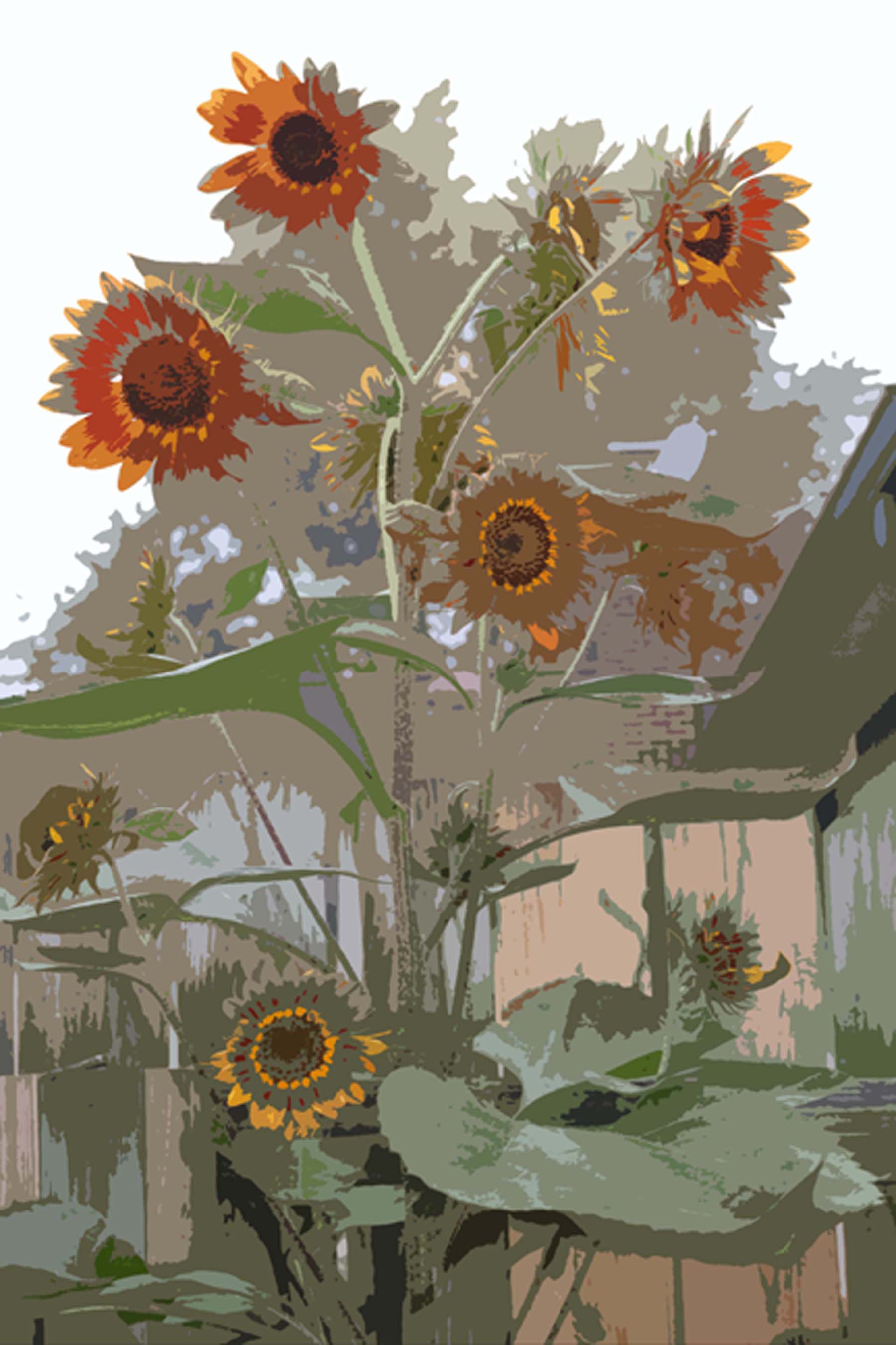
Extra credit: On the veranda by the pool.

I got full credit for this one (which is good since I forgot to bring in part of my assignment for this week) and the teacher requested permission to place this on the wall outside the classroom for the next quarter.  Of course I accepted!  That is an honor.

Here are my two locations for doing this work… I love this “studio!!!” Can I have one (or both?!!!)

IMG_1628

IMG_1630

Sunflower, Goodmorning!

Design:  Abstraction 4 Step Process – Take a photo and create 3 abstracts. The 3rd abstract must be so abstract that it does not look like the original photo, but the other 2 must show how it is related.

My sunflowers were chosen as the subject because they seriously needed to be commemorated this year.  I had fought chipmunks and puppies to get them to this point and they are gorgeous.

My biggest challenge on this one was to pick the photo out of hundreds.  Finally, I went and took a few more…then narrowed it down to 2.  This was so much fun I did this on 2 different photos.

After spending time and a lot of paint and paper to create the 4th image, I opted to keep things simple and use photoshop as my tool.  It was really fun playing with photoshop to do these renderings.

The first set of 4 was interesting and I really liked it a lot so that is what I turned in.  The second set was another option that I liked a lot.

What I turned in:  The original photo was taken on a foggy morning, thus making the colors and background sort of flat.  I like that but the teacher, Scott, said that made it almost abstract from the beginning.

As it turns out, it was not exactly what he wanted.  Sometimes I have to double check what Scott says.  I love his class, but sometimes my notes and the gal next to me are saying opposite things!  I am sure we are both hearing what we noted.  It is all in how he phrases things.  Usually I am the one who is right…this time I was not.

I think that second option of 4 might have served the purpose better as it more directly shows a progression to the abstraction…thus I include it here as the “road not taken”.

Panorama

Photography homework:

Tool: Rebel T1i EOS 500D
Setting: Manual – metered for the rich sky coloration

We were to take a panorama and then either put it together in Photoshop or physically print up to 7 pictures and paste them to a backing.

I chose Mom’s farm (my childhood stomping grounds). After several tries with lighting (all photos were suspposed to have the same exposure which was hard because of the trees), I obtained an exposure that really showed the clouds off and still kept a rich color going on.

The professor said it had nice coloring with a faded, old world look to it.  Hmmm…Mom just painted her fence.  I am not sure she will be thrilled about that faded comment.  I think he meant how the lighting caused the whole picture to appear.  [Note: we were to turn it in with the edges showing so I am leaving it like that here. There is one missing on the right side, but it won’t all fit here.]

I had fun with this and it gives me good feelings.

Panorama blog

Update: Grade is 100% and the teacher said he showed it around!  Funny how something I think is just ok will actually impress the teacher.  Other times, I think something is cool and I miss the boat.  As my teachers often say… “It is all subjective.”

Fabric Swatch

Recreate a fabric swatch in Adobe Photoshop, was the instruction.  No geometric shapes or plaids.

I think I sprained something in my brain on this one…and it hurt!  Very labor intensive even after I figured out some short cuts. 

The top is my version and the bottom is a piece of the fabric.  When I pasted it onto the black matte board, it darkened the fabric, so that was disgusting.

However the teacher loved it, so I did good on this one. (Got 100% and she requested to place it on the wall outside of the classroom for the next quarter.) This is a crazy class for me…I can nail some projects and get a C on other projects.  Crazy! I am just hoping to pull a B out of the class. 

IMG_1317sm

Yes Paste Allergy!

photo_new_yes_paste2Those of you who know me probably know that I am back in college and changing my career due to severe and life threatening allergies.  What you might not realize is that over the past 2 years I have been increasing in health and physical stability due to a wonderful medical doctor who practices a natural allergy elimination technique termed NAET

Being at college, symptoms have returned (fortunately, none life threatening), so I went in for a treatment today.  One thing they can do is test to see if you are allergic to something new in your environment (as long as you can bring it in.)

Sure enough… YES paste was one of the main culprits (used to matte nearly everything we do and it is on all the matted art posted on the walls at school.)  Somehow I kinda guessed that.  

The other thing I suspect is the perfumes that I sit in class with for 4 hours at a time.  Some students just load it on not realizing what it can do to people around them.  It is a hazard I have to deal with…at least it is not 8 hours a day 5 days a week.  Think maybe I could haul some of them in to Dr. Honan to be tested?  “Hey, Doc, I am bringing my whole class in!  Can you tell me if I am allergic to them?”

Oh…and after some online searching on forums, Yes Paste is not considered archival!!!  It yellows.  Ok… time to do some paste research!

Cat and mice…a figure ground

Upon occasion (well, quite frequently in my Fundamentals of Design class, actually) I get a project that seems like an impossible task.  This was (another) one of those.

Our assignment was to create a figure ground (which harks back to the Gestalt concept we have been dealing with for weeks now.)

The principle of figure/ground is one of the most basic laws of perception… In its basic sense, it refers to our ability to separate elements based upon contrast–that is, dark and light, black and white.

or…

The figure-ground principle captures the idea that the visual field is normally divided into two parts, figure and ground. The figure-ground principle is very much a part of our everyday experience. If we notice a book on a table, we see the book as a figure and the table as its ground. The edge that divides the book from the table bounds the book but not the table. The table is assumed to continue under the book. We would be very surprised if, when we lifted the book, we discovered a hole in the table the size and shape of the book.

So…black and white image yet take it a step further and make something similar to this famous image…

FigGrd Is it a white vase or is it two black faces? 

This was painfully difficult for my brain, but eventually I came up with a concept that I liked using our cat, Stitches.  2006-02-08 022

What I was not sure about was whether I satisfied the teacher’s requirements or not.  Was it too obvious?   I was a bit hazy about that, but after trying to work it out with marker first, using tracing paper and carbon paper to duplicate and then flip the image, I finally committed it to paint. 

IMG_1079

 Arrgh!  Not being used to working with acrylic, I did not like the effect at all.  5th time is a charm and using airbrush paint (which is thinner and easier to apply) on a thick Bristol paper, I completed my final piece.

Ta da!!!

IMG_1077

Side Note:  My Mom thinks this is creepy.

Critique (other than Mom’s):

  • Teacher said I nailed it, so…happy teacher…happy student.
  • He did say I could have switched to kittens instead of mice if I wanted it to be more cuddly (I told the class my Mom said it was creepy.)

Ellipses

Remember that Drawing class I think is so boring? It got a little more interesting this week when the teacher introduced the technical aspects of drawing ellipses.  Who knew?  Or rather… I really don’t recall ever learning about this but I bet I did…surely!  I got to use my new compass.  Woo hoo…

IMG_1080

These things are NOT easy.  And technical drawing is not fun for a fine arts artist.  And another thought… why didn’t they teach us in high school that math and geometry was going to be important for an artist throughout their life?  I totally skipped geometry thinking I would never use it.  How crazy is that?

Oh…I got a B on these because I messed up one of the elipses…ha!  Told you they were not easy!  If you look at the “cup”, the bottom elipse is not in the same perspective as the top.   Some other students had the same thing happen…we follow the instructions and still miss the boat.

Wired!

A good description of my art over the past several decades would be 2 dimensional.  So when the Design instructor informed us that he wanted a 3D project made out of wire, it was a bit intimidating. 

That afternoon after class I sat on the back deck with all the proper tools around me (don’t forget the ipod! you need that when being creative) and it felt like a very blank space in front of me.  A blank 3D space. 

IMG_0689sm

After wrestling with the wire and nearly poking my eye out, the project was shelved for the weekend while my head worked on various options. 

For some reason, the idea to take the wire to my Mom’s after church on Sunday took hold.  There is something very inspiring about having the kids around me when I am creating… so I packed up my tools and supplies (with the added item of safety glasses!) and Sunday afternoon I sat there with an audience as I created my little nephew at his fishing pond. 

IMG_0899


[A pre-drawing gave me an idea of what shapes I needed to create. The kids were fascinated with it as they tried to work out in their little heads how such a funny drawing could mean anything!]

  The kids LOVED it! My siblings laughed at my glasses (but after watching my dangerous shenanigans with the wire they agreed it was a good idea for me to wear them.) My Mom said that at least my audience (the kids) were able to visualize my concept.  <g> 

He was really hard to grasp until I finally put the pole in his hands and stablized him. (Notice the fish on the end of the line?)

In class, the final part of the project was to draw our wire structure.  Ha…THAT drawing will not be included here!!!  It looks like a bunch of scribbles when put on paper!  Final resting place of this little guy will be on a shelf in my nephew, Nathanael’s, room despite protestations of his mother.

IMG_0880sm

Morphed image

I am finally catching up with my postings and am able to write this after turning this project in today.

Adobe Photoshop Project 2 was actually fun!

Criteria:

  • Make a morphed image of two words:  Eye/Storm

My Response:

  • It seemed too boring to just put an eye in a storm or a storm in an eye…although that would have satisfied the criteria just fine
  • I went more for a Native American feel to it by morphing an intense wolf with a cyclone

2008-02-15-wolf

Original wolf photo


Cyclone_Catarina_from_the_ISS_on_March_26_2004


Original cyclone photo

Morphed image – the eyes in the storm…

jpeg web

Critique:

  • Show less of the fur
  • Instructor thought I would have made a better morph if I had really kept it just to the eye

Perspective Drawing

1 point and 2 point perspective is something understandable.  3 point was a refresher…I never use that in my current art, but it was all pretty basic stuff.

Homework was to create a room in 1 point and 2 point perspective.  We also sat in the hallway and rooms for several hours drawing.   I will add some photos when I remember to take pictures.  (Remember…I don’t find this topic all that inspirational so I tend to turn in the homework without photographing it.)

This is me working in my outdoor office…my absolute favorite location for drawing! Not only is our garden serene and lovely, but the natural light can’t be beat. Well…other than it changes in the evening and I have found myself drawing in the dwindling light.

IMG_0416sm