Portfolio Prep – Conclusion

The summer 2011 quarter ended with a bang and I went straight into a very busy week long break that included a “simple” oral surgery. That was a choice that knocked the stuffing out of me for the entire subsequent quarter, so now I am playing catch up with the blog!

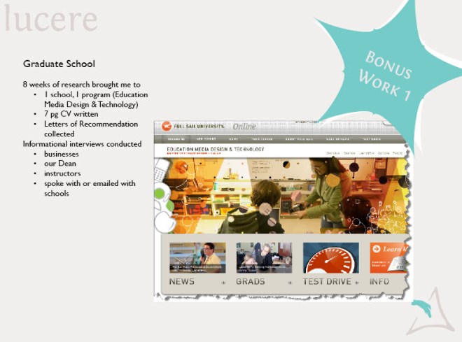
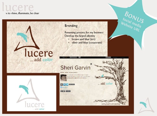
One of the items I was particularly thrilled with at the end of summer quarter was my Portfolio Prep class. Decisions were finalized on my business name and branding direction, the look and feel of my design resume and stationery/business cards, portfolio concepts were explored, as well as graduate schools chosen and cv written.

I finally honed my graduate school down to one favorite choice, but I will probably end up with one of the less expensive options on my list. I have to pay it back and an MBA might serve me just as well as my preferred choice.

Branding included but was not limited to finally deciding upon my business name, setting up an About.me page, buying a business url, and setting up a Twitter account.

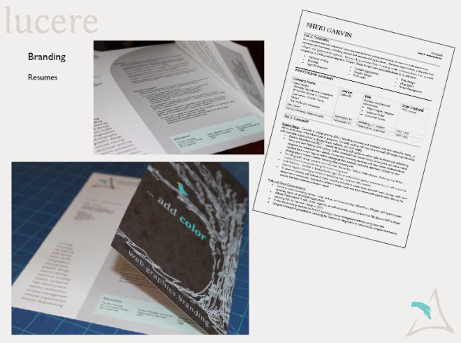
Not only did I create a 7 page cv (curricula vitae), but I finally finished my design resume. “Keep it to one page,” I was told, which created a challenge with 7 pages worth of experience, so I compromised and created a fun semi-two-page. To the right is my standard business resume often submitted via a pdf online and it is a 2 pager.

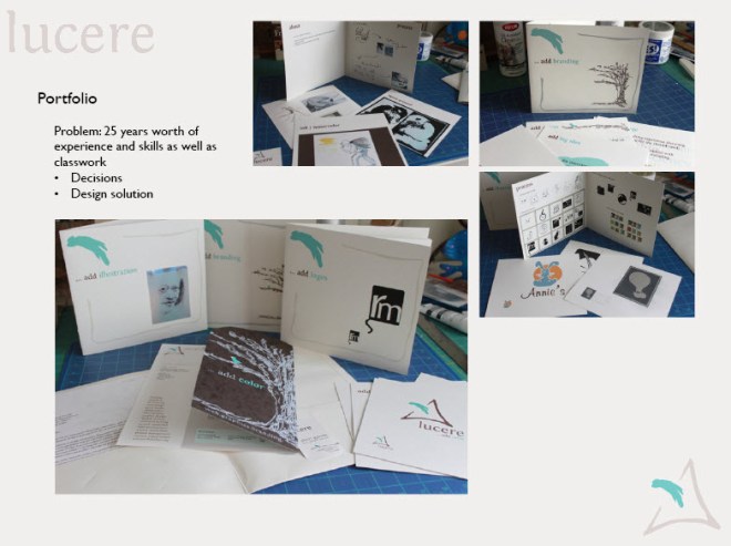
I also tried out an idea for my portfolio; however, I may make this more simplistic when I go into my portfolio show class in order to do more with the show itself. It was fun to explore and obtain feedback from those around me though!

The class was extremely productive and the resulting task list should move me forward through the upcoming year and beyond. I would summarize this class, led by Zeb Wood, as one of the key courses in my degree program and certainly the class that synthesized my current classwork with past experience and future possibilities.

Advertising

The final project in Advertising class was to create a campaign for the Children’s Museum. I decided to utilize my drawing skills in a way I rarely do and create ads with a coloring book flavor to them.

I had the misplaced idea that it would be less computer work, forgetting that I would then need to scan them into Photoshop and manipulate them. So… it ended up being more work than if I had used photographs, but it was a better learning experience in the long run.

This slideshow requires JavaScript.

Social Media: It’s not just for fun

As a part of our Portfolio Prep class, Zeb Wood (teacher)  had a guest speaker (Tyler Burgardt, co-founder of Indiana Uploaded) talk to the class about the role of social media in creating an online brand and how it impacts the job search in the new millennium. The resume is not enough anymore.

If you have not Googled yourself lately, you may want to give it a try. Over 79% of employers now google applicants to review their online information. You will want to know what they are finding! How we are seen online can make or break a job opportunity.

As a fallout of the presentation, a couple of us began creating about.me pages and cleaning up our LinkedIn profiles.

See my new about.me page.

See my fellow student Steven Ray Brown’s page. Love this guy and the work he does!

——————————-

Resources

If you want more information about branding and the social media role in job hunting:

Book: ME 2.0 (on Amazon)

51 Resources from Mashable (I especially like the infographics)

For those who prefer to read text in a quick format: 10 Tips for Job Searching

Illustration 3: A Famous Face

Funny thing about me, I don’t do faces. That said, it was with trepidation that I took on our third assignment to illustrate a famous face. However, it was actually quite enjoyable once I looked at the face as a matter of shapes in relationship to one another.

I wanted to do Nelson Mandela, but opted for a more familiar image who played him once in a film. I like Morgan Freeman as an actor and his face is fascinating. Maybe it is the mystery in his eyes and the humor I sense behind them. I have always been a sucker for that combination.

First I researched photos, then thumbnailed the position. Simply put, I liked it best directly in the general center of the paper… nothing too design driven, just simple.

Practice runs:

#1 Conte pencil/tan pastel paper – I was not happy.

#2 conte pencil/grey pastel paper – didn’t finish, didn’t like it. (Our teacher, Jacob Dobson, likes to tell us “don’t polish poop” – crude, but very effective. I let go of a project when I think of it that way!)

#3 Felt like it needed to be bigger!

Had loads of fun doing this one, but would have liked to try it again (and maybe again) but ran out of time. This one was turned in, but I know the face is not yet the length that I want.

What it lacked in style, it made up for in size! No doubt about it, I would love to just be an artist – as long as I had an income and time to perfect my craft.

Chalk pastels on large, light tan pastel paper.

Given more time, I think I could have gotten the likeness down. By the time Morgan and I were at this point,  it occurred to me that “taking a likeness” can be a very intimate experience. The artist has to get to know the subject in deep detail…to feel the other person and get to know them more than casually. It can happen even with a photo.

I then remembered that it was one of the reasons I had steered away from portraiture in the past. I am not always comfortable with that intimacy… it feels like an invasion of privacy.

Jelly Belly Ad Campaign

Advertising class project number 3: (you can see the photo shoot on a previous post)

Working on the premise that Jelly Belly gourmet beans are special (Ronald Reagan was never without them!), I wanted my campaign to be about creating or evoking memories and being a part of long term relationships.

I featured their Cold Stone Creamery (ice cream) flavors because of their nostalgic coloring.

Tagline: The Taste of Memories

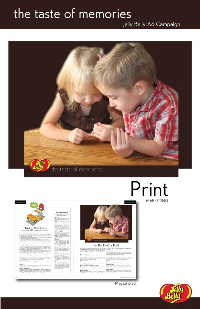
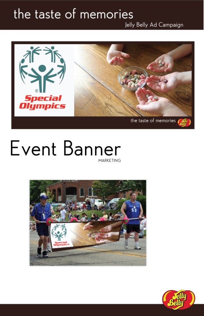
Following are pages from my formal presentation of 5 different ads for the campaign:

1. Magazine Print Ad – 2 children building memories

2: Billboard – evoking a nostalgic memory and indicating that Jelly Belly Jelly Beans have longevity and are still fun as adults.

3: A quilt show sponsorship by Jelly Bellys. This would be their candy sales counter at the show and the quilt with candy on it would be inside the glass counter. It was challenging to show that.

(Note – this is a quilt I made and gave to a friend of mine a few years ago for her birthday. It seemed perfect for this and she allowed me to spill candy on it.)

4. Direct Marketing print piece advertising the quilt show.

#5. Another event sponsorship.


Hope you enjoyed these as much as I enjoyed the research!

Feel free to vote! I like feedback!

Conceptual Illustration: Some have the courage…

Conceptual Illustration

My goal with the second illustration was to go for a simpler form. I chose to do a line drawing with minimal color, which is not my usual style.

Process:

  • research art precedents
  • brainstorm words that describe the concepts in the chapter we were illustrating
  • choose a concept and brainstorm images that would best illustrate the idea
  • draw concept sketches
  • choose one and thumbnail
  • get a roommate to pose for me for reference photos
  • (get feedback from class and teacher and start all over again)
  • complete the final piece on bristol board with ink and watercolor

M. Scott Peck – The Road Less Traveled

Illustration of chapter 1: Discipline

“Life is a series of problems. Do we want to moan about them or solve them?”

Some have the courage…

Portfolio Prep Plan

The Portfolio Prep class is my most active, yet the things that I am doing are not “beautiful”. This quarter Zeb Wood was teaching it for the first time to his group of animation students. I asked to be in his class because I suspected he was going to be good (he is a founder of Indiana Uploaded.) I am not disappointed!!! He has me working my tail off, but with my consent and cooperation.

Zeb works with the individual students to set their personal goals for the class. My plan took a two pronged approach:

  1. Prep for graduate school
  2. Portfolio/resume preparation

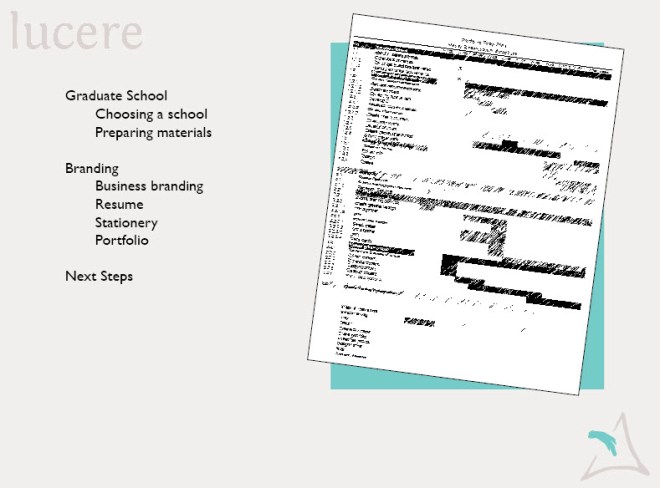
The list of things to accomplish in 11 weeks is daunting, but I set up a Work Breakdown Structure and am plowing through it. Here is a visual… there are even more items to accomplish after the quarter is over, including designing and setting up a web site. Aiy aiy aiy!

So far, as of mid-quarter I have accomplished the following and more:

  1. Identified schools/programs I am planning to apply to and started the process of collecting information (letters of recommendation etc.) for applications.
  2. Written a 6 pg CV (long version of my resume) as well as a cleaned up short resume.
  3. Named my business, designed a business card to be sent to the printer this week, and purchased the domain name and hosting from godaddy.com.
  4. Put together a rough and ready version of my portfolio.

AND,  job opportunities began popping up this past week (thus the need for a rough and ready version of my portfolio.) My internship will be ending and I would like to try my hand at something else, so it is fun to have the energy flowing before I am even ready!

Jelly Belly Photo Shoot

Our 3rd project in Advertising was chocolate. And not just any chocolate… our favorite chocolate!

Anyone who knows me or is following my blog will know that I can not eat chocolate for health reasons *insert sad face here*.

Assignment: 25 points – Buy your favorite chocolate candy and spend some time with it. Really experience it, then bring it in to share.  Write a creative brief and begin developing a campaign surrounding this wonderful candy.

This posed a problem for me. I had been craving chocolate for weeks and knew for certain that I would not be able  to immerse myself in it for 3 weeks without tasting it! After some consultation with the teacher she agreed to allow me to use jelly beans (some are chocolate- so that should count, right?) Jelly beans are no threat, but I could give them to my nieces and nephews and live vicariously through their experience! (By the end, I was having a hard time resisting their temptation, though!)

Thus… the Great Jelly Belly Event was scheduled! One Sunday afternoon I turned the kids loose on a bowl of the Cold Stone Creamery Jelly Bellys while I held the camera. It was chaotic and quite entertaining. Maybe not the most scientific photo shoot, but very immersing.

Call it research, call it a photo shoot, call it “Aunt Sheri is the bestest Aunt ever”… I called it fun and then titled it “homework”!

This slideshow requires JavaScript.

Catchin’ the Breeze

Our first illustration challenge was to create a cd cover. I chose a song that has been the embodiment of my return to college and move towards the lifestyle I want  – no, not sailing and ocean cruising… following my heart and living in joy!

I chose an almost monochromatic theme and focused on the sun as a symbol of the hope and promise ahead… “as you walk into the light….” The main stanzas are below the photo.

Technique is watercolor and ink on illustration board.

The process was to collect photo references and work from those. I chose a photo from the trip to the Keys that had a boat on the water; however, I wanted a photo of a sailboat with the sail unfurled, so that Saturday a friend and I headed to Geist Lake and lucked out! The sailing club had a class in session and using a zoom lens I shot photos to my heart’s content!

Catchin' the Breeze

I created a youtube video of the actual song set to the photos of our dolphin swim for the nieces and nephews, so excuse that personalization. However, this is the specific song for anyone wishing to hear it – Eden’s Bridge: Catching the Breeze .

Catching the breeze
Sailing away and traveling
The seven seas
Open your door and
Step out and catch the breeze

The journey is long
But one step is all that it takes
To start
So lift up your eyes and
Pack up your courage and fill
Your heart

The horizon is distant
The sun is so bright
And the city is fading
As you walk out into the light

Advertising Cup Noodles

Assignment 2 was to create an advertising campaign for Nissan’s Ramen Cup Noodles to college students. (An interesting note is that these were invented to feed the masses inexpensively after WWII.)

Using this brand, we explored a variety of tools for brainstorming and idea generating, sometimes in a team and sometimes alone. Then we each set up our own creative brief.

My one word for the product is “smart” – health commentaries not withstanding. Smart because it saves money, is quick and easy, can be eaten on the go, and the containers are recyclable.

We were then tasked with creating a tagline and carrying the big idea across the campaign with 3 different approaches.

The tagline I created was “Use your noodle” as a play off of the “smart” aspect.

  1. Print Ad is for a bus stop. I can see this one being changeable with all sorts of images of really stupid things that students do, but I was unable to find a high resolution image of something like students using skateboards incorrectly etc. so went with the head-bust image.
  2. Social Ad is for a Facebook contest calling for spontaneous photos of students NOT using their noodle.
  3. Guerrilla Advertising is trash cans around campus that look like the noodle containers.

This slideshow requires JavaScript.