Doomsday in 3D

Our final project in 3D Design was actually a mix of fun and gruesome (that was because of the choice I made.)

The assignment was to create a museum space teaching about a doomsday prophecy or fears of the end of civilization. The topics the students were choosing were quite interesting (Y2K – I lived through that one, The 4 Horse Riders of Revelations, The Battle of Armageddon, The Cold War, an asteroid impact, the Mayan calendar, etc.) There was one very different one where one student took a children’s book about spaghetti overtaking the world. Click for the illustrated story.

I decided to be a bit different and find something from further back in history. The research on that was very interesting, indeed, but I settled on The Munster Rebellion of the 1530s because of the various elements it offered that lent themselves to a good story.

Munster Germany in the 1500s

The basic premise is that the Anabaptist movement split off a radical who, with a growing following, took over the town of Munster, Germany, saying the Lord was coming and this was to be His New Jerusalem. Easter was his doomsday prophecy. This original leader thought he was Gideon and ended up making a suicide run against the original Bishop who had put the city under siege. Another radical took over. Somehow the missed deadlines were overlooked by the followers and for over a year the new guys in charge lived high-on-the-hog and introduced polygamy (if the world was ending, I am not sure why they needed multiple wives. It wasn’t for procreation.)

Eventually they were overcome and the 3 living leaders were beheaded and strung up in cages on top of a church spire.

100 years later, their bodies were removed, but the cages remain to this day. Nice story, eh?

The Anabaptists went on to become the non-violent, modern day Mennonites and Amish.

My scenario…

The “baptismal” is a clay container I made in high school! It was fun to reuse it.

Final Adv. Animation

This was from a movie I have never seen (The Matrix?) and was talking about “there is no spoon”. I have no idea of the context, so just went with it.

This is about half done. I was so sick the second half of the quarter and my doctors think it was a mix of physical stress from the oral surgeries and 3 rounds of antibiotics. I had 1 week of feeling well this whole quarter. On top of that, one roommate had surgery 2 weeks before the end of the quarter that entailed more care than we expected.

I knew I was going into this with a high A, so I opted to let this one final slide and concentrate on the classes that actually mattered to me or needed the most attention. This is the second class I have ever received a B in and I was ok with that choice (though I admit I struggled a bit with it.)

I do believe I learned what was being taught, so it just was a matter of jumping through the grading hoops. I was just glad to be done!

Two figures talking

3D – 1950s

The 3D Design teacher asked us to make the next project a portfolio piece. When asked what we would use it for, he was unable to answer that question, “I am not the graphic designer, you are!” I was not motivated, needless to say.

  1. Find a piece of furniture you like and make a scale model.
  2. Match a font of that same period with the furniture, make a scale model of the first letter and use the font on a wall plaque.
  3. Write a report on how the design of both are connected to the influences of the era.
  4. Make a museum installation of it with appropriate window coverings, flooring, and wall paper.

Original Chair by Warren Platner / Font – Helvetica

My chair…

1950s elements

Flooring (linoleum)

1950's wall paper

I got docked on not completing the H (it needed to be cleaned up and painted.) I felt lucky to even get it into the scenario.

I was not pleased with the outcome, but I did get to practice how to use polymar clay, something that had been on my radar for a couple of years. I made the cushions removable too, which was a fun element.

Maybe it was not so bad for something that had no use except to be thrown away as soon as it was graded. I did salvage the netting – that came out of my air brush tool box. I often try to utilize other art skills that I have… or tools from them. Who knew that scrap of netting would save me a trip to the fabric store one day?

Design Production Team Layout

Train yard at night - Photo credit goes to Sean

This class took the most effort, but was the biggest disappointment of the quarter.

————————————————-

Lessons Learned

I walked into this class more lackadaisical than I should have and with an expectation that everyone would just do what they told the team they were going to do. It did not work that way.

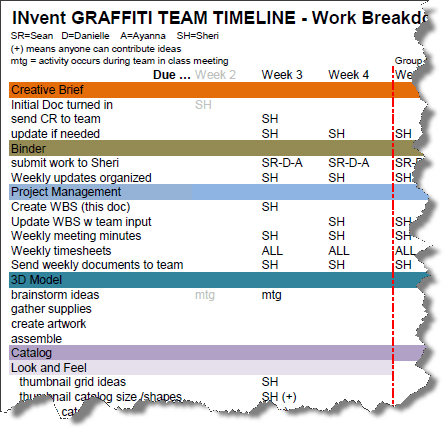
The team assigned me the role of organizing the chaos, since that is what I do in my business life. I chose to do this with a work breakdown structure and meeting minutes; however, you have to have team members with a willingness to work for the good of the team in order to make these effective, and that is where things fell apart.

Unfortunately, my intense business organization was misinterpreted and seen as being too detailed… maybe too controlling, though it was never meant as such. The only word I can really come up with to describe it is “sadness”,  sadness at the misinterpretation and the sadness that I was unable to fix it once it went awry. The latter part of the quarter was overshadowed with this sorrow and frustration, because we just couldn’t seem to get it together to meet with our original plan and vision. And it was such a good one!

————————————————-

The Project

The basis of our project was to “sell” a product. We chose to sell graffiti. I was responsible for pulling together the artwork from the other team members into a catalog, as well as the t-shirts we wore for the final presentation.

The team did an excellent job coming up with the company name, INVent (for Indiana Vent) and the accompanying logo (both powerful and effective!):

The catalog was split – one side featured the work of the individual artists on the team.

Flip it over and the other side featured the products we were “selling” that had the art on them.

The t-shirts were accomplished by spray painting a black t-shirt with basic everyday white spray paint and a template.

————————————————-

Special Nod to Sean

I will have to say, one team member in particular really impressed me.

His name is Sean and he was graduating this quarter and joining the Navy in Jan. The Navy will love him and will know how to use his abilities, for sure! He is organized, motivated, has a great attitude and I gained a lot of respect for the young man. He is going to go far no matter what he does, and I see the potential of great leadership within him.

The other pieces of the project were supplied (or not) by the other team members. Below are a couple examples of the art work provided by Sean.

Guerrilla advertising – meaning he went out to a train yard and tagged some box cars as well as a wall or two.

Template used

Wall tagged at a train yard

Drawing a design on a model’s back (a removable tattoo):

We photographed a model and later overlaid designs on the t-shirt. This is one of Sean’s pieces, as well as the logo.

————————————————-

Conclusion

While I am sad at the frustrating experience we all had, we did end up pulling off a project in the end. Some of the pieces by individuals were not met, but the catalog, which was the biggest and most complex deliverable, was completed. We had to create 4 of these. One for each team member.

I also gained some personal insights and lessons learned that I am not likely to forget in a long time. It gave me the impetus to start on the job hunting trail with an unparalleled determination. I am ready to get back into the real world with real projects.

Advanced Animation

My Advanced Animation class was a lesson in endurance. Don’t get me wrong. It was fun, if that is what you were wanting to pay several thousands of dollars for, but here again, this class had little to do with graphic design. It could have…but it didn’t. This ended up being about creating animations that “act”. We even took class time to play Guesstures and practice what acting was all about.

Yeah. We did that.

I did not have the energy within to try to extrapolate what I was supposed to be learning in Flash as a graphic designer, so I just did what it took and did not strain anything.

Practicing – I chose to do a guy falling asleep from boredom…

Practice animation

Project 1 – action and intention.

I took video of my nephews trying to grab at a tree as my reference. That was fun.

Project 1

Lipsync – we chose a clip provided by the teacher and did one person talking. We only needed a non-moving head since the lips are the important piece here.

Lip sync exercise

Midterm – lip sync and add body actions.

This clip was from Ghostbusters… the moment the Stay Puff guy was “imagined”, so I used him as my talking figure just to add some humor for my own delectation.

Ghost Busters animation

All of these could use more work on their drawings. Time was not my friend this quarter. In addition, these classes were on Friday and my initial and subsequent surgeries and dental visits fell on Thursdays. However, I was hitting the intended learning points and had a very high A at the half-way point.

3D Design – an enigma

Our 3D Design class was an enigma to me. I sort of understood what the teacher was getting at (or what he should have been getting at, which is environmental graphic design), but since he was an engineer and not a graphic designer, I felt more frustrated than anything. The focus was on the craftsmanship and the math. It really should have been on how to design the graphics for 3D spaces and the math should have centered around how to reduce our designs appropriately.

However, I did get that he wanted us to work with our hands after his irritated comment, “I am trying to teach you how to actually do something.”

And forget the math. It was not going to happen for me with all the migraines and pain going on (from my oral surgery.) Besides, that is what the internet and friends who work in the math world are for, anyway, right? (Shout-out to my brainy friend, Charlotte, on that one! She came to my rescue on one tricky calculation.)

It became an expensive expedition into one of the bigger non-learning events of my degree.

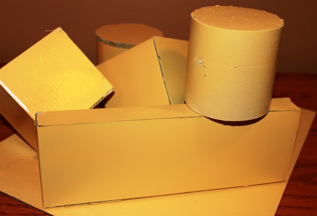
The first project was making cylinders and boxes with various materials and then painting them. I got an A… that is more of a puzzled comment than any sort of bragging.

Portfolio Prep – Conclusion

The summer 2011 quarter ended with a bang and I went straight into a very busy week long break that included a “simple” oral surgery. That was a choice that knocked the stuffing out of me for the entire subsequent quarter, so now I am playing catch up with the blog!

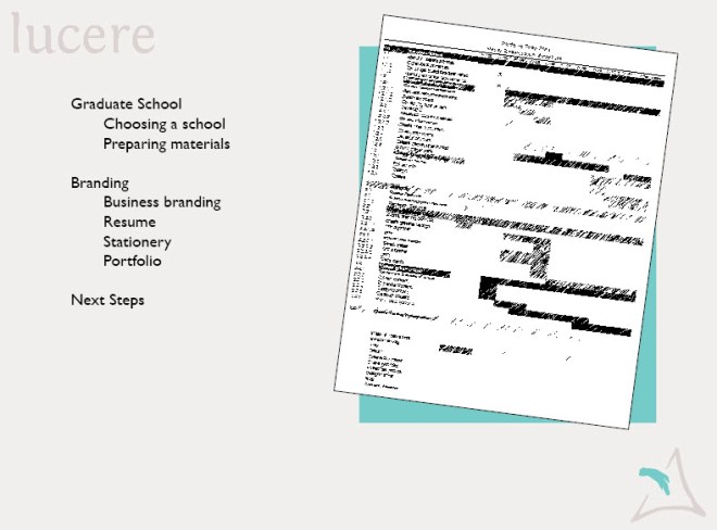
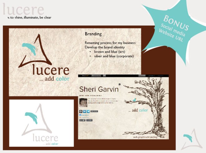
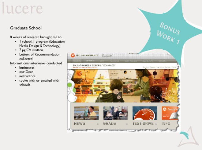
One of the items I was particularly thrilled with at the end of summer quarter was my Portfolio Prep class. Decisions were finalized on my business name and branding direction, the look and feel of my design resume and stationery/business cards, portfolio concepts were explored, as well as graduate schools chosen and cv written.

I finally honed my graduate school down to one favorite choice, but I will probably end up with one of the less expensive options on my list. I have to pay it back and an MBA might serve me just as well as my preferred choice.

Branding included but was not limited to finally deciding upon my business name, setting up an About.me page, buying a business url, and setting up a Twitter account.

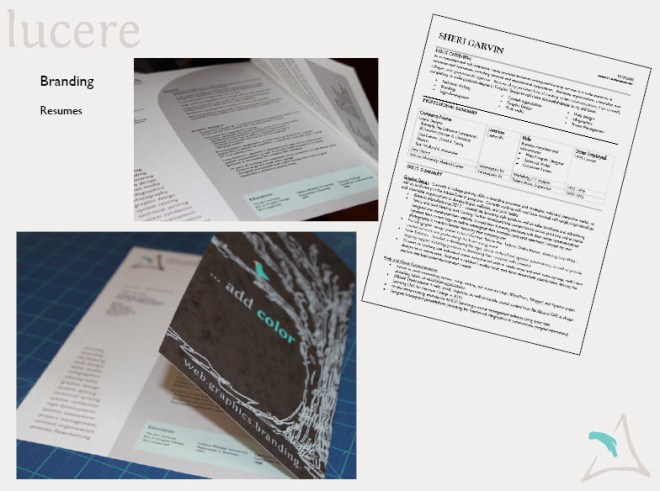
Not only did I create a 7 page cv (curricula vitae), but I finally finished my design resume. “Keep it to one page,” I was told, which created a challenge with 7 pages worth of experience, so I compromised and created a fun semi-two-page. To the right is my standard business resume often submitted via a pdf online and it is a 2 pager.

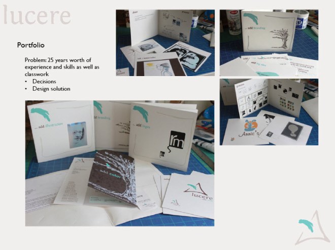
I also tried out an idea for my portfolio; however, I may make this more simplistic when I go into my portfolio show class in order to do more with the show itself. It was fun to explore and obtain feedback from those around me though!

The class was extremely productive and the resulting task list should move me forward through the upcoming year and beyond. I would summarize this class, led by Zeb Wood, as one of the key courses in my degree program and certainly the class that synthesized my current classwork with past experience and future possibilities.

Advertising

The final project in Advertising class was to create a campaign for the Children’s Museum. I decided to utilize my drawing skills in a way I rarely do and create ads with a coloring book flavor to them.

I had the misplaced idea that it would be less computer work, forgetting that I would then need to scan them into Photoshop and manipulate them. So… it ended up being more work than if I had used photographs, but it was a better learning experience in the long run.

This slideshow requires JavaScript.

Social Media: It’s not just for fun

As a part of our Portfolio Prep class, Zeb Wood (teacher)  had a guest speaker (Tyler Burgardt, co-founder of Indiana Uploaded) talk to the class about the role of social media in creating an online brand and how it impacts the job search in the new millennium. The resume is not enough anymore.

If you have not Googled yourself lately, you may want to give it a try. Over 79% of employers now google applicants to review their online information. You will want to know what they are finding! How we are seen online can make or break a job opportunity.

As a fallout of the presentation, a couple of us began creating about.me pages and cleaning up our LinkedIn profiles.

See my new about.me page.

See my fellow student Steven Ray Brown’s page. Love this guy and the work he does!

——————————-

Resources

If you want more information about branding and the social media role in job hunting:

Book: ME 2.0 (on Amazon)

51 Resources from Mashable (I especially like the infographics)

For those who prefer to read text in a quick format: 10 Tips for Job Searching

Illustration 3: A Famous Face

Funny thing about me, I don’t do faces. That said, it was with trepidation that I took on our third assignment to illustrate a famous face. However, it was actually quite enjoyable once I looked at the face as a matter of shapes in relationship to one another.

I wanted to do Nelson Mandela, but opted for a more familiar image who played him once in a film. I like Morgan Freeman as an actor and his face is fascinating. Maybe it is the mystery in his eyes and the humor I sense behind them. I have always been a sucker for that combination.

First I researched photos, then thumbnailed the position. Simply put, I liked it best directly in the general center of the paper… nothing too design driven, just simple.

Practice runs:

#1 Conte pencil/tan pastel paper – I was not happy.

#2 conte pencil/grey pastel paper – didn’t finish, didn’t like it. (Our teacher, Jacob Dobson, likes to tell us “don’t polish poop” – crude, but very effective. I let go of a project when I think of it that way!)
#3 Felt like it needed to be bigger!

Had loads of fun doing this one, but would have liked to try it again (and maybe again) but ran out of time. This one was turned in, but I know the face is not yet the length that I want.
What it lacked in style, it made up for in size! No doubt about it, I would love to just be an artist – as long as I had an income and time to perfect my craft.

Chalk pastels on large, light tan pastel paper.

Given more time, I think I could have gotten the likeness down. By the time Morgan and I were at this point,  it occurred to me that “taking a likeness” can be a very intimate experience. The artist has to get to know the subject in deep detail…to feel the other person and get to know them more than casually. It can happen even with a photo.

I then remembered that it was one of the reasons I had steered away from portraiture in the past. I am not always comfortable with that intimacy… it feels like an invasion of privacy.