A seed of my creative roots

Have you ever run across  something from your childhood that strikes a long forgotten emotional cord? That is what happened today when I came across these 2 paintings tucked among my stashed art resources such as frames and canvases.

IMG_0002sm


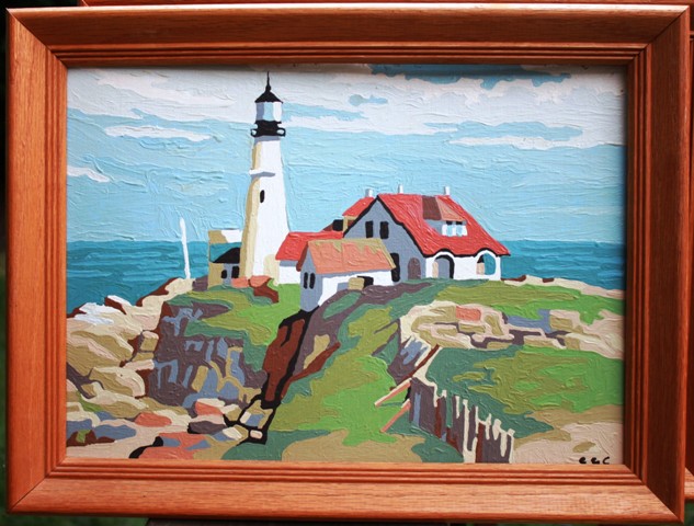
As I stared at them I felt nostalgia, puzzlement, as well as deep pleasure of a found treasure. At the same time I was thinking, “What in the world did I save paint-by-numbers for?” Then I saw the initials.

IMG_0002sm2


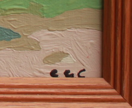
No – that is not e.e.cummings, but these are the initials of my beloved uncle who introduced me to his writings!

Then the memories came flooding back of these hanging on my grandmother’s wall all my growing up years, painted by her son when he was still a young sprite battling polio in the 1950s or early 60s.

IMG_0004sm

My uncle was one of the major influences in my very early artistic endeavors. What a precious find.

So what if they are paint-by-number; there is such a funky charm, as well as deep connected-ness to sweet memories and tender relationships held within these youthful, exploratory strokes. What a treasure.

I will hang them in my new art studio.

“We do not believe in ourselves until someone reveals that deep inside us something is valuable, worth listening to, worthy of our trust, sacred to our touch. Once we believe in ourselves we can risk curiosity, wonder, spontaneous delight or any experience that reveals the human spirit.”
― E.E. Cummings

Insite Rebrand


Workmark-and-logo-only2

A 12 year old project management training business rebrand.

The original logo:

oldBrandsm

In discussions with the client, the important piece of the logo is the directional arrows (they have solid meaning behind them when she speaks to a classroom.)

Tag line

Your Guide to Effective Project Management

New logo

The new logo creates the sense of movement, as well as the hint of a compass.

Logo-only


Blog header

Blog 

CF_Splash2

Stationery

BusCard_Insite_front

BusCard_Insite_back

22 Illustrators

5 Things I love:

  1. Creating books
  2. Making things people love
  3. Giving thoughtful gifts that strengthen relationships
  4. Teaching kids how to have giving hearts
  5. And especially involving others in the joy of doing something creative (because I believe EVERY person is creative!)

These loves coalesced a month before Mother’s Day this year when I saw this book sitting tucked away in a little store. It was like fireworks went off!

IMG_9148

In April of this year my mother had 22 (in June #23 arrived) grandchildren ranging in ages of 17 to a year. 14 of them are under the age of 12, so this was perfect. It even had 22 blank pages!

With a little logistics work, it happened and I got it back in time to present one of my favorite Mother’s Day gifts of all time — from all of them! (This, another book, is now my second favorite – I believe this one tops it.)

Here are some delightful excerpts:

Simeon gave grandma a colorful superhero cape – it was fun to see some of the kids use that same concept on their pages. Kids are so creative!

IMG_9150

IMG_9154

IMG_9155


Lizzy knows Grandma loves her hummingbirds so she drew one and pasted it in. Several of the older kids wrote notes on their pages.

IMG_9173

IMG_9176IMG_9178IMG_9186IMG_9189IMG_9191IMG_9192

Flashback Fun

IMG_2275

In the early 1980s I began painting Christmas ornaments using oil paints and tiny brushes (sometimes my own hair or a cat whisker was used to make the smallest of lines.)

Most of the time I was painting people’s homes or farmsteads, but occasionally I would do a humorous ornament for my family. This was for my brother, Stephen, who really did not like school.

(PS. No, I did not sell trademarked images. This was for fun. I was a huge Garfield fan.)

Here is one that I did for myself simply because I enjoyed the image. I still own this one.

IMG_5974


August Update

Hummingbird Moth / Bee

Ever since graduating in June, I have been questioning whether to dismantle this blog.

These past months I have continued as a full time Communications Specialist in the consulting project I accepted in February. The project has evolved into a lot of technical IT writing and not so much designing. The break from intense creativity after graduation has been good… but I am ready to begin adding more creative projects back into my schedule.

In the meantime, it is a Canon Rebel camera and the butterfly bush in the back yard that are providing me with the greatest pleasure this summer.

There is a possibility my love of photography may drive a new creative blog. I am knocking around some topic ideas and contemplating next steps, so stay tuned.

In the meantime, visit my new website and enjoy a taste of my current photography via the photos below:

Eastern Tiger Swallowtail

Buckeye

Painted Lady

Variegated Fritillary

Mourning Cloak

Packaging Final

The packaging class ended with an excruciating fizzle… I pinched a nerve in my back so I could not sit during finals week! I missed my last day in a business class and 3 days of work. I hate it when that happens and it happens when I sit for 18 hours a day working on the computer in bad chairs.

So, while I could not finish it the way I was hoping, I did complete a package… barely. It was a toss up as to whether I just take the hit and get a C or actually push to at least get a B. I literally cried all the way through this one. When I was ready to quit, my roomies kept encouraging me.

This is a class that with enough time, I would have easily gotten an A because the teacher allowed us to redo our work after we received feedback. However, that week I was barely able to get my first drafts turned in. Very, very painful. Four weeks later and I am finally feeling fine, although I am still being very careful not to do anything to aggravate it. 2 weeks of daily chiropractor visits and then 3 days a week, and now 2 days a week.

At this point in time, I am still not sure if it was worth it for this particular class. One thing I have learned, these past 3 years, is what it means to push myself beyond what I thought  I was physically and mentally capable of accomplishing. Amazing how I have overcome stressors that before I never thought possible.

Part of the requirements on this were the handle and the die cut. I disliked the distinct color change between the computer color and the actual printout on the final, which was more orange, but I gave that detail up in the interest of being able to present a finished piece. Normally I would have tweaked and reprinted until this was perfect with my vision.

That is another skill I have learned – how and when to make the proper compromises, what to fight for and what to let go of.

Here are the final results for Packaging:

This slideshow requires JavaScript.

Art Direction Final

Art Direction was partially a team class and I enjoyed the teams I was put on, even if we were working at warp speed. As a team on the final project we chose to research and promote Kellogg’s Corn Flakes. The team also chose the tagline (which happened to be one I proposed, which was fun.) We then chose our 3 favorite group proposed headlines and general visuals. From there, we each interpreted the final pieces in our individual ways.

One challenge was to find high resolution stock photography and to create the ads in a way that the photography doesn’t scream “stock”.  We each used our own stock photography finds, although as a team we chose a general direction for each (extreme sport, old bicycle, and a business person.) I chose to crop mine and manipulate in Photoshop CS5 by removing the color. I also hand wrote a portion of each headline as if it were a note on the photo.

My thought for this group is that they could be located in a photography magazine.

Packaging Product Labels

Moving along with my product, High Tea, the next phase was to create labels and photograph the containers.

Instructions were to use clear glass containers with the product visible and a die cut of some sort. I chose to use our Penzey’s spice containers and package this as a gift set for high end loose leaf tea. I never did get around to dumping out the spices and filling it with the loose leaf tea. Oh well.

With more time, I feel I could have really done something with these (i.e. they have potential.) Feedback was to extend the labels further around, lose the die cut on such a small item or die cut around the logo, and to darken the name of the tea. Otherwise the teacher felt they were a strong design.

This slideshow requires JavaScript.

Illustration Rework

Two days before my final was due, I had an epiphany and figured out why I was struggling with this painting so much. I spent the weekend re-working and adjusting what I had spent the previous 8 weeks creating. There was a lot of sanding off of what I had put on, then repainting. Fortunately, we were having a 80 degree, summer-like weather and I was able to do this work outdoors.

I can not even describe the amount of rework I did, but thankfully the teacher gave me grace. As long as I promised to complete it, which I will be doing in the next weeks, then he was satisfied with what I had accomplished so far.

It seems that my left side perception must be scewed. I spent my time adjusting that side of the painting, making everything just slightly bigger (well, the guitar a lot bigger) except for Ron’s face, which I needed to make smaller or just move things about (like bring his ear down and nose and mouth up… sounds odd, doesn’t it.) It is like that whole side was just slightly off scale or proportion.

It was quite the operation, and while it is definitely not finished, I was elated once I had created the outlines and positions. I now had a roadmap to the finished piece that I was very satisfied with, and for the first time in my life I believed I might be able to do portraiture- something that has been a very scary impossibility in the past.